Build brilliant forms in Jira Service Management
Overview
Forms provide a consistent way to collect information when raising a request or adding information to an existing issue.
While you can structure forms in many ways, every form has the following two components:
1. Fixed content - form creators provide information that users cannot change. This can include instructions or guidance on how to answer questions.
2. Fields - empty spaces or choice questions where users enter their responses.
After a user finishes and submits a form, it becomes a document (e.g., a formal request, order, statement, letter, or agreement).

This guide is for Jira Service Management users responsible for building customer-facing portals and request types. With the new form builder, you can create dynamic forms to collect the information your agents need to provide high-velocity service management at scale.
Jira’s new no-code/low-code form builder makes it easy to build forms for your customer portals. In this guide, we'll show you how to create effective forms with fewer custom fields and how to cut down the back and forth between agents and customers.
Why form design matters
Forms aren’t inherently sexy, but when they are well-designed they can save resources, improve relationships, and influence user actions.
Optimized forms drive better data quality
Decisions about form design determine the quality of the data you receive.
Better data allows you to:
- Provide better, faster service
- Refine your processes
- Improve the bottom line
- Enhance compliance


Forms are the foundations of relationships
Most business processes start with a form and that means a form is often your best chance to make a good first impression.
Poorly designed forms can result in customers postponing, bypassing, or even abandoning key processes. On the other hand, user-friendly forms can reduce friction, build rapport, and set appropriate expectations.
Well-designed forms get submitted
Shorter forms have been proven to have higher completion rates.
As we’ll see in later sections, it’s not only the length of the form, but also form design principles that affect how likely users are to complete and submit a form. If your goal is to use forms to capture as much accurate information as possible, design is critical to helping you accomplish that.

How to ask good questions
The right questions, including the right question types, let users share the right data. Well-designed questions and instructions minimize frustration for users because they know what they’re being asked to provide and how to provide it.
Your choice of which field types to use, what context to provide, how to word your questions, and how much validation to include directly impact a user’s experience. When considering each question in your form, reflect on what data you hope to capture and consider the user's point of view.
Question types
Questions come in two general varieties: open and choice.
Open questions (text fields) let the user type in what they want to tell you.


Ensure the user has a chance to say what they want to say

More work for the user to fill out
Choice questions (checkboxes, combo boxes, pickers, radio buttons, and select lists) let the user choose an answer from the options you provide.
Easier for users to interpret and fill out
Easy to aggregate and report on
The answer a user wants to select may not be listed
Finding the right balance of open and choice questions will depend on the purpose of your form. Consider including at least one open question on your form. This could be an overview question to start the form or an optional “Comments” field at the end.
Choice questions and conditional logic
Choice questions provide structured data and are great for triggering automation or conditional logic. Choosing from a predetermined set of options is also fast for users because they don’t have to imagine what the possible answers could be and they don’t have to spend time typing.
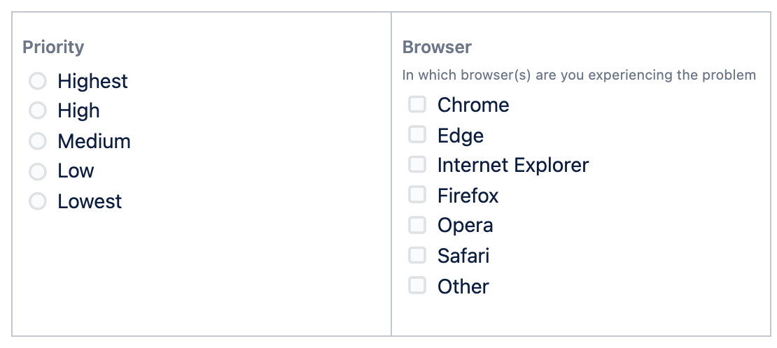
Jira Service Management provides nine choice question types:
- Radio buttons
- Checkboxes
- Dropdown
- Multi-select dropdown
- Date
- Date & Time
- Time
- Single user
- Multiple use
How to use choice questions
Determining which field type to use for a choice question should be based on:
- Whether you want users to select only one option (radio buttons, dropdown, single choice select list), or multiple options (checkboxes, multiple choice select lists).
- Layout and available space on the form/screen – Radio buttons and checkboxes are the fastest for users because they can see all of the choices at once, with no extra clicks required. However, if you’re option list is excessively long, dropdown boxes let you save space on the screen.
Since choice questions already limit the user, when choosing field types it’s good practice to use the least restrictive option. Radio buttons, single select lists, and dropdown boxes mean the user can only select one option. If there’s any possibility that the user would want to select more than one option, use checkboxes or a multiple select list.
Things to consider when creating choice questions
Make sure that your choices offer every user the opportunity to provide an honest and complete answer
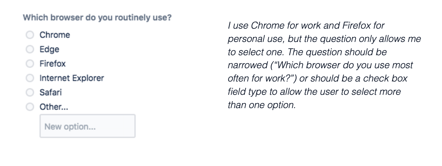
The limitation of choice questions is that they are closed. While this may be helpful to the form owner, it can be frustrating for the user. What if an answer the user wants to choose isn’t listed? Forms in Jira Service Management allow you to include an “Other” option, with an adjoining text field on your choice lists. Depending on how your question is phrased, it may be appropriate to offer options such as “I don’t know,” or “Not applicable”.
Avoid double-barreled questions
Since the purpose of a form is to obtain structured data, it’s important that each question asks for one response. This is especially true for choice questions. Otherwise, you end up with a bunch of easy-to-categorize answers with no idea what they refer to. Customer satisfaction surveys that ask you to agree or disagree with statements like, “The agent I spoke with was friendly and knowledgeable,“ miss the mark. What if the agent I spoke to was rude but knowledgeable?
Structure your rating scales
Choice questions are often formatted as rating scales (strongly agree > strongly disagree) to measure users’ opinions or satisfaction. Carefully consider if you want an even or odd number of options. An odd number of options gives the user a chance to be neutral, while an even number forces them to give an opinion. Label each point in your scale with words that clearly describe what the numbers mean. Scales should not be too large and the increment between each point on a scale should be equal.
You may choose a rating scale that goes from “lowest” to “highest” or vice versa. The important thing is to be consistent throughout your form.
Avoid overwhelming users
The number of choices a user sees increases the complexity of the question. Complexity may cause users to skip questions or take a long time to complete a form. Try to limit choice answers to only those that make sense.
Choice architecture
Creating good choice questions requires a few considerations beyond what you’re asking. How you frame questions impacts how users respond. This is called choice architecture. You can use it to shape responses or attempt to limit your influence to get more “pure” responses.
The influence of defaults
A default answer is a pre-populated answer choice within a question.
Default answers save users time, but they also nudge users to select the choice you choose as the default. Users may perceive the default to be recommended or the most popular choice. This may create a bias for the default answer and skew the overall data captured by your form.
Conditional logical
Choice questions let you use conditional logic to dynamically show or hide form questions based on a user's response to a previous question. This allows you to:
- Reduce cognitive overload for the user – the form looks less cluttered, less overwhelming.
- Shorten the user’s path to completion – the user only sees the parts of the form that are relevant to them. There’s no confusion about which parts they are supposed to fill out.
- Use one form for multiple, similar use cases.
- Accommodate edge cases.
Let’s look at an example
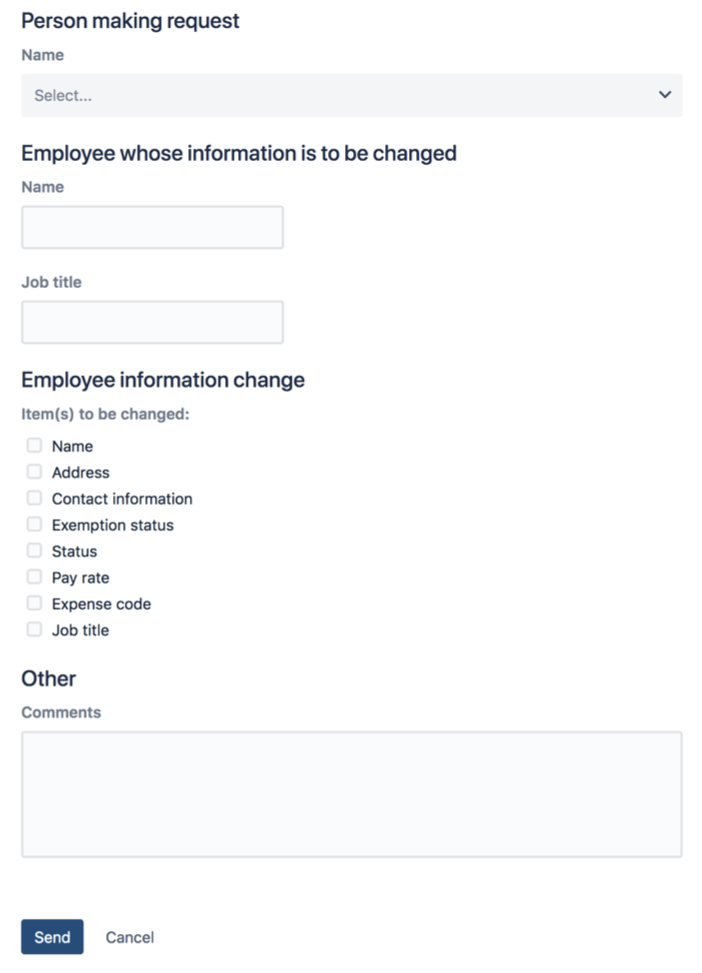
An HR department is using Jira Service Management to manage Personnel Action Notifications.
When the form first loads it looks like this:
Other questions appear depending on what items need to be changed:
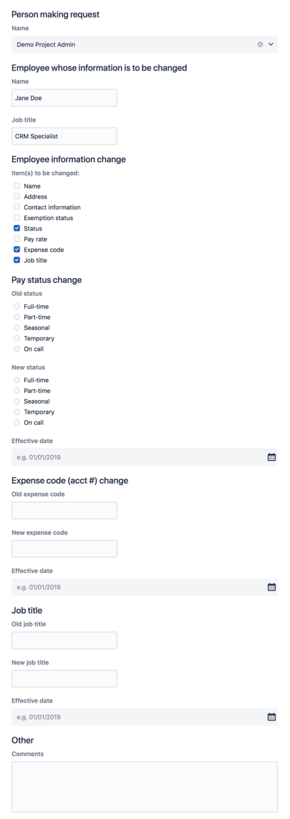
Conditional logic is one of the best things you can do to make your forms more user-friendly – especially customer-facing forms on the Jira Service Management portal.
Summary

When you build your next form, remember…
- Forms are an important part of your workflows and processes. A well-designed form can serve as a great first impression for your customers while also driving higher data quality that lets your teams do their jobs more efficiently.
- Make it easy for users to know how to answer your questions by reducing the number of questions you ask, simplifying the language you use, and following a logical structure in your forms. Making it easy for people to answer your questions and to see a clear path to completion increases submission rates and captures better data.
- The right question type can make all the difference. Remember to think through your open and choice question types to make it easy for users to give you the answers you need.
- Conditional logic can create a better user experience and allows you to show people the right questions at the right times.
- As you build your forms, keep your users in mind and work to make the form experience positive and even rewarding for them.
Tips and tricks
Automation