When AI generates a user interface, the results tend to look the same: gradient buttons, all-caps headings, generic card layouts and hover animations that nobody asked for. It works, technically, but it doesn’t look like your brand. The design community has started calling this UI “slop”: output that may be functional, but lacks any real visual identity or intentional design decisions.
The underlying problem isn’t hard to diagnose. Without context about your brand, components and patterns, AI defaults to the average of everything it’s trained on. Generic in, generic out.
At Atlassian, our design system team has been hard at work on building a context engine for the AI era. We’re creating tools that give AI agents rich design context through our ADS MCP server and detailed AI skills, powered by a structured content model that encodes our documentation for both agents and humans. We’ve found these tools to be successful in reducing our AI token costs — as well as improving the accuracy and quality of what is generated by thousands of product builders at Atlassian.
Learn more about this from our recent blogs:
- Atlassian Design System: Building the context engine for the AI era
- Teaching AI to speak our design language
More recently, a new format has entered the conversation. DESIGN.md is an open-source Markdown format designed by Google for their Stitch design tool — a portable snapshot of a team’s brand and UI patterns that’s gained a lot of traction as a simple fix for slop. The idea is straightforward: include this file in your prompt, and the generated output starts to look more like your product.
We’ve explored this format and tested how it fits alongside our existing tools, and we want to share our findings. The portability of a single Markdown file shows genuine promise for certain workflows and use cases — but we also found that portability comes at the cost of sophistication and efficiency.
DESIGN.md: a primer
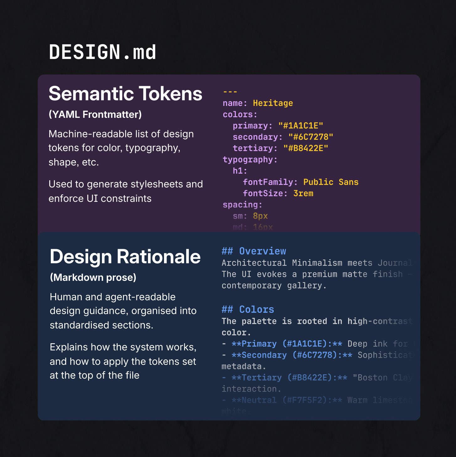
What it is: A portable markdown file that describes just the key elements of a design system. The first part of the file is machine-readable, listing out design tokens. The second part is human and agent readable, describing the design rationale for foundations such as colour, spacing, layout, elevation and components.
What it isn’t: The complete technical spec for how your design system works in production – or the full details of your system. The format doesn’t include your existing code libraries, linters to maintain coding standards, or detailed design specs in Figma. DESIGN.md’s spec frames the format as capturing the intent, rather than the full details of a system.
Building our own DESIGN.md
We’ve been priming the Atlassian Design System for AI consumption for a while now, through our MCP server, structured content pipelines, and rich array of agent skills. So when DESIGN.md landed, we were curious to see where this static markdown file would fit in.
To test this, we generated our own DESIGN.md from our structured content pipeline — the same pipeline powering our MCP and agent skills. From there, we tested the format in common vibe coding tools, and added stricter guidance where necessary for common mistakes that weren’t captured in our existing guidance. Next, we needed to test it.
Testing the standard at Team ’26
A perfect test case came up at the keynote demo for Team ‘26, which wrapped up a month ago in Anaheim. One demo in the keynote featured Figma Make generating custom dashboards using the Teamwork Graph. We wanted these dashboards to align with our design language in one shot — but without relying on internal MCP servers or tools.
This was a great use case for DESIGN.md, but how would it perform? The answer; fairly well!
Check out the results below; the screenshots show the same prompt we demoed on-stage, both with and without the markdown file as context.
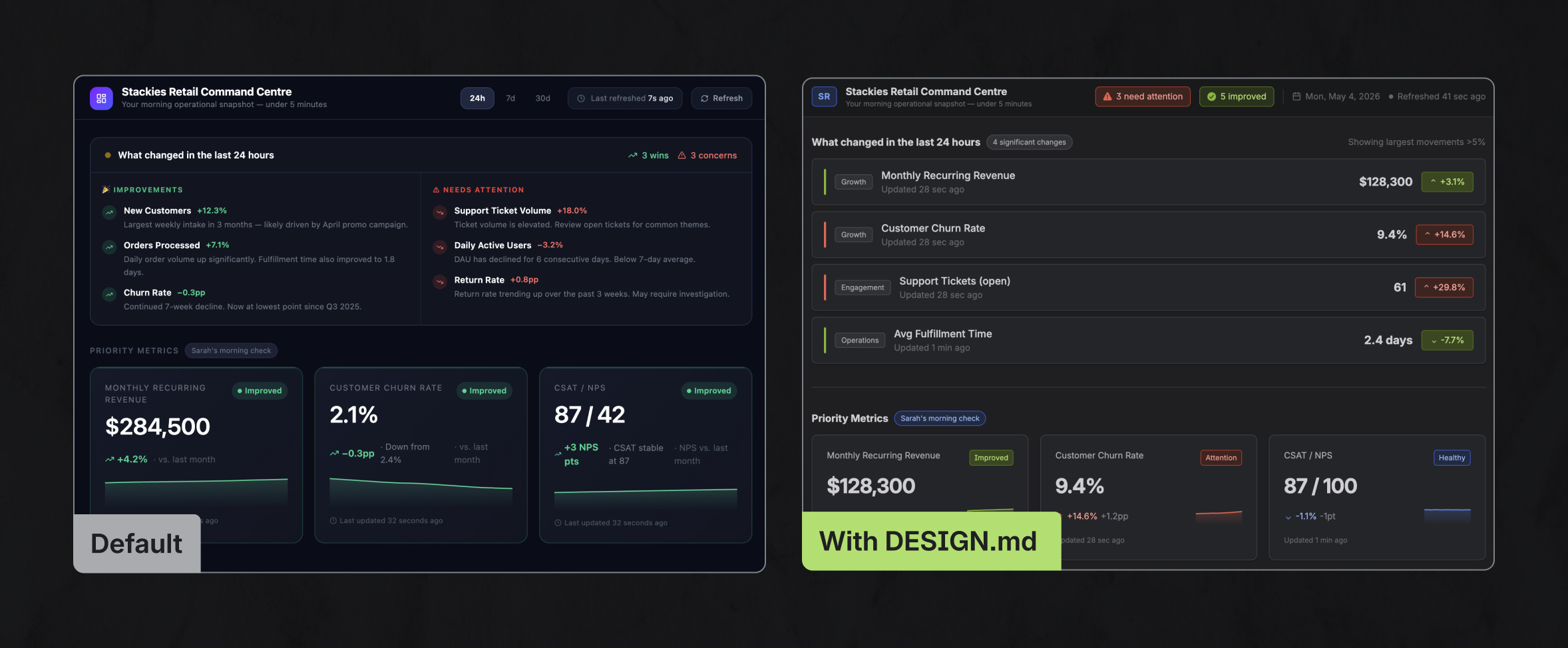
DESIGN.md turned the generated interface from generic “slop” to something recognizably Atlassian, using expected values for color, spacing, shape and typography, and applying elevation to components in a way that aligned with our system. The high-level guidance and specs in the file are perfect for customising a common library like Tailwind and Shadcn, to generate UI from scratch.
So this new format was great for a one-shot prototype — but how about for building larger applications?
The trade-offs using DESIGN.md in production
A production codebase is a very different environment to building an isolated experience from scratch; you’re working with an existing token and component library, and have stricter coding standards enforced by strict lint rules and type checks.
In this context, we found that DESIGN.md performed worse than the MCP server and skills we’ve built and integrated into Atlassian’s software development lifecycle. For a simple task, such as producing a user log-in screen, using DESIGN.md as the sole source of design system guidance required ~92% more tokens, took longer to produce results, and had ~2.7x the variance in token consumption between runs.
| Approach | Design system context available | Average token usage | Average time | Average turns |
| No context | ~5% | 4.20 million | 6m 19s | 43 |
| ADS MCP | ~80% | 3.75 million | 5m 1s | 35.1 |
| ADS skill | ~80% | 4.43 million | 5m 23s | 36 |
| DESIGN.md | ~30% | 7.21 million | 6m 46s | 45.3 |
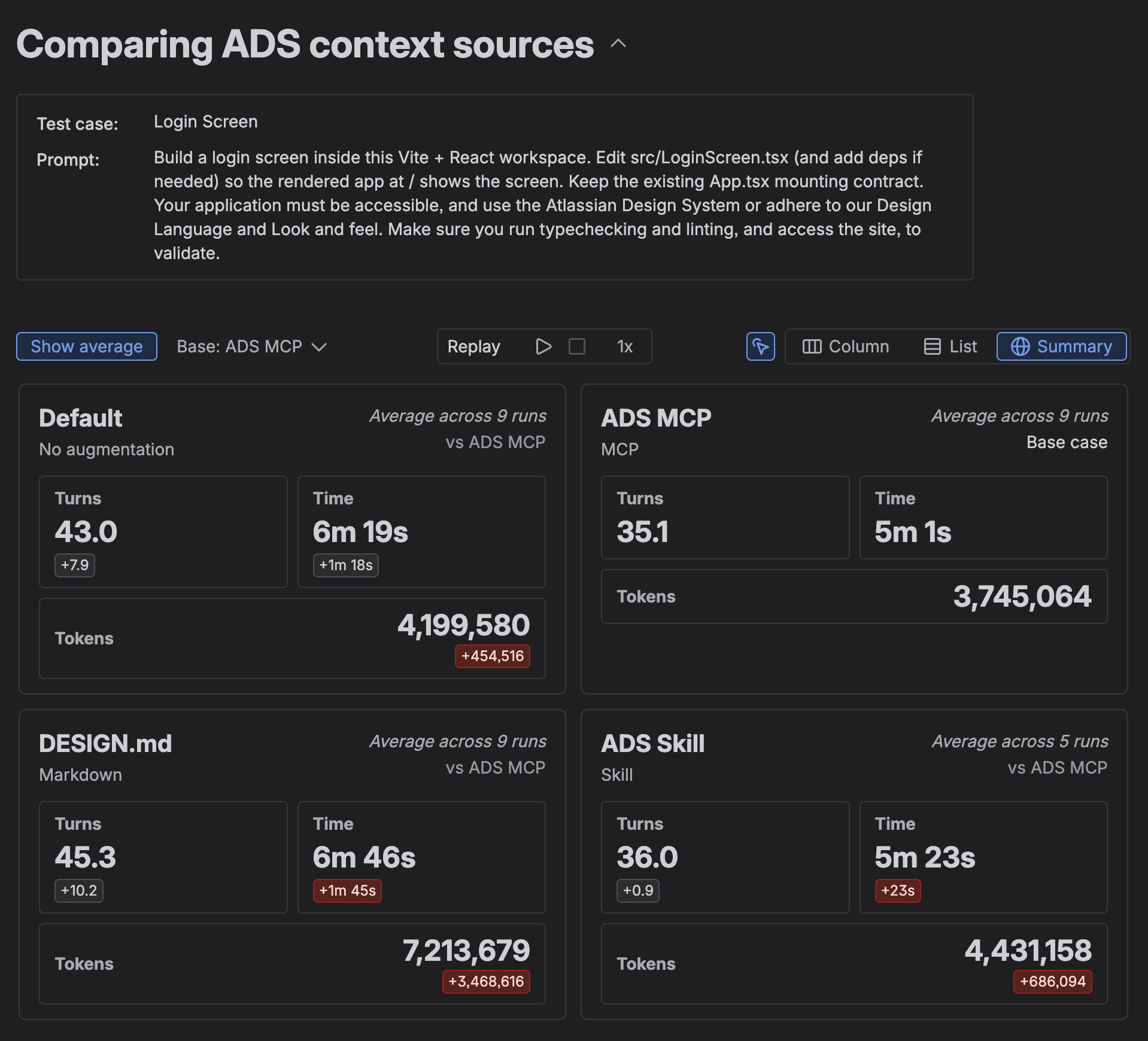
These results should not be seen as conclusive; this blog is not a research paper. Different models, prompts, design systems, environments and the quality of these context sources will all produce different results. But these tests do reflect the general constraints we’ve observed testing the DESIGN.md format.
Limitation #1: Context is delivered all at once, not on-demand
An MCP server is able to load relevant context on demand; an agent can perform a tool call such as ads_plan to fetch guidance only for a specific component. For heavier parts of our system, such as our hundreds of icons and our extensive set of semantic design tokens, this on-demand context saves hundreds of items from being loaded into context when they’re not needed. Our skills are less granular, but are similarly divided into smaller sets of files.
A DESIGN.md file, by comparison, loads everything, every time. This means higher cost and slower responses from the start — and context truncation occurs in fewer turns, which can reduce the accuracy of the generated output.
Limitation #2: Keeping the file short means losing context
Design systems are complex beasts. They contain the combined design guidance and context of the whole business – condensing the shared language of thousands of individual views, Figma files, and frontend components into a single library of guidelines and components. There’s only so much of this you can pack into a single markdown file without trading off on cost and performance.
For our on-demand MCP server and skills, we distill our design system into about 2.5 MB of guidance for agents to fetch on demand. DESIGN.md, since it’s loaded all at once, needs to be shortened much further. The resulting file is 80 KB, or roughly 19,800 LLM tokens (~10,700 without frontmatter), which is on the larger side compared to examples we’ve found in the community.
In order to reach this size, we had to cut out plenty of details that could be useful to an LLM; we had to remove much of the usage guidance from our 50+ components, heavily trim our foundation guidance, and cut a number of design tokens that were low-use. Because all this context is missing, agents aiming for production quality will either produce less accurate results, or have to gather the context on their own; we found agents given the DESIGN.md generally read through component implementations to find usage guidance absent from the spec.
Limitation #3: The spec reveals the internals of your design system
DESIGN.md is a portable snapshot of your design system re-written in prose, intended to provide all the design principles, component specs and guidance for you to implement a new copy of the design system from scratch.
In an established production environment, this information can be unnecessary, or worse can steer an agent to generate tech debt. This is particularly true for components. Rather than reading and interpreting the full details of a button’s styling:
button-default:
  backgroundColor: '{colors.background-neutral-subtle}'
  textColor: '{colors.text-subtle}'
  borderColor: '{colors.border}'
...
## Button
Buttons use the {rounded-medium} token to maintain a soft, organic feel. Default buttons use {colors.border} and {colors.text-subtle}; primary buttons are solid blue for maximum contrast..
It’s preferable for an agent to learn how to import and use an existing component:
import Button from '@atlaskit/button';
// ...
<Button appearance="primary" spacing="compact" />
Ensuring agents use your shared components is vital for maintainability — ensuring you can make a change to your Button in one place, and have that feed through to the rest of your codebase. Plus, it makes the code easier to review and maintain.
DESIGN.md intentionally excludes this kind of code guidance, only providing the spec for how to re-implement the component. In our testing, this meant DESIGN.md was more likely to re-create components rather than use the existing system:
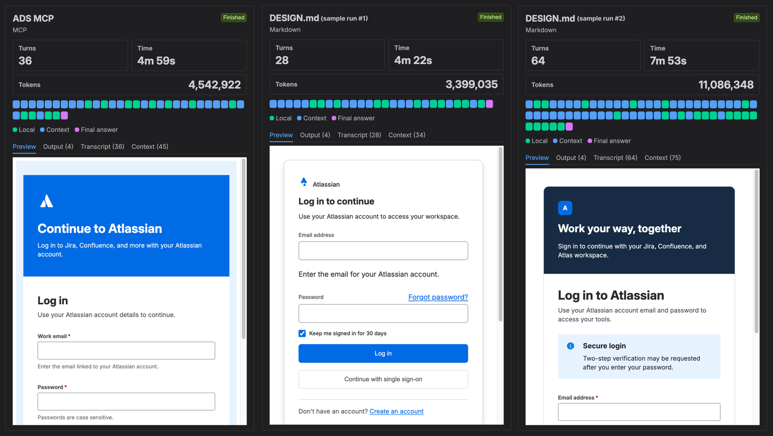
In production, we’ve found our MCP server and skills provide a better level of abstraction, since they’re grounded in our technical foundations. They act as an instruction manual to using the existing design system, rather than a guide on how to re-implement it. We pair this with lint rules, which enforce quality frontend coding standards for humans and agents alike with no token spend at all — resulting in a positive feedback loop for agents, and generated code that’s more useful for our engineers.
Where DESIGN.md is most useful
Despite its limitations in production, the simplicity and portability of this format are really unique and we see a few scenarios where it can be particularly valuable:
- High-level artistic direction: The simplest DESIGN.md files focus on the visual direction and feeling of your system. If you don’t already document these, these portions of DESIGN.md may be a helpful artifact. The front-matter, however, duplicates what’s already in your codebase.
- Quick prototyping in unfamiliar environments: When doing blue-sky prototyping or testing a new tool, a DESIGN.md helps create an on-brand UI without configuring your entire tech stack or burdening your LLMs with existing component constraints.
- Interoperability of your design system with design tools: Some AI tools assemble UI by customising pre-built components, that are customised to match your design language. DESIGN.md provides the perfect level of guidance for such tools.
- Customer theming for adaptive UIs. If your product needs to generate dynamic interfaces like reports, charts and dashboards, a DESIGN.md gives customers a way to easily describe their brand so AI-generated outputs feel like their brand, not yours. Imagine this as an option an admin or brand team could upload into their workplace tools.
What these all have in common is their scope; agent-generated UI in an environment where the existing design system outputs aren’t available, or aren’t practical.
Get started with our DESIGN.md files
We’re keen to work in the open – we’d rather shape this standard than just react to it. In that spirit, we’ve shared our DESIGN.md files at atlassian.design/DESIGN.md. Drop any of these into an agent that supports the spec and your generated UI will start to feel more Atlassian. Give it a go, and share back what you learn!
Our file diverges from the current standard in a few ways (though it’s not far off). We include some non-standard properties that provide important context for how to render our components – and as the standard doesn’t currently support theming, we’ve shipped a separate dark mode variant. We’ve shared our feedback on Github, and have already seen some other suggestions incorporated into the spec. We encourage folks across the industry to do the same!
In summary
DESIGN.md is a useful portability format as a snapshot of your design system, not a replacement for richer design system tooling. If your agent supports MCP or skills, those will give you better results at reduced cost. But for cross-platform portability, customer theming, and blue-sky prototyping, a well-structured DESIGN.md promises to be a meaningful step up.
We’re sharing ours as a resource for teams, and we’re excited to see where the standard goes. The whole ecosystem benefits when design systems are legible to AI ✨