


We believe the future of work is more expressive, more human, and more connected. As a company centered on collaboration and teamwork, we have a unique opportunity to lead the way…not just through our products, but through the language our users and teams use every day.
To that end we built a custom set of brand emojis: a visually distinctive, emotionally intelligent system of expressive marks that reinforce our values, enhance our experience, and sets our brand apart.
Why we started this project
- Emojis are the new shorthand for modern communication, especially in digital collaboration tools.
- Users crave personality in their tools. Thoughtful, well-crafted emojis can spark joy, build connection, and reduce friction across interactions.
- We already lead in team-focused design and this is an opportunity to extend that leadership into visual language.
- The Tweemojis (seen below) we use are incredibly dated (developed in 2014) and stick out like an eyesore in our product.

What we created… Teamojis
We created a limited set of Atlassian-only emojis that represent an expression of our brand that can be used in product and in key customer facing places. In addition to this, we deprecated the old Tweemoji set and have swapped them for the more universal unicode emoji set.

Defining a direction

After extensive exploration work, our team landed on a design direction informed by considerations in key areas:
- Color
- Shape and line
- Gradient and dimension
- Scalability
- Tone
Color – A saturated palette that holds at 16px
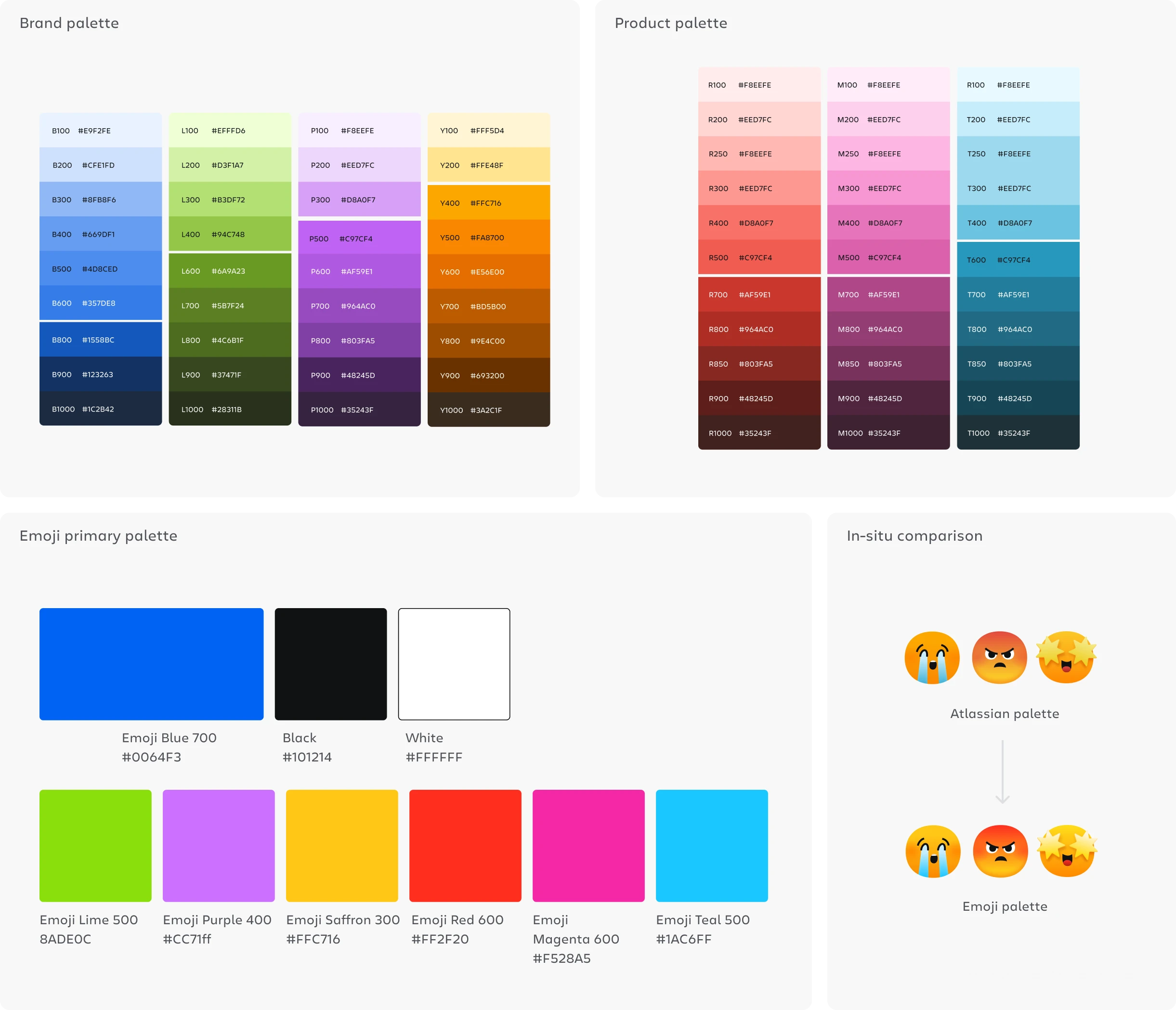
We don’t take creating a new palette lightly, we quickly realized that our palettes struggle with contrast and vibrancy when used in an emoji context in small sizes.

We don’t take creating a new palette lightly, we quickly realized that our palettes struggle with contrast and vibrancy when used in an emoji context in small sizes.

We’ve arrived at an adjusted Emoji palette that is based on the Atlassian and Product palette primaries with increased saturation. Teamojis utilize these enhanced primary colors in combination with our existing tints and shades to preserve the Atlassian identity.
Shape & Line – Humanistic geometry, squared-off intent
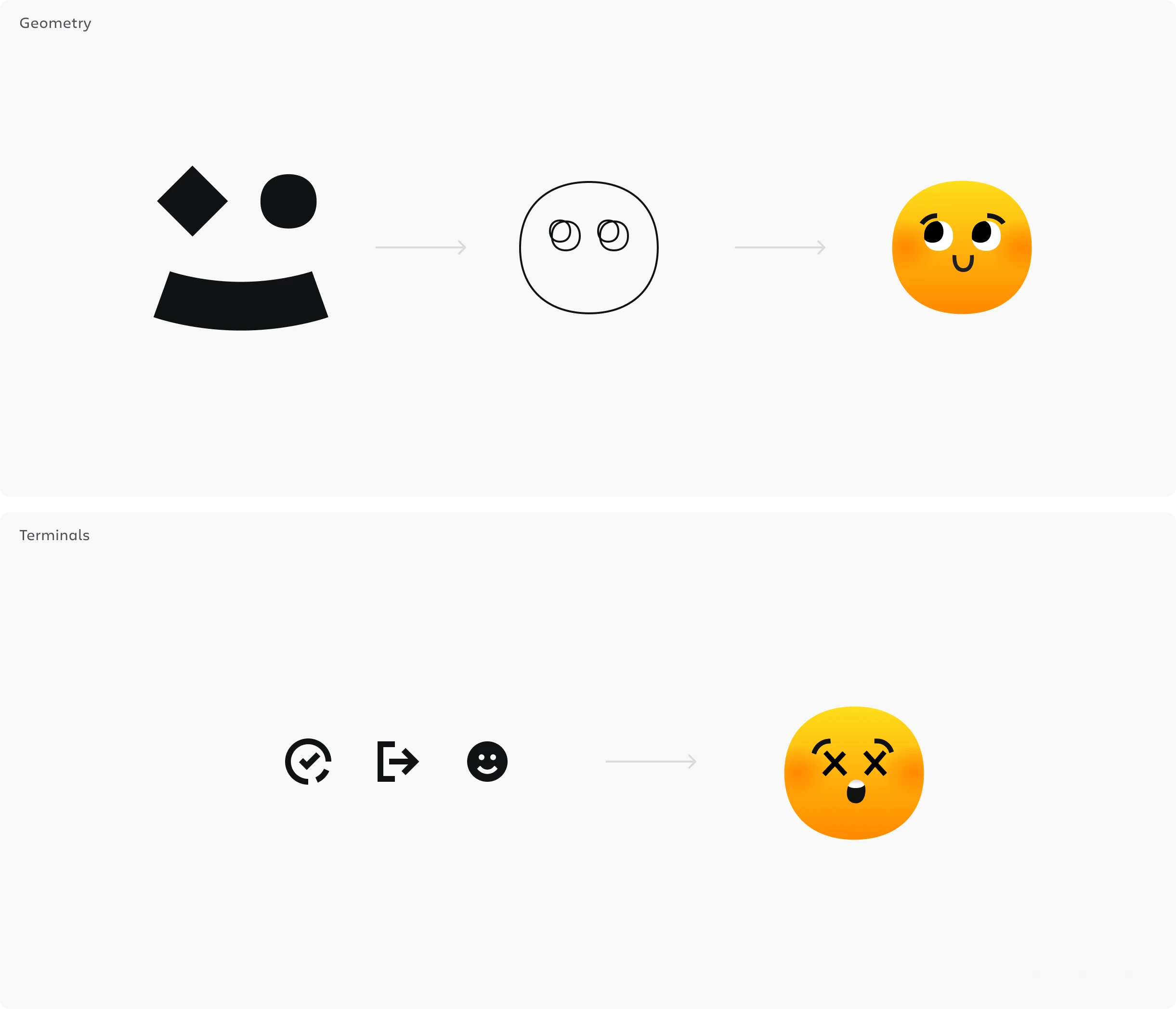
Our geometry utilizes the humanistic shapes from our foundation library these are the same building blocks for the foundation spot illustrations and create a nice through line from the emojis to our brand identity.
To balance the friendliness and humanity of our geometry, we use squared off terminal and sharp corner angles in our linework. The line is untextured and pulled form our iconography language to preserve legibility and scalability in our system.
Gradient & Dimension that carry conceptual meaning
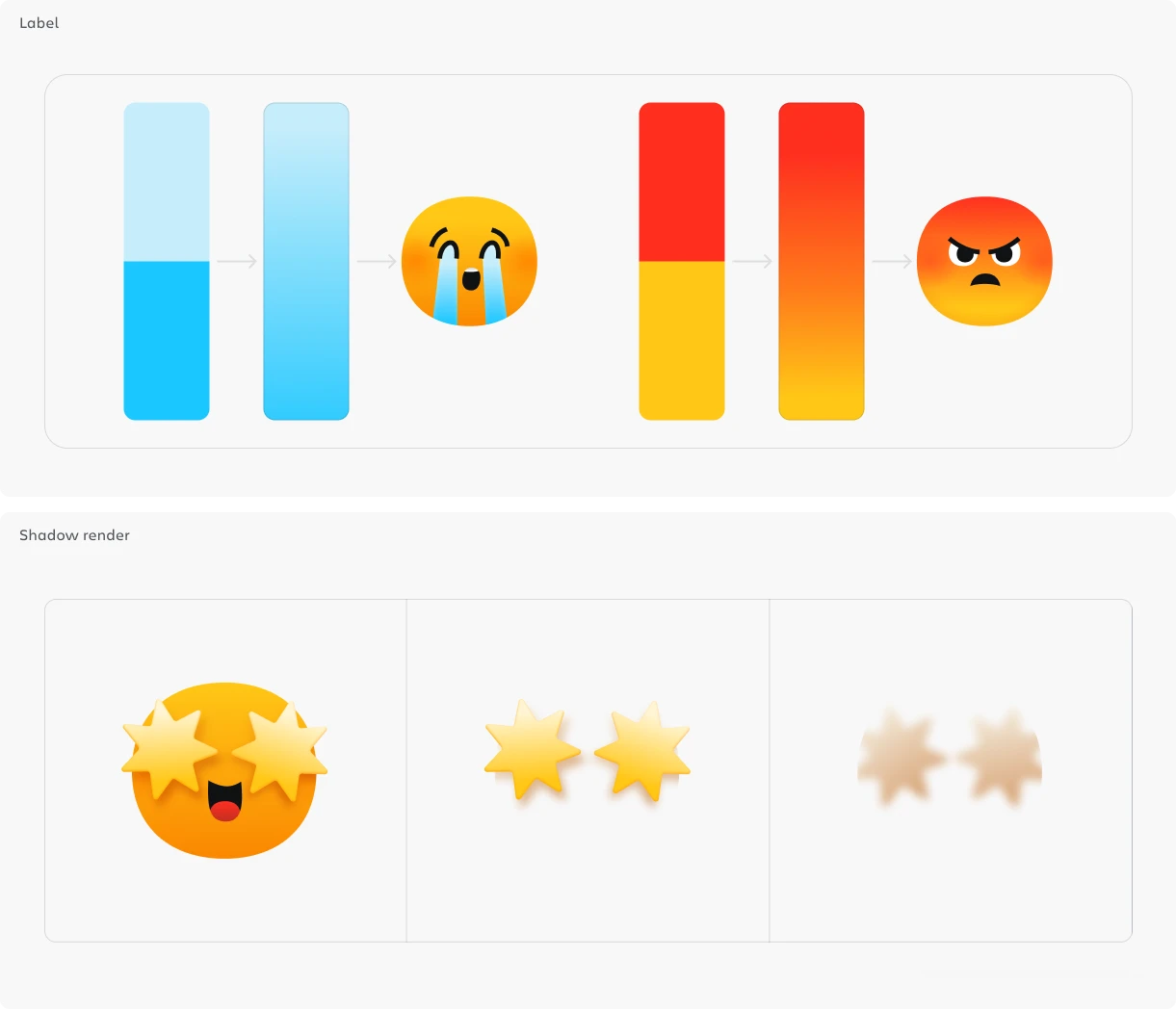
Gradients are confined to range between a primary and it’s tint or shade. Exceptions are made for the Yellow and Orange palette and for emojis where the color shift holds conceptual meaning (ex. lime to yellow gradient for the sick emoji)
Shadows enhance contrast against flat or gradient backgrounds, helping define features (eyes, mouth, contours) across light and dark themes without resorting to heavy outlines. Graphic elements like stars and hearts are rendered less skeumorphically and more as flat stickers. We use a softer drop shadow that hugs closely to the actual shape to give a subtle effect of dimension. These shadows are cropped to the face or background object to maintain clarity. Instead of using black, the orange palette is used to enhance palette harmony.
Tone – Expressive for delight, professional for enterprise
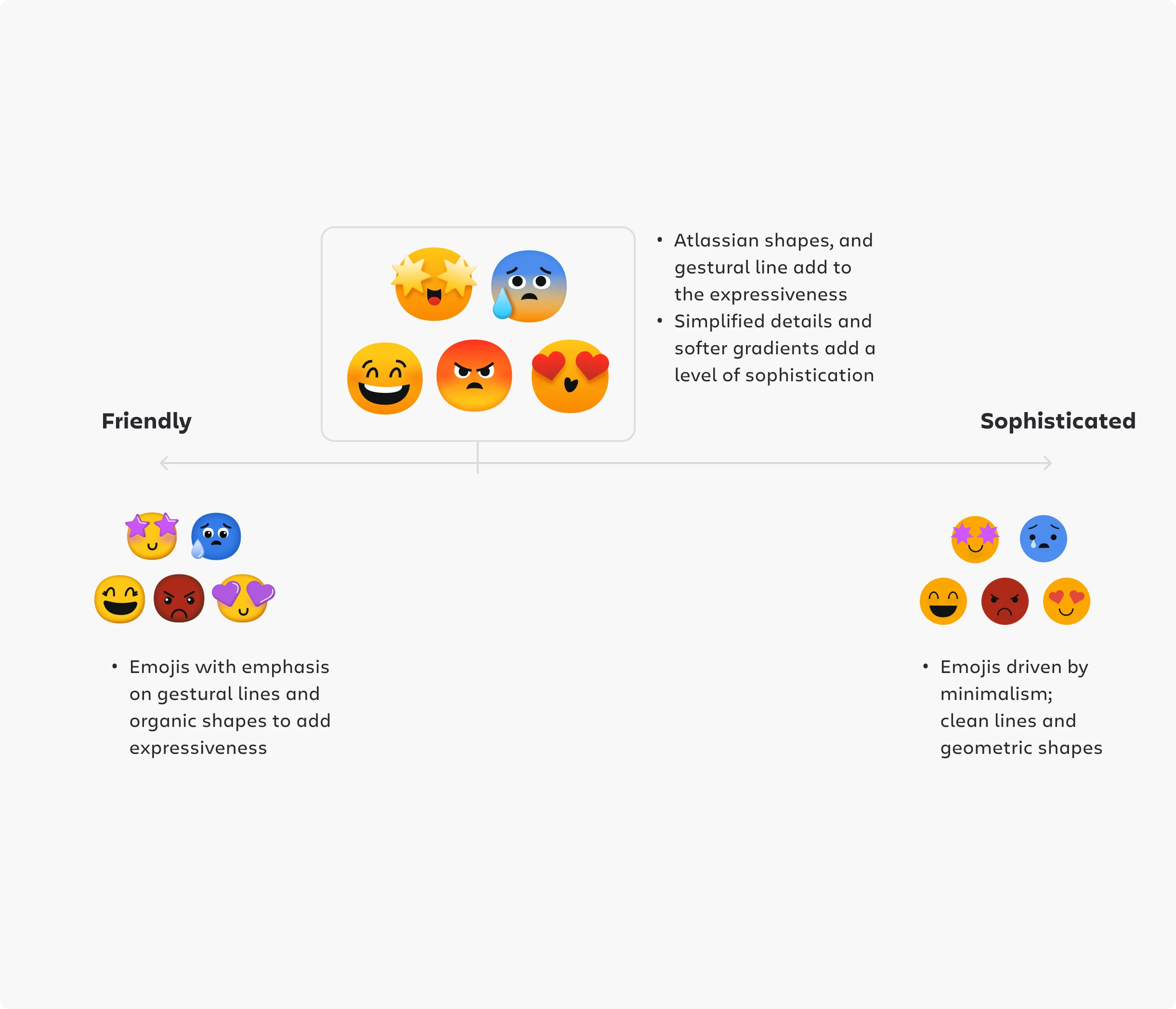
Emojis are fundamentally used for expression and delight. Our explorations focused on balancing the friendliness of our set while maintaining trust and professionalism with our enterprise customers.
Signature moments by Maxwell Hathaway


