
How I Discovered Rogue Processes Running on our Build Agents
In the process of digging around investigating a performance issue with our internal build agents, I discovered rogue fluxbox processes taking 100% CPU on a large number of our build agents, here’s a write up of how I found them.
On a particular host you can get a vague idea of how busy a host is by the load average, for example:
![]()
This doesn’t tell you much. How has the value changed over time? We use collectd to collect system statistics from all our Build Engineering systems (physical and virtual servers) and send this data to our Graphite instance. We can graph the host’s load over time using graphite, for example:
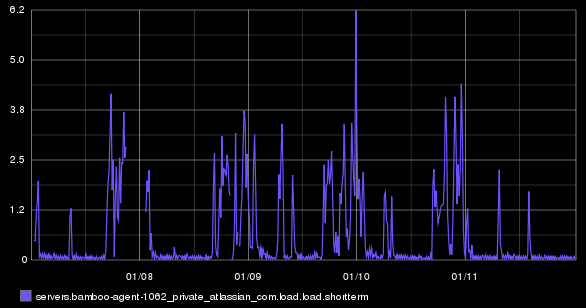
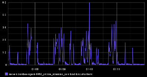
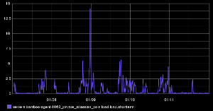
So we can see trending of this particular host over time. Not very exciting. But what happens if you want to compare the load across multiple instances. You could graph them all I guess:

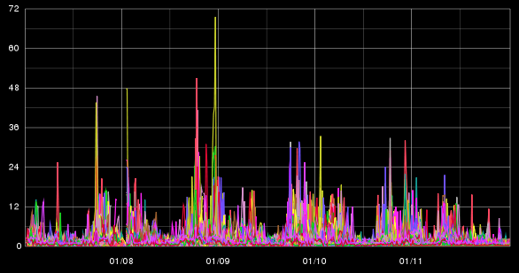
Not very informative. You could graph all the load averages as separate graphs, The problem there is that the y-axis takes up way too much space to make comparison possible:
You could scale the y-axis, to fit more graphs in, but you lose clarity in each graph.
Data visualisation
This is where I discovered a javascript library called cubism.js, written by the square guys. This library uses D3 and allows you to pull in Graphite data and visualises data in a different way. Taking the original load graph, it says, screw it, I’m only going to show the first x pixels of the graph. If there are peaks that spill over the top, they are cut off, and drawn from the bottom of the x-axis, but in a darker shade of colour, this continues, until the full peak is drawn. Here is an example from their website of the same graph, at 120px, 60px, 40px & 30px:
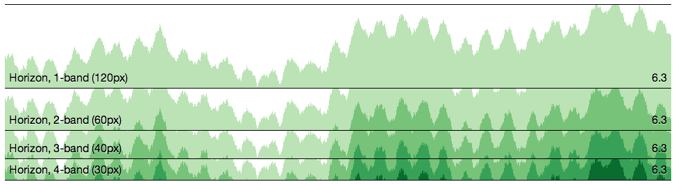
As the graph height gets smaller, shades of green replace the height. You quickly replace looking at the height of the graph, to looking at the shades of colour instead. So this has potential, what about some real data? Armed with a bit of HTML & Javascript, I started pulling down data from our graphite instance (I had to enable CORS on the Graphite server as well):
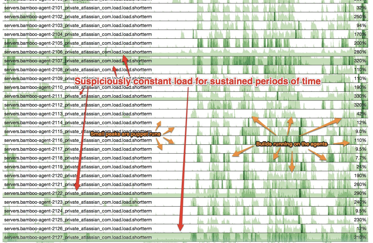
As you can see, when you have a large number of hosts / data series, you can quickly use the shades of the colour to visually determine the differences, patterns and hotspots. So a number of build agents really stuck out when they where different from the rest. This lead me to investigate into each host which was showing the sustained load – turns out that they all had a rogue process of fluxbox running. We’ve updated our purge script that runs before every build to kill this process to ensure that we don’t get hit by this again, if this problem happens more frequently, we’ll look at moving to a different windowing manager.
Instant Graph-ification
The cubism.js library also auto updates the graph, so you could use it for a wallboard display as well. Also using a different metric from graphite is trivial. We could enhance this visualisation to overlay information about the builds that were running at the time (both on the virtual machine that the build runs on and the physical host that the VM runs on). This will allow us to identify patterns of behaviour of the build agents & hardware based on what builds are running. In preparing for this blog post, I looked at todays data, and noticed a couple of hotspots:
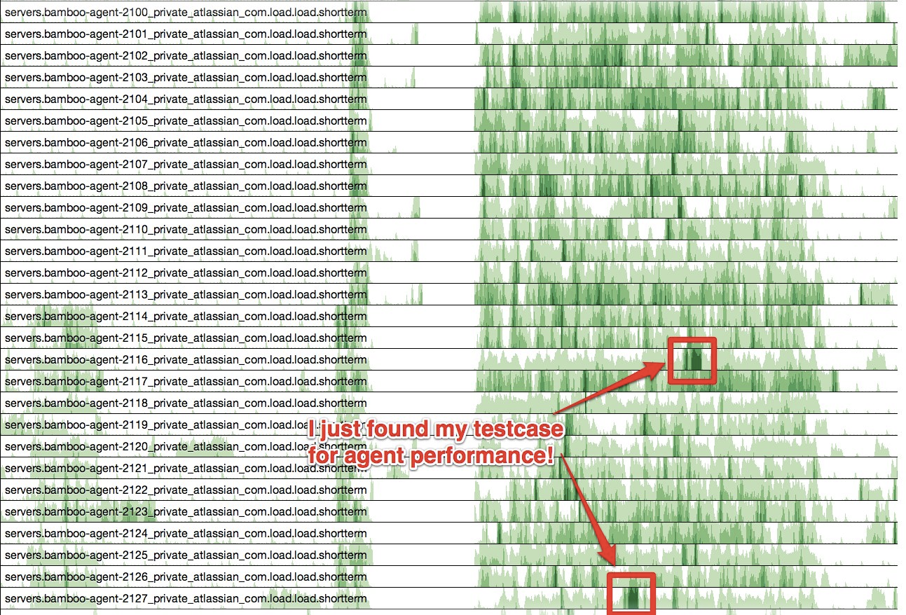
Looking up what builds were running at the time (manually via the bamboo web UI), the hotspots were from one particular build that runs Jira, Confluence, Bamboo and Fisheye/Crucible to test a plugin. I would have not been able to find this level of information out without this type of visualisation (and in the process I found a good test case to use when performing stress testing of our build infrastructure!)