
This post is third in a series on using Confluence as a Business Intelligence tool.
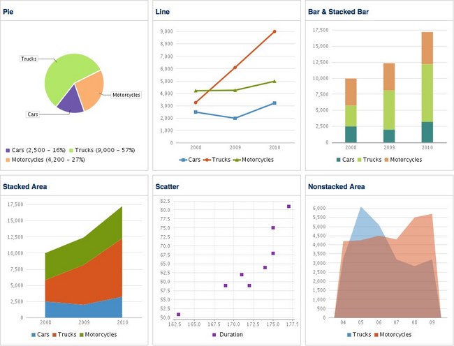
Nothing compares to a chart for quickly conveying rich, multivariate comparative data. Confluence comes with several types of charts, each of which has many formatting options that let you present your data in cool and powerful ways.
Out of the box, {chart} can produce these charts and more:
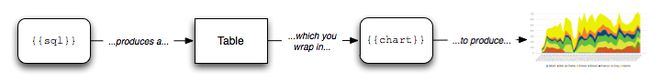
In the previous section of this guide, we looked at getting your data onto a page. In this section you’ll learn how to present that data visually with charts.
The {chart} macro renders data from tables into chart graphics. Before you can chart anything, you need to get your data into tables as described in the previous section. We typically use {sql} to extract data into tables, then wrap those tables in {chart} to produce charts. Remember, the output of the {sql} macro is just an ordinary table in the wiki. As far as Confluence is concerned, a table and the output of {sql} are the exact same thing.
Confluence lets you fine-tune your charts by specifying additional parameters to the {chart} macro. We won’t describe every single parameter to {chart} here, just the ones that we use most often. For the detail, see the Chart macro documentation.
Orientation
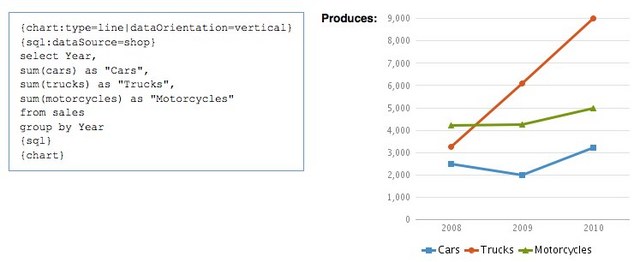
It’s natural to orient your tables vertically, especially if you’re using SQL to retrieve your data. When you do this, you’ll need to use the dataOrientation=vertical parameter to tell Confluence how to read the table.
Size
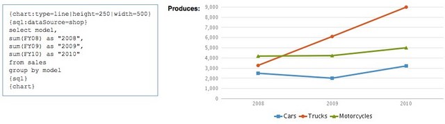
By default, Confluence makes charts 300 pixels high by 300 pixels wide, which isn’t usually the size you want. You can override this using the height and width parameters.
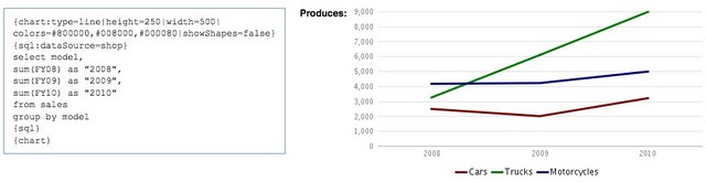
Colors and Shapes
{chart} comes with a default set of series colors that work well enough in most cases. If you need to, though, you can override the defaults and specify which HTML colors you want to use instead.
The line chart by default displays shapes at each data point. If you want to turn this off, you can use the showShapes=false parameter.
Labels and Legends
You might have noticed that there are no y-axis labels in the charts above, so there’s no way to tell if the values represent units, dollars or little colored stones. Fortunately, labeling axes is easy – just add yLabel or xLabel parameters to your {chart} macro.
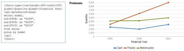
If the legend is unneeded (often the case in a single-series chart), you can remove it by specifying legend=false. If your labels are too crowded, adjust them as you see fit with the categoryLabelPosition parameter.
Scale and Units
You can contol the vertical range of the chart using the rangeAxisLowerBound and rangeAxisUpperBound parameters.
Confluence picks a default “tick unit” based on the scale of the data and draws lines at each tick. You can override this and specify a manual tick unit with rangeAxisTickUnit.
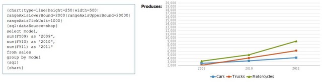
You can exercise the same control over the horizontal axis with the domainAxisLowerBound, domainAxisUpperBound and domainAxisTickUnit parameters.
Multiple Sets of Data, One Chart
One of the hidden gems of {chart} is that it can wrap several sets of results into one graphic. Remember, all {chart} does is interpret tables and render them into charts. {chart} doesn’t care if you give it one table or several: If the domain values are the same, it’s smart enough to stitch the series together as of they were all in one table. This gives you an easy way to “bundle up” what might be disparate and complicated data series into a single visualization.
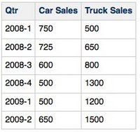
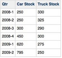
Here’s an example: Say we’re querying an accounts system to produce this sales table:
What if you wanted to chart this data alongside stock data from an inventory system?
As long as the domain axis values (in this case, the dates) are the same, {chart} will treat these series as if they were in the same table. For example:
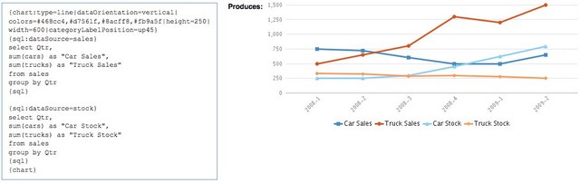
We used the color parameter to assign similar colors to related series, making visual comparisons easy – a neat trick.
Want to know more? In the online version of this HOWTO, we cover more chart options, more formatting capabilities and the high-OMG-factor {deck} macro, which lets you stack charts and tables on top of each other and flip through them in a nifty tabbed interface.