

Turn the nightmare scenario into the stuff of dreams
Picture this: you’re about to attend a work presentation; it’s a big one. This one promises to be the key to your company’s future success. It has major implications for your personal career growth. The hype is real. You’ve logged on, coffee in hand, you click ‘join meeting’.
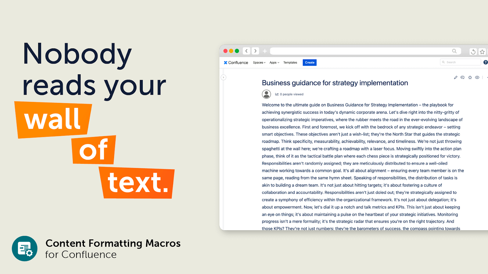
But as the speaker begins, you realize it’s the stuff of nightmares. You want to listen, you want to take in this vital information, but you’re dismayed to find the talk is stuffed full of slides filled with the dreaded wall of text. There are no visual aids, the delivery is monotonous, and you’ve lost all focus. Despite the speaker’s expertise, the presentation falls flat. It’s as if the words are merely escaping your laptop and passing you by.
This vital information deserved better. But the reality is, this fever-dream scenario is a daily reality for workers simply trying to navigate the vital information held on knowledge bases, documentation, intranets, wikis and information hubs; the typical use cases for Confluence. It doesn’t have to be like this. By harnessing the power of design, teams can create content that connects.

Four things we tell ourselves about documentation that just aren’t true
Bust these myths to help build a thriving knowledge culture
Brain-friendly content
Be kind to the most energy-consuming organ of the body: the brain. When crafting content, prioritize making it easy to digest so that words and information are memorable and engaging.
Being confronted with a wall of text is visually daunting and overwhelming, making the prospect of reading through it unappealing. This can lead to a reduced likelihood of engagement, as readers may feel overwhelmed by the amount of effort required to process the information.
It’s not just about aesthetics. Well-designed pages have the power to empower talented team members. Visually engaging information captivates interest and inspires action.
There is science behind these concepts: making content more accessible can lead to over six times more recollection.
Take Richard Mayer’s book Multimedia Learning for example. It explores how multimedia elements can enhance learning outcomes. According to his research, incorporating visual aids, such as images and diagrams, alongside textual information can vastly improve comprehension and retention.
Maximizing the benefits: Design focus in Confluence
While Confluence is intrinsically a platform to store information, share that knowledge, and collaborate, a design-led approach enables teams to maximize those core benefits and discover additional ones:

3 steps to streamline workflows and optimize processes
Enable your team: Save time and simplify workflows with powerful cloning tools In the field of IT Service Management (ITSM) and Agile and DevOps practices, efficiency reigns supreme. Teams contend with complex projects and multifaceted issues on a daily basis. They are looking for ways to save time, simplify their workflows and boost their productivity […]
Streamlined content creation
Reduce the time teams spend formatting content by producing well-built and functional templates. By investing time in the first instance, you can ensure consistency across your team’s output. And it makes it easier for your team to produce and update content without worrying about layout and design.
Templates can be customized to fit the specific needs of each team or project, incorporating elements such as branded headers, predefined text sections, and placeholders for images or tables. This customization not only enhances the visual appeal of your pages, but also guides contributors in creating content that aligns with your organization’s standards, goals and values.
The good news is you don’t need to start from scratch: Confluence’s template library has a wide selection of ready-made designs to get moving immediately.
Ultimately, leveraging templates saves you valuable time and resources, leading to improved collaboration and productivity.
Enhancing knowledge sharing
There’s no point in producing great content if it’s not shared or discovered. A design-led approach benefits the look and feel of your pages, but it should be a consideration of how your Space and Instance is structured and managed.
It can be easy to think of Confluence as solely a repository of information, but effective teams transform their knowledge bases into dynamic workspaces that promote transparency and bridge the gap between departments and projects. Promote intuitive navigation and organized content structures to ensure your Space becomes a catalyst for knowledge sharing, driving your projects forward.
Improving user engagement
It’s easy to fall into the trap of presuming that once a page is published, that’s the end of the story, and now that piece exists in that way for eternity like a digital Rosetta Stone.
By implementing good design principles, teams can influence how users interact and engage with the content on an ongoing basis. After all, collaboration is the most vital component of team success.
To promote this, make sure your page design encourages users to contribute and react: embed videos, presentations and social media inlays. Stimulate conversation by using page comments (both inline and for the entire page), and don’t forget to respond to them! You can even go one step further and integrate a Confluence Whiteboard into your page.
Empowering asynchronous work
The ability to collaborate effectively across different time zones and physical locations is not just an advantage; it’s a necessity. Asynchronous work, which allows team members to contribute at times that suit them best, is at the heart of this modern work standard.
Good design and a strong visual information hierarchy mean you are presenting in such a way that your teammates can easily understand the priorities. And understanding what needs to be actioned, and when, is essential to any remote work environment. Who really wants to be on the 3am catch-up call?
5 quick tips to get started
Kolekti is proud to help teams prioritize design by effortlessly improving page structure, creating engaging visuals, and adding context with Content Formatting Macros for Confluence.
Here are some quick tips to make improvements to pages instantly with this powerful Confluence add-on.
1) Grab attention from the get-go

Showcase the most important messages by incorporating the Interactive Banner macro. Sometimes referred to as a carousel banner or image slider, it offers a dynamic way to display news, announcements, and links.
2) Banish that wall of text
It is simple enough to counteract a wall of text by breaking it into smaller, more manageable sections, but why not make it even clearer. Use the Numbered Headings macro to instantly help readers navigate and understand the context between each section.
3) Visually appealing projects
We process images 60,000 times faster than text, so make the most of visual aids by incorporating them easily using the Background or Advanced Card macros. They both come with direct access to a varied stock image library, saving time and effort when looking for the perfect picture.
4) Add a guiding light
Using the Tabs macro is a great way to structure layouts and guides readers through the material. By reducing clutter on your pages, it streamlines navigation, making it faster and more user-friendly.
5) Take action so users take action
The Button macro adds visual appeal to links, making them more effective and inviting than a standard link. Choose any color and an icon to amplify a call to action.

The Ripple Effect of Good Design
Investing in good design has a ripple effect throughout entire organizations. Making better design choices improves the quality and impact of presentations and essential documents, but it enhances more than that.
Good design leads to increased productivity, as team members spend less time deciphering information and more time acting on it. It also contributes to a more engaging and satisfying work environment, which can significantly boost morale and reduce turnover.
Industry behemoths like Netflix, Disney, VISA, and Apple understand this, and they all use Content Formatting Macros as their solution for a wide range of Confluence use cases, from documentation and knowledge bases through onboarding to blog posts and beyond.
At Kolekti, we practice what we preach and, with team members in five different time zones, we recognise the value of collaboration and asynchronous working. Our products and apps are built to support teams working better from anywhere, providing the tools people need to communicate and collaborate through impactful choices made through the principle of quality design.
Learn more about Kolekti: A Platinum Atlassian Marketplace Partner on a mission to end inefficient work. That’s why they build essential apps that empower knowledge workers to work better, together or apart.
With the powerful Content Formatting Macros app, teams have everything they need to improve page structure, add extra context, and boost page design, making it easy to create engaging, user-friendly Confluence pages.
Content Formatting Macros is the ultimate Confluence sidekick.
Get the essential Confluence macros toolkit today.
Check out these helpful Marketplace apps to resource teams and boost productivity:
Extension for Jira Service Management – enhance your ITSM customer experience to delight your customers with this app from Deviniti
Deep Clone for Jira – Start saving time with powerful cloning tools to clone epics, bulk clone and copy project templates with this app from codefortynine
Scroll Viewport – Create intuitive help centers and beautiful web pages in Confluence with scroll apps from K15t
Content Formatting Macros – Help your teams work more effectively with this essential Confluence macro toolkit from Kolekti

