This is a guest post from Charlie von Metzradt, Cofounder of Hosted Graphite.
At Hosted Graphite, our users rely on us for a heavy-duty component of their business: monitoring their stack.
This is a responsibility we take very seriously and we realize how critical it is for a user to know right away whether the problem detected is related to their own systems or to our system. That’s why we choose to publish our internal system metrics to our public status page.
We operate by a policy of “openness by default,” where transparency is the backbone of how we operate, both internally and externally. This takes on extra importance among our tech-savvy users who appreciate a high level of detail about how their service is behaving.
[tweet_dis]But the system metrics that make you look good aren’t always the same metrics that matter to users[/tweet_dis]. How do you reconcile that?
Building trust vs. looking good
At first, the idea of externally publishing metrics that would otherwise be hidden from users seemed scary and caused some conflict within the team. What if something goes wrong? Won’t it be embarrassing if issues emerge that everyone will be able to see as we fix them? The answer was yes, but we decided to see that as a feature, not a bug.
The argument came down to what would help our users more: looking good on paper, or giving them data that would allow them to make good decisions.
We decided that though it might be uncomfortable at times, publishing more data would help our users self-diagnose problems – often before sending a support request. Instead of users finding themselves in a state of frustration and uncertainty, they could quickly check our status page to see if what we’d communicated lined up with their current experience.
[tweet_dis]Delivering information faster while building trust is a win-win.[/tweet_dis]
Additionally, publishing metrics has made us a better engineering team. When everything’s public, it’s a lot harder to ignore your own technical debt. The extra level of scrutiny means we can’t ignore issues and assume users won’t notice them, so we’re motivated to build more resilient systems.
What we share on our status page
We put a lot of thought into our status page. It would be easy to overwhelm users with a bunch of graphs that might be hard to understand, particularly without the right frame of reference. Any metrics shown need to be easy to grasp with minimal context, and limited to the parts of the service users really care about.
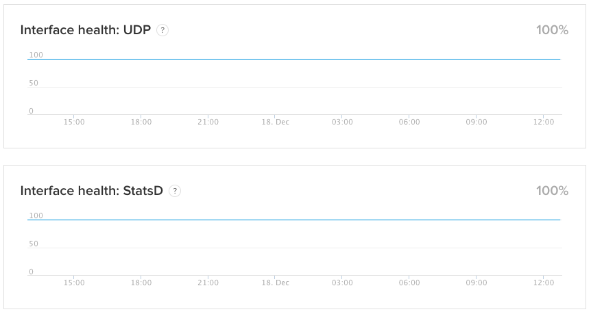
In our case, one of the more important components of our service is the health of our ingestion pipeline. Our users rely on us to process and store their monitoring data, so the ability to check the status of this service is very important. That’s why we publish our own internal measure of the health of the service for every major ingestion protocol that we support. Our users have access to a real-time view of the same metrics we follow, and are alerted if something unexpected happens.
Interface health metrics
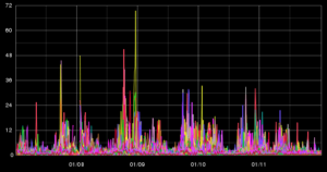
Measurements pertaining to the health of our ingestion pipeline make up the majority of the public system metrics from our own status page, as they allow us to break down the measurements per ingestion protocol. Users can choose from a large variety of protocols to send us their monitoring data, and someone sending us data via our HTTP API is not going to care about the health of our UDP endpoints. Therefore, showing their health as an aggregate (like the average of their values) would just result in confusion.
AWS connectivity
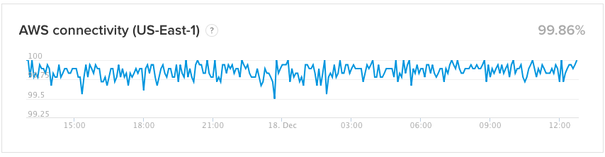
We also track connectivity to our ingestion endpoints from several regions around the world, which is very useful for our SRE and Support teams when troubleshooting issues. We’ve found that the us-east-1 and us-west-1 AWS regions are popular sources of data for our ingestion service, so we also publish our internal measurements of connectivity from those two regions. This helps to differentiate between any issues our ingestion endpoints might be experiencing and more specific connectivity issues from a single AWS region.
Uptime stats
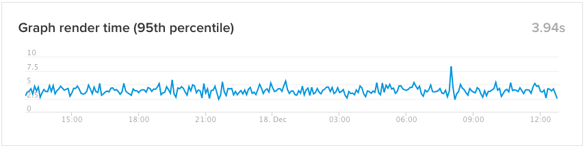
Finally, we share our own uptime statistics for our website, and a measurement of the 95th percentile of response time for render requests that we serve. This allows our users to see how our render service is performing, so if they experience slow response times, they have a quick way to verify whether it’s a widespread issue. It also provides a historical baseline, so our users have access to the same data we do.
What metrics matter to your customer?
Ultimately, you have to put yourself in your users’ shoes. Open your status page and ask: “What would I like to see here if I were using our service and started experiencing issues?”
The main goal is to give users access to the big picture regarding the health of your service.
Like us, you’re probably awash in data from your services, but you probably also have a good feel for which metrics really matter. Those that form the basis of your alerts are a good place to start, since those are usually the systems that affect your users first. Here are a few quick rules to help you choose whether to expose a metric:
- Does the metric have a direct impact on what your users experience?
- If a user saw it, would it help them answer the us-or-them question?
- If I publish this metric, can I give it a clear, simple title and explanation?
Post your metrics, build trust
At Hosted Graphite, publishing internal metrics on our public status page has been an important step toward providing a more reliable and transparent service. Public metrics have complemented our incident updates, and even helped reduce some support load. Now external users can access data that was only available to internal teams in the past.
This week, pick a metric with your team to post and see how it’ll build trust with your customers, too!
Add a system metric to your status page