We’ve got exciting news to share today – Atlassian has a new look!
As we continue to grow the Atlassian family (Hi Trello & Statuspage!), expand our areas of focus, and update core product experiences, we want our brand to best reflect why we exist, what we believe in, and where we’re headed.
At Atlassian, we think of our brand as a continuous project that’s never totally done. Just as people and companies evolve, so do brands. We’ve grown ours over many years through our fantastic products, a unique culture, and an incredible customer community. Today, we’re taking a bold step forward with a new logo and identity system for Atlassian and our products.
This marks a new chapter in our ongoing mission to unleash the potential of every team. Thank you to all of our customers for inspiring this important change!
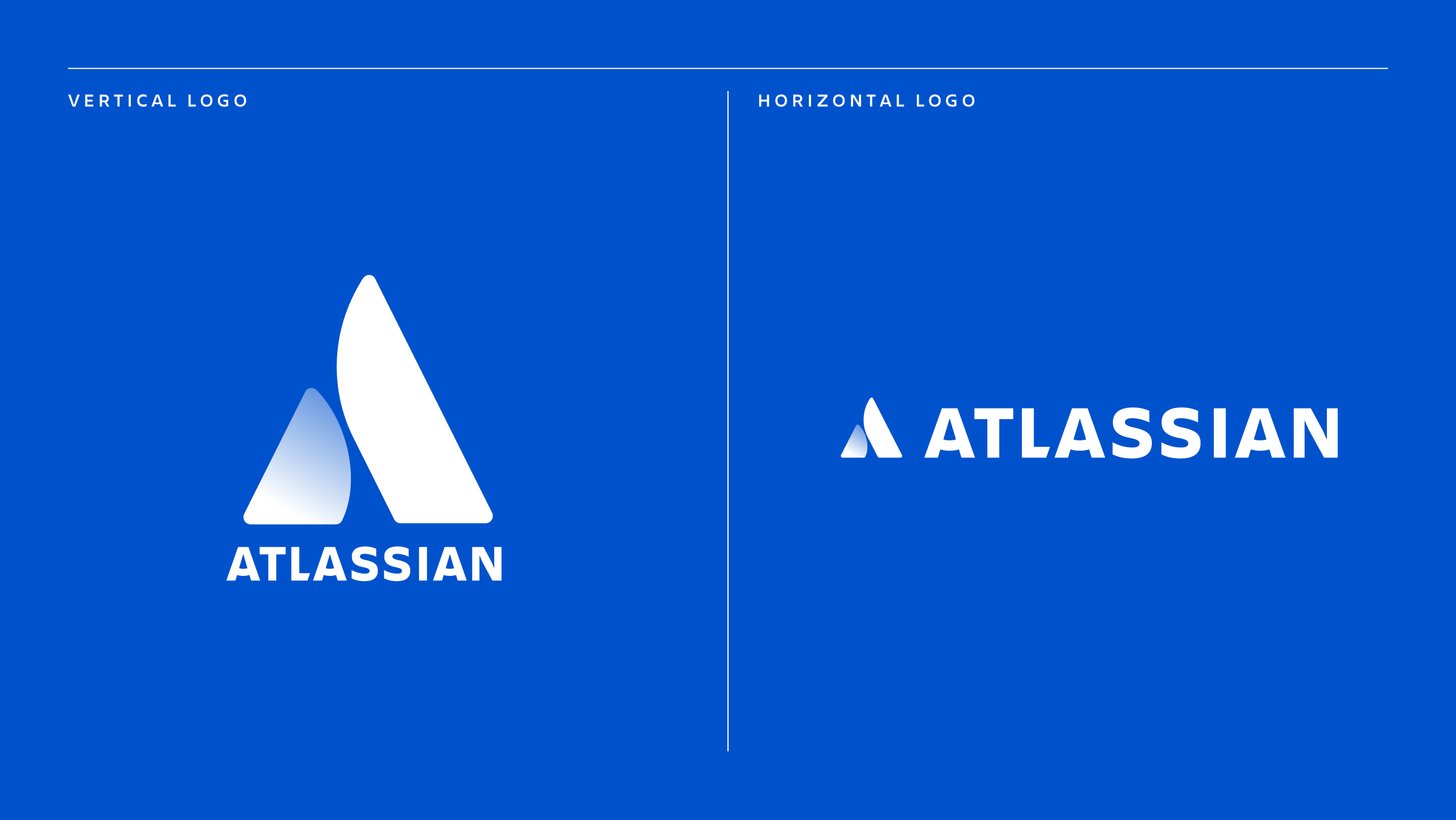
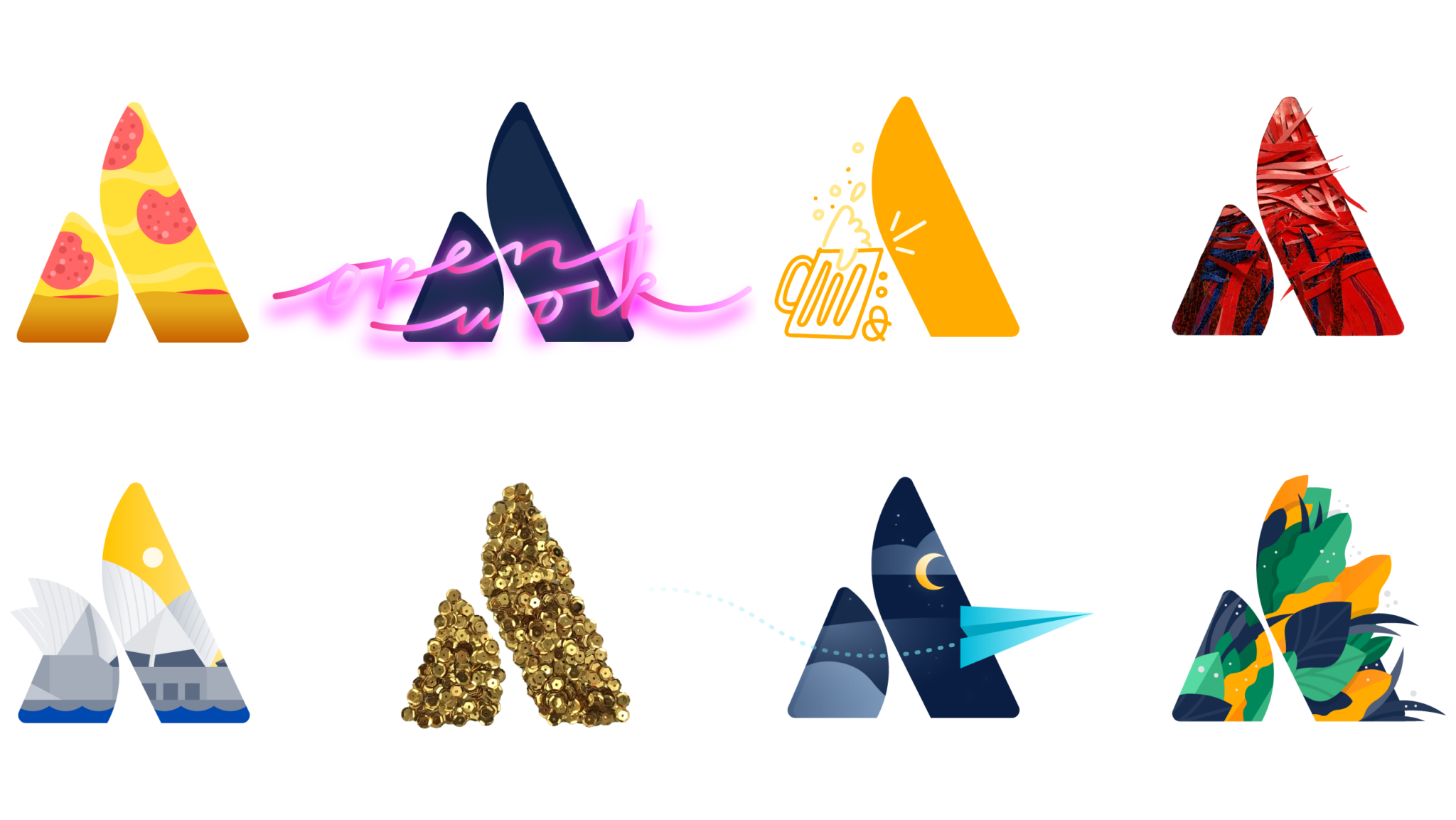
The Atlassian logo
At the heart of this rebrand is our core focus on teams and our beliefs around teamwork. We believe when work is open, the full potential of teams is unleashed. Infused into our values, product experience, and business model, this philosophy encourages teams to think, work, and behave openly. Working open helps tear down the barriers and silos that keep people from each other and from the information that’s critical to their roles. Working open helps teammates interact authentically and honestly with each other, enabling more diverse viewpoints that lead to stronger outcomes. Later this week, you’ll hear us talk more about what it means to work open, and how we hope to help other teams to do the same.
We’ve built this belief around teamwork into our logos, focusing on the specific benefits we want our customers to feel when teamwork is at its best. And I’m proud of the end result. Like us, you may notice important symbolism around teams in the new Atlassian logo – two people high-fiving, a mountain ready for teams to scale, or even the letter A formed from two pillars reinforcing each other.
And for the curious: the earliest version of the Atlassian logo, which I “created” in 2002, was inspired by the sky-holding Greek titan Atlas, and the incredible example of legendary service and support that represents. While legendary service is still a core pillar at Atlassian, we’ve grown to embody broader and bigger ideas around teamwork and team potential.
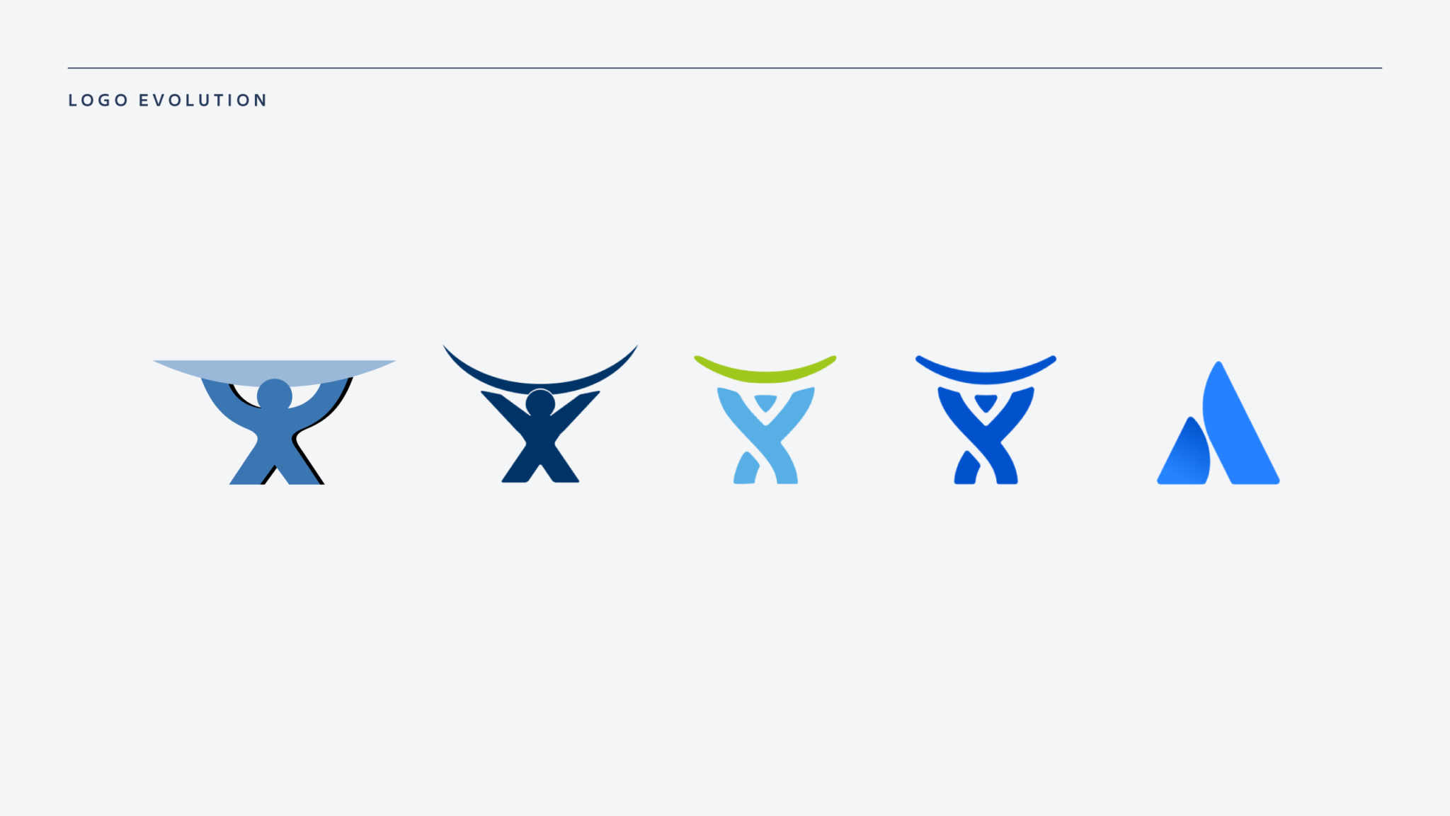
I’m excited about our new logo for the same reason I appreciate our old one: it’s friendly, human, and reflects our genuine personality.
Our new product logos
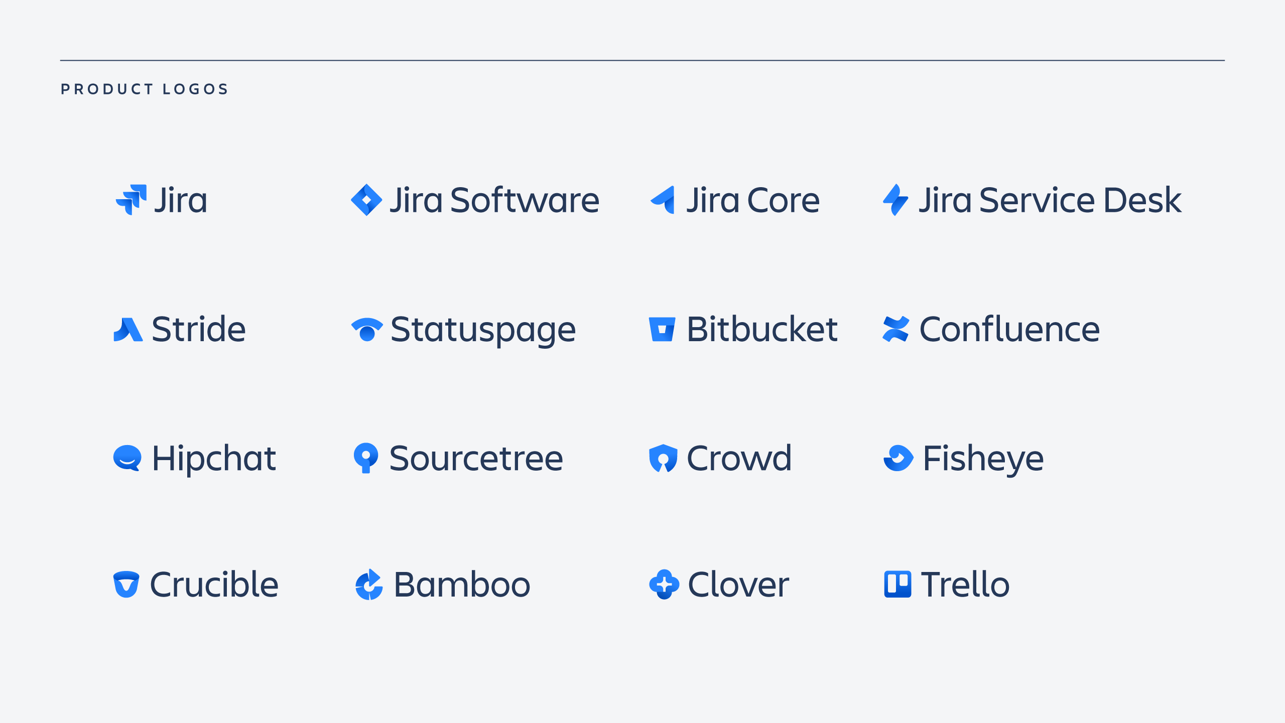
We’re also evolving our product logos in concert with exciting new user experience changes (which our cloud customers will start to see this month). One of our biggest challenges was designing a visual system that stretches across 14+ products, accounts for future acquisitions, and feels unified under one parent brand. No easy feat!
Each logo is anchored in a core value or benefit, rendered to feel individually unique but also part of a family, all while being legible at any size. As an example, we started with what was core to Jira Software – code brackets, connoting development teams – and worked on the shape and style until we had a mark that was representative of teams coming together in iterative cycles.
The result is a set of unique marks that still feel very related to each other. These logos are a fantastic representation of what we are today, while remaining flexible as our products continue to evolve.

Our new typeface
Meet our new typeface, Charlie Sans. Designed to balance legibility with personality, Charlie Sans is a welcome addition to our brand family. It has tremendous flexibility, which allows us to create hierarchy between Atlassian, our products, and other offerings in our ecosystem. Most importantly, we believe it has the ability to stand the test of time. Fun fact: we paid special tribute to our original logo, Charlie, in this name, as well as in the letter “A” in our wordmark.
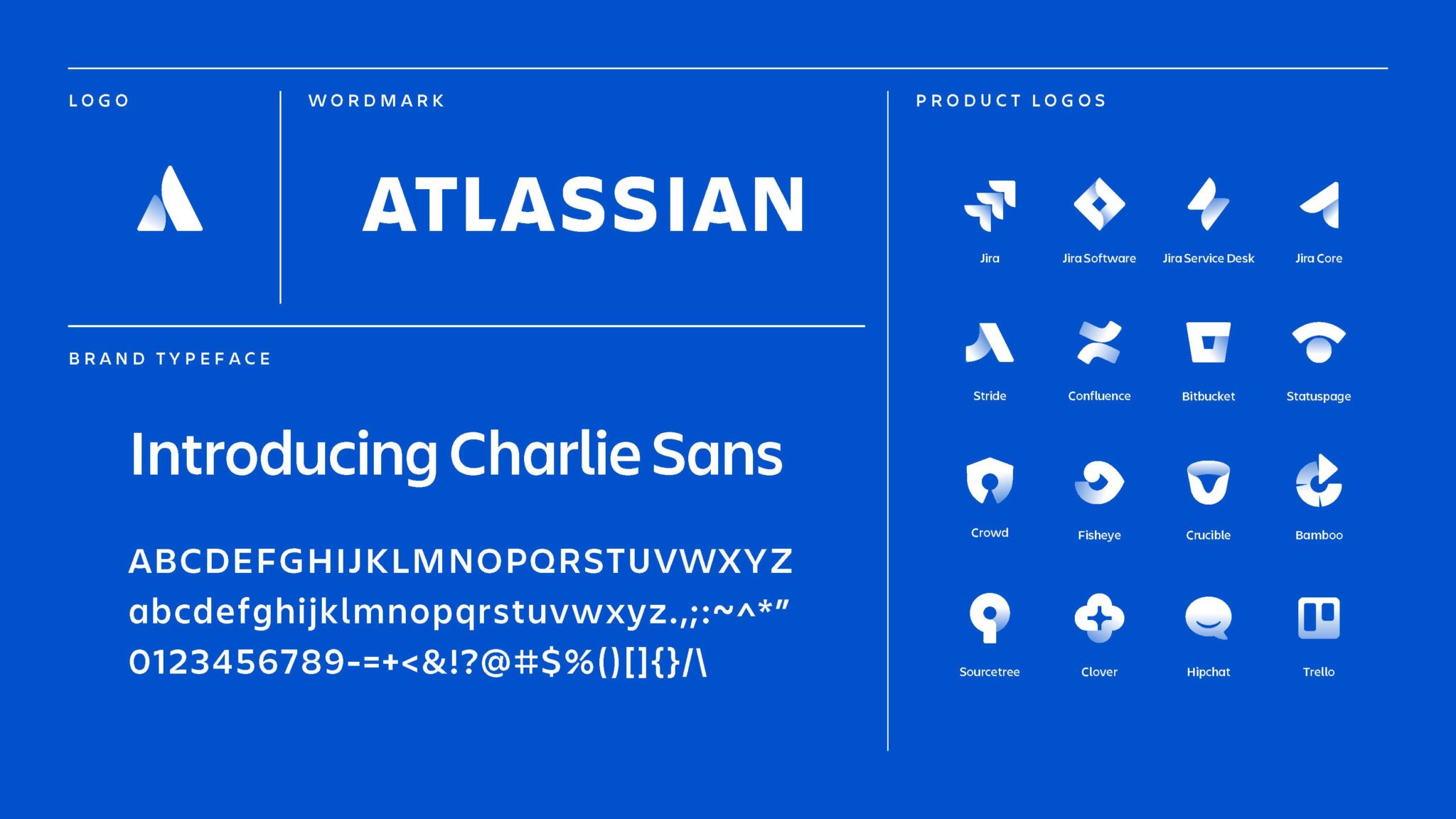

Starting today, you’ll see these exciting changes out in the wild, and gradually over the coming months, in-product. And for Summit US attendees, we plan to give you a more in-depth peek into the story behind our new logo system as well as our philosophy on opening up work, so stay tuned.
Much more to come – onward, team!
Hat tip to our design team Angy Che (logo design), James Edmondson (type design), and Atlassian’s in-house design team!


