It’s no secret that teams like to use Trello for running agile projects. So we added the best of Scrum and Kanban team management to Trello with the new Corrello Power-Up. Think burndown charts, cumulative flow diagrams, historical cycle times—all the good stuff.
The quickest way to describe Corrello is “a dashboard for Scrum and Kanban teams using Trello.” Managers can get the information they need, while their teams can continue to use the tool they love.
Wondering if Corrello might be useful for you and your team? Let’s dive into how Scrum and Kanban managers keep their teams organized using Corrello and Trello together (plus how you can give it a try):
Corrello + Trello: Top Features For Team Dashboards
To get an idea of how Corrello can help you, let’s take a look at some of the more popular features, starting with the simplest. If you’re interested in burndown charts, cycle time, and cumulative flow diagrams, feel free to skip ahead. ?
Status via card counts
At the basic level, Corrello helps keep track of cards across one or more boards based on the lists they are in, their due dates, and labels.

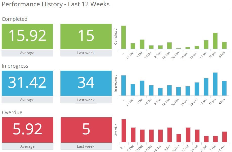
This part of the dashboard shows you counts of different groups of cards (cards completed, open bugs, etc.) and gives you the ability to drill down and see the actual cards included in the count, the lists they are in, and how long they have been there. Click on the buttons under the numbers, and you can also get these same counts broken down by board and by member.
You can choose which counts you want Corrello to show you here. You can include counts for cards with any labels you are interested in (here I’m tracking uncompleted cards labeled as “bug”) or based on their due dates. The simpler counts just give you the number of cards done, in progress, or still to do.
Pro Tip: We are showing counts of cards from ‘This sprint’ (combo box on top right of the screenshot). If you are working with a Kanban or continuous-flow approach, you don’t need to use the sprint-related features of Corrello and, in fact, won’t see them in the dashboards.
Also, we are counting cards here but you can opt to use ‘points’ for your counts instead, in which case Corrello looks for a number in brackets in your card titles to use as the points for each card.
Another part of the dashboard shows us these same numbers historically:
Cumulative flow diagrams
This is the top feature requested by Kanban teams. Cumulative flow diagrams (CFD) could also be useful for other teams using Trello who want to gain insight into how their process is working over time.
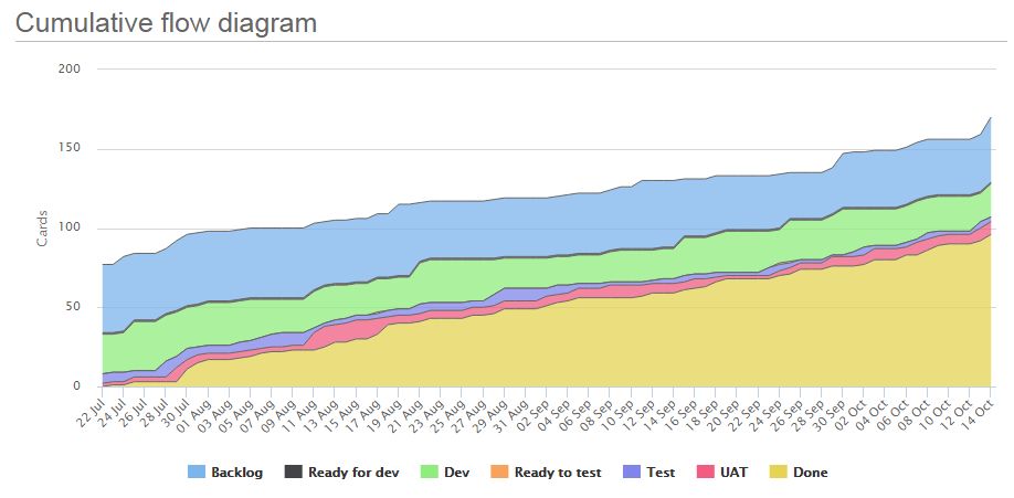
The legend at the bottom shows each of the lists on your Trello board (or boards). You can add or remove lists in the diagram by clicking them on and off. For example, click to remove the ‘Done’ list to see if your work in progress is growing or shrinking over time.
If you’re new to CFDs, this chart is useful in a few ways: It shows the work accumulating in ‘Done’ over time, and the daily amount of cards in each list on your board. By looking at the size of different lists over time you can see if work is building up in one list or another.
For example, if I have two lists for each stage in my process (i.e. ‘Ready to Test’ and ‘Test’), it can be useful to know if things are building up, waiting for testing, or how many are currently in testing. Each can be caused by unique problems with different solutions.
Another useful team status check is to remove the ‘Done’ and ‘In progress’ lists from the diagram and see if your backlog is building up or shrinking over time. This shows you if you are getting through work faster or slower than you are adding it.
To help with this visualization in Trello, split your backlog between ‘Suggestions’ (work which you’re not yet sure you want to do) and ‘Committed’ (work you know you definitely want to get done). Since growth in the ‘Committed’ backlog is more of a concern than growth in ‘Suggestions,’ it is useful to be able to view these separately in your CFD.
Burndown charts
Before we look at some more features inspired by Kanban teams, let’s talk about that one thing Scrum teams always want… burndown charts.
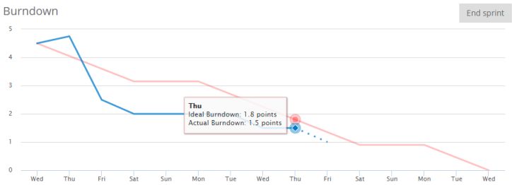
This sprint burndown chart is counting story points, not cards. The days of the sprint are along the bottom and the points remaining at the start of that day are on the left.
There are three lines on the chart:
- Actual burndown: The blue line shows how many points are remaining in the current sprint at the start of each day. In the chart above, some work was added on the first day of the sprint (the blue line ticks up). Then a big chunk was completed on the second day (the first big drop on the line). And so on it goes throughout the sprint.
- Ideal burndown: The red line shows what the blue line would look like if you completed all the work in the sprint by doing an equal quantity each day (well, except for the weekends—we’ll let you have those off!). Even though your actual burndown is unlikely to look like this, the comparison of actual vs. ideal shows you whether you are currently ahead or behind and by how much.
- Burndown today: The blue dashed line shows where the burndown will be drawn tomorrow based on how much work has been completed already today. In the chart above it shows 0.5 points have already been completed today, so you could see that tomorrow you would still be under the red ‘ideal’ line.
Cycle time
Cycle time, another invention by those clever Kanban folks, is a measure of how long it takes to complete a task. In Trello, you can easily track this, as each task is a card. There are two ways to view this information with Corrello. The first is a chart showing the date cards were completed against how long they took to complete.
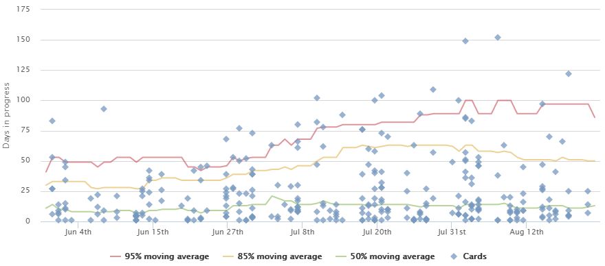 This data can also been seen via a table showing the average time cards took to complete, broken down by percentile groups.
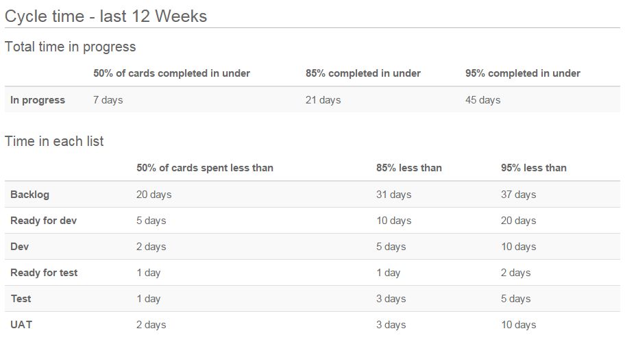
The chart is useful to pick out some of the cards which took the longest. You can select them to see which lists they spent most of their time in, and try to work out if you could have changed your process to get them done sooner.
The table is useful in estimating when some upcoming work may be completed, or again for seeing if there are stages in your process which are responsible for too much of the overall time to complete cards on average.
Release burnups
Want to know when a project or upcoming release will be done? Or what the impact of adding those 10 new cards will be? The release burnup chart shows progress towards completion of cards from one or more lists on your boards over time.
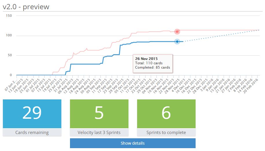
As with the burndown chart, we have three lines but with slightly different meanings this time:
- Completed work: The blue line shows how much work was done in the selected list(s) over time.
- Total work: The red line shows the total amount of work in those lists. This can be useful to see what the impact of adding work was on the completion date.
- Forecast: The blue dotted line points to when work will be complete, assuming no extra tasks are added and the team remains on track.
View charts directly in Trello
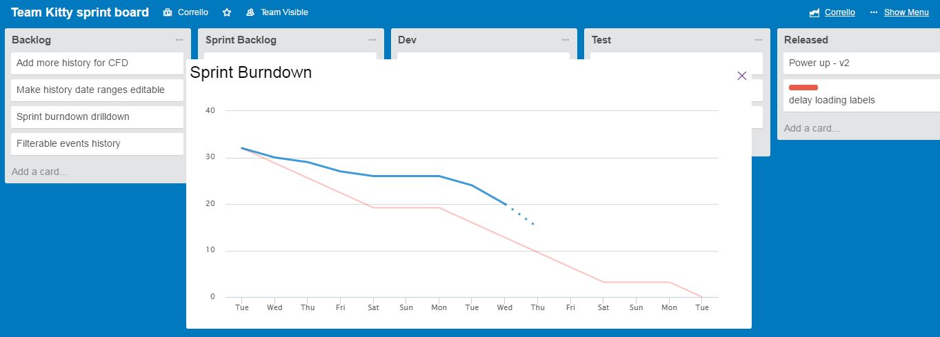
You can view all of those charts in Corrello but it’s faster to view something like your burndown chart without having to leave your projects in Trello.
 The Corrello Power-Up gives you access to your team’s progress charts right in Trello with a link if you need to go and see the full dashboard:
How To Set Up The Corrello Power-Up In Trello
If you sign up for Corrello (a 14-day free trial is available), you will be guided through setting up your first dashboard. There are two things you need to do to let Corrello understand your boards and show you the information you want.
First, Corrello needs to understand your boards:
- Pick the board or boards you want to report on.
- Select the list(s) cards are moved to when completed.
- Select the lists cards are put in when in progress (Include any ‘on hold’ lists assuming the card isn’t parked for a very long time).
- Select your backlog lists.
- If using sprints, you can select your sprint start/end dates and sprint length.
Second, configure what data you want to see:
- Add performance stats like counts of cards with certain labels or due dates.
- Configure your release burnup chart if you are using it.
Corrello will then load your historic data from Trello (this can take a few minutes) and update your dashboards as you make changes in Trello.
Turning on The Corrello Power-Up
Corrello works with most Trello boards without any modifications. However, here are some pro tips to help things go smoothly:
- If you are using sprints, Corrello works best if you have one board you reuse, rather than a new board for each sprint. Corrello can work with new boards for each sprint, but it can be tricky to get a proper history since you need to connect it to multiple boards. It is much easier to reuse the same board each sprint and save yourself the effort of creating and setting up each new one.
- You should have a “Done” list where cards are moved when they are completed, rather than just archiving them where they are.
- You can report on multiple boards in one Corrello dashboard. Although not required, it helps if they all look similar (i.e. have broadly the same lists with the same names)
If you’ve read this far, you should definitely check Corrello out. There is a 14-day free trial on all accounts, you can sign up here or learn more about the features for Scrum and Kanban.


