


Want to ship on time? Try this approach
Get to know the project management strategy that changed the game for the Confluence dev team.

Late last year, the Confluence team introduced the 7.0 platform release for Server and Data Center customers. It was our first platform release since 2016, and it focused on delivering improvements to administration, team productivity and enterprise needs. After a months-long development cycle, we shipped within a week of our goal – not too shabby, if I do say so myself! Our success came down to making informed decisions at the right time – about everything from scope to people allocation to blockers – and we employed a novel technique to keep ourselves on track.
As a program manager in R&D, my mission is to unleash the potential of Atlassian teams through data-driven agility. I typically work with leadership and development teams to drive programs, pioneer new ways of working, and ultimately delight our customers.
Confluence Server 7.0 presented a few challenges:
- First, lots of core library updates with domino effect meant unpredictable scope, which made it difficult to come up with a timeline we could actually deliver against.
- Second, this program involved multiple teams, each having their own way of planning and tracking work, so consolidating and communicating progress was a huge headache.
- Finally, high uncertainty demanded high reactivity. But teams really struggled to quantify risks, especially the risk of delivering late, which slowed down decision-making and actually increased risks.
To address these challenges, I created a project management estimator we like to call the Bubble Framework:
How the Bubble Framework works
Essentially, it’s a data-driven feedback loop that enables dev teams to actively respond to change – specifically by accurately tracking progress and anticipating risks of delay – and course-correct accordingly. With the estimator, I used historical data from Jira to compute a project lead time in the form of a probability distribution. Unlike traditional estimation methods, no team estimates are necessary, which not only saves time and hassle but also enables unbiased and instant forward visibility for planning and course correction throughout a project. In developing the algorithm, I drew heavily from two established methods of estimation: the visual component is based on a tool developed by the Critical Chain Project Management community, and the estimate function is rooted in the Monte Carlo method. In essence, what I brought to the table was the pairing of the visual tool and the estimation algorithm to create a short feedback loop that relies on historical data rather than team estimates, thus avoiding some common pitfalls of progress tracking and estimation.
The Bubble in practice
If that all seems a bit esoteric, here’s what the daily routine looked like. The first thing I did when I got to the office each morning was run the estimator. This involved extracting data from Jira via a JQL query for my program and loading it in the estimator. By the time I was back to my desk with a cup of tea, the algorithm had spit out a progress update and a revised projected completion date for each project in the program, which I then shared with the whole team on Slack in the form of a bubble chart. This would take about 15 minutes.
Here’s how to read the chart:
Each bubble trail represents a series of daily snapshots for a single project. The bigger the bubble, the more recent the snapshot. The x-axis represents the estimated progress, and the y-axis represents the estimated risk of delays. The higher the bubble, the more risk. The farther to the right, the more progress. What we want is for the bubbles to travel all the way to the right of the chart without reaching the top – ideally staying inside the yellow cone on the chart for maximum traction on the project without risking burnout.
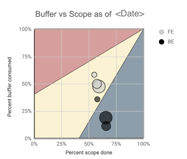
Everyone on the team, up to our senior leadership, knew how we were tracking across all project teams, just by looking at this single chart. A bubble trail trending upwards typically meant risk was brewing and would trigger further investigation. In those cases, I would liaise with the team to clarify the context and what decisions needed to be made, and by whom, to mitigate risks, e.g., re-prioritize tasks to handle dependencies. The bigger decisions would typically involve the leadership team, e.g., diverting devs from workstream A to help workstream B.
This decision-making mechanism was mostly data-driven and would always involve re-running the estimator over different scenarios to assess risks. All decisions were documented and communicated to stakeholders to maintain alignment. Some took longer than others to close, but we made sure they were never stagnating. The team was then committing to those decisions in order to make further progress.
We repeated the cycle daily. This short feedback loop helped us align horizontally and vertically, and rendered the team more reactive to change throughout the program of work.
Benefits to productivity
Instant estimation: Our estimation algorithm uses Jira historical data to compute a project lead time in the form of a probability distribution. Unlike other estimation methods, no team estimates are necessary, which not only saves time and hassle, but also enables unbiased and instant forward visibility for planning and course correction throughout a project. This means estimates are more accurate and the team has more agility in decision-making.
Cross-team alignment: It did take some effort to get individuals accustomed to the bubble chart. But in just a couple of weeks, everyone on the Confluence Server team was proficient in its mechanisms. Within a month or so, external stakeholders were fluent too. Every day, I would post an updated bubble chart on our Slack channel and project home page, which prompted queries and commentary from every level. As a result, people would join our weekly sync already aware of how the program was tracking, making our meetings shorter, yet more effective.

Data-driven risk management: This framework has really helped socialize and, more importantly, materialize the notion of project risk. Project-level buffering (inspired by critical chain) unlocked the bubble chart while the estimation algorithm unleashed probabilities, and as a result, we were able to be more deliberate and transparent about our decisions and actions in relation to how much risk we were willing to take on given the high variability inherent to project delivery. Being able to manage risk was important because our development team also needed to coordinate with other stakeholder teams, like Marketing, ahead of the platform release. A data-driven approach helped us clearly communicate expectations with these teams and set them up for success.
Effective and timely decision-making: Possibly the most important benefit of this framework was the quality of decision-making it enabled. It truly was instrumental in shipping Confluence Server 7.0 within close range of our target release date. The vast majority of decisions along the way were made at the right time and leveraged data in a way I haven’t experienced before. For example, we used the estimator and bubble chart to assess how various scenarios would play out, before making an informed decision.
Possible drawbacks
Hyper visibility could lead to over-scrutiny: Over-scrutinizing data can lead to overreactions to irrelevant fluctuations. Drawing conclusions based on these ups and downs can cause people to make poor decisions that seem data-driven, but in fact are not. Unfortunately, the bubble chart isn’t immune to this problem. For example, one member of our team decided to break down their Jira tickets into smaller pieces of work, which was unlike any other item in the backlog and historical data. This change caused the backlog to suddenly grow which led to a massive spike on the bubble chart, and we needed to work with this team member to confirm that the scope of the work hadn’t changed – just the tickets! Adjusting the cadence of bubble chart updates according to the audience, eg., daily for the dev team only, weekly for team leadership, and fortnightly or monthly for senior leadership would have helped limit overreactions.
Data overriding judgment: The bubble chart is a bit like a GPS navigation system. It’s a really good tool, but doesn’t always get it right. At times, we were so focused on the data and what it told us that we were blind to what was in front of us and deaf to the concerned voices on the team. Gut instinct has and always will have a place in the estimation process.
Behold: the Cone of Awesomeness
Our team still uses this approach to project management, and it’s even expanded to teams across Atlassian, most notably Confluence Server, Jira Server, and Bitbucket Server. We’ve been keeping a record of all the projects delivered using the Bubble Framework (or, as we’ve come to call it, the Cone of Awesomeness), and thus far it does strongly correlate with significantly fewer project delays.
If you have questions or comments on the Bubble Framework, head over to the Atlassian Community!