
Colorful and accessible theming in Trello with CSS custom properties
The Trello engineering, design, and product teams recently created new colorful and accessible board themes using CSS custom properties (also known as CSS variables).
We began with the following questions: While applying a dark or light theme to an application is common, how can we build a fun, dynamic theme that is inspired by the dominant color of an image selected for a board background? How can we make the themes accessible for users so the text remains readable? While doing all of this, how can we also ensure that performance doesn’t slow down?
Read on to learn more about how we answered these questions.
Architecture
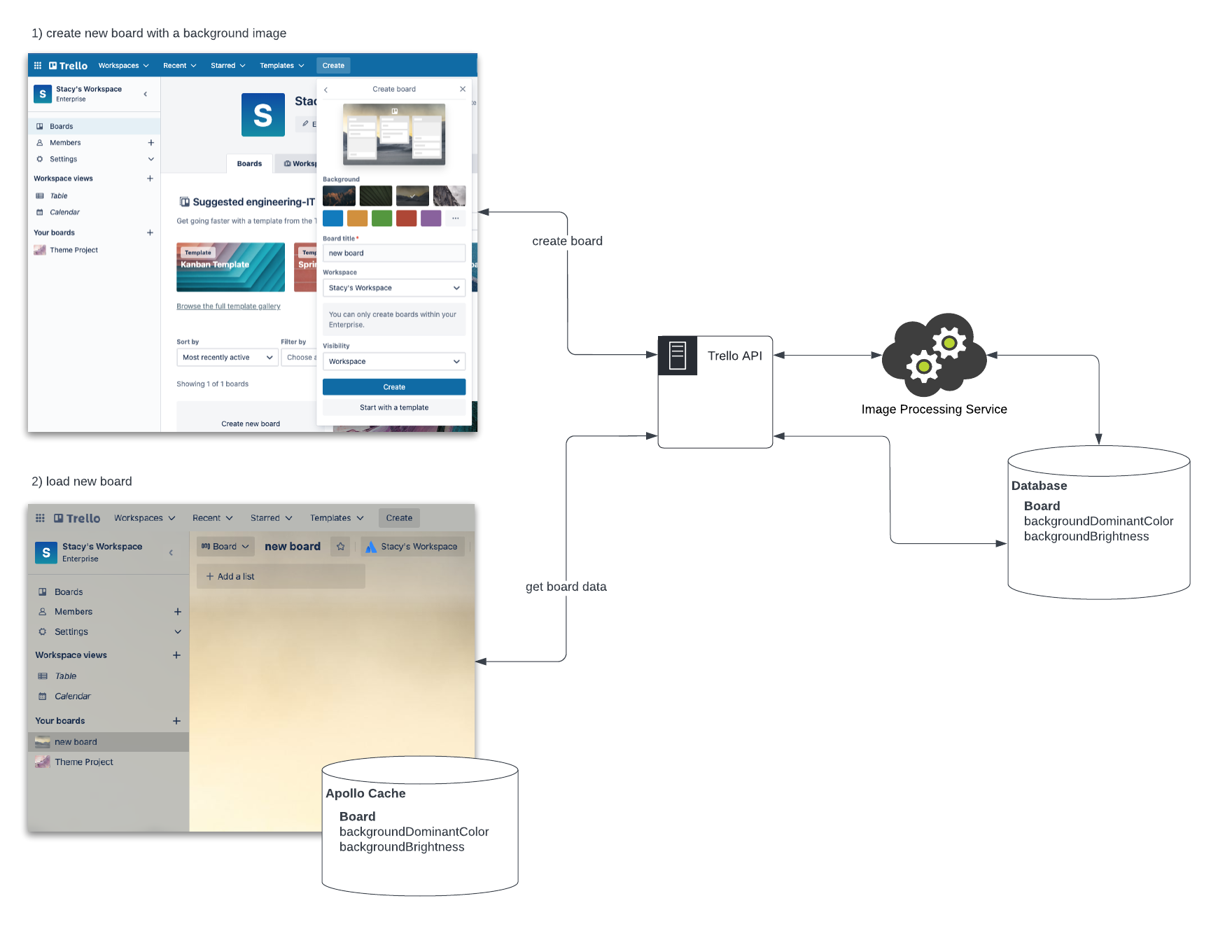
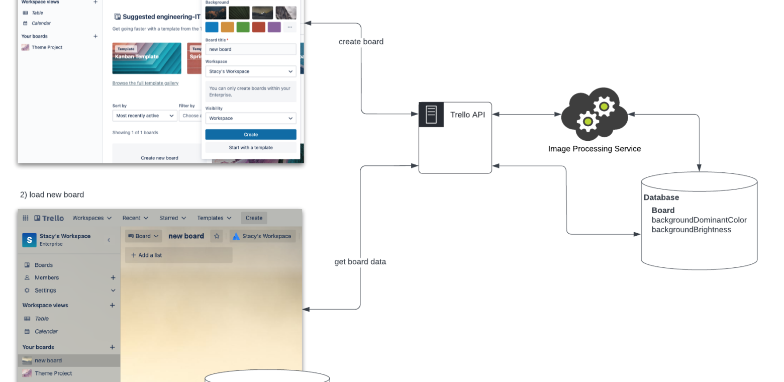
The diagram above shows the process we use to determine what the dominant color and the brightness of a background should be. When we create a new board, we select an image for the background. Upon clicking the Create button, we make a call to the Trello API, which in turn sends a request to the Image Processing Service (this includes GraphicsMagick and ImageMagick). This processes the image and determines the dominant color as well as the brightness of the image (dark or light). The computed data, backgroundDominantColor and backgroundBrightness is then saved to the database along with the rest of the board data. When this board later loads, we make a query to the Trello API to get board data (which includes backgroundDominantColor and backgroundBrightness).
We manage state in the Trello UI with Apollo Client so that data is added to the Apollo cache in the browser. When we navigate to another board and then back to this board, it gets this data from Apollo cache rather than making another API call. With the data in Apollo Cache, we then use it for theming UI components.
Theming approaches
There are various approaches for theming a UI. React Context and CSS-in-JS are common approaches but we found that CSS custom properties was the best approach to make the calculated data backgroundDominantColor and backgroundBrightness a theme that is readily available to all of our UI components.
React Context
A good practice in React applications is to fetch data and then pass this data down through UI components (from parents to children). Imagine, though, passing down props that are required by many UI components like a theme prop. This can get tedious as you have to intentionally send this prop through every level of the tree (also known as “prop drilling”). React Context is a place where you can store global data like this that many UI components need access to without having to do prop drilling. Instead, you use a provider to pass the current theme to the tree below.
Without React Context, it looks like this. Notice how you need to pass the props down through all intermediary components (e.g. through Navigation and MenuButton).
const themes = {
  light: {
    color: "#ffffff",
    background: "#000000"
  },
  dark: {
    color: "#000000",
    background: "#ffffff"
  }
};

const App = () => {
  return <Navigation theme={themes.dark} />;
};

const Navigation = (props) => {
  return (
    <nav>
      <MenuButton theme={props.theme} />
    </nav>
  );
};

const MenuButton = (props) => {
  return <Button theme={props.theme} />;
};

const Button = (props) => {
  const { theme } = props;
  return (
    <button style={{ background: theme.background, color: theme.color }}>
      button
    </button>
  );
};
With React Context, it looks like this. Here, you don’t have to pass props through intermediary components.
const themes = {
  light: {
    color: "#ffffff",
    background: "#000000"
  },
  dark: {
    color: "#000000",
    background: "#ffffff"
  }
};

const ThemeContext = createContext(themes);

const App = () => {
  return (
    <ThemeContext.Provider value={themes.dark}>
      <Navigation />
    </ThemeContext.Provider>
  );
};

const Navigation = () => {
  return (
    <nav>
      <MenuButton />
    </nav>
  );
};

const MenuButton = () => {
  return <Button />;
};

const Button = () => {
  const theme = useContext(ThemeContext);
  return (
    <button style={{ background: theme.background, color: theme.color }}>
      button
    </button>
  );
};
Trello was built with Backbone.js and React is sprinkled in as new features are built so there are many React roots. We’d have to define equally as many React Contexts which defeats the purpose of a single, global place to set a theme. If we also wanted to share this theme with the non-React parts of the application, React Context doesn’t work. All of this makes React Context not the right solution.
CSS-in-JS
Often a CSS-in-JS approach is paired with usage of React Context to apply a theme. This is because you can dynamically set style property values via JavaScript based on a theme prop.
Styled Components is a popular CSS-in-JS library. This is what theming looks like using it. The example below is directly from the Styled Components documentation:
// Define our button, but with the use of props.theme this time
const Button = styled.button`
  font-size: 1em;
  margin: 1em;
  padding: 0.25em 1em;
  border-radius: 3px;

  /* Color the border and text with theme.main */
  color: ${props => props.theme.main};
  border: 2px solid ${props => props.theme.main};
`;

// We are passing a default theme for Buttons that arent wrapped in the ThemeProvider
Button.defaultProps = {
  theme: {
    main: "palevioletred"
  }
}

// Define what props.theme will look like
const theme = {
  main: "mediumseagreen"
};

render(
  <div>
    <Button>Normal</Button>

    <ThemeProvider theme={theme}>
      <Button>Themed</Button>
    </ThemeProvider>
  </div>
);
Trello uses a Less and not a CSS-in-JS solution, so setting a theme via a React prop that can be referenced in CSS-in-JS is not a viable solution either.
How can we make this dynamic color available anywhere in Trello regardless of technical stack? CSS custom properties to the rescue!
CSS custom properties
For a long time CSS didn’t have a way for you to define a color that you could re-use across many styles. If you had a large website, you’d find yourself defining colors over and over again.
.navigation {
  background-color: #000000;
  color: #ffffff;
}

.menu-button {
  background-color: #ffffff;
  color: #000000;
}
Libraries like Sass and Less became popular because they offered the ability to define variables for reuse in addition to other features they added that weren’t available in native CSS yet. You could name them semantically and it would also make the code easier to read.
You could define your shared colors in a single file and then re-use across all your style definitions like this:
colors.less
@neutral: #ffffff;
@dark: #000000;

@primary-background-color: @dark;
@secondary-background-color: @neutral

@default-text-color: @neutral;
@secondary-text-color: @dark;
navigation.less
@import (reference) 'colors.less';

.navigation {
  background-color: @primary-background-color;
  color: @default-text-color;
}
menu-button.less
@import (reference) 'colors.less';

.menu-button {
  background-color: @secondary-background-color;
  color: @secondary-text-color;
}
Now, CSS variables are available in modern browsers without having to use libraries via CSS custom properties. The syntax is a little different but the idea is the same. Define once, use in multiple places.
:root {
  --neutral: #ffffff;
  --dark: #000000;
  --primary-background-color: var(--dark);
  --secondary-background-color: var(--neutral);
  --default-text-color: var(--neutral);
  --secondary-text-color: var(--dark);
}

.navigation {
  background-color: var(--primary-background-color);
  color: var(--default-text-color);
}

.menu-button {
  background-color: var(--secondary-background-color);
  color: var(--secondary-text-color);
}
This is the ideal solution for Trello because we can take the dynamic color computed from the board background image (backgroundDominantColor) and set this as the value of a CSS custom property. We can also re-use across many UI component style definitions.
Dynamically setting the values of CSS custom properties
We use a small amount of JavaScript to dynamically set the values of CSS custom properties. To do this, we create a React custom hook called useTheme.
For those new to React, a custom hook is a JavaScript function where the function name starts with ”use” and it can call other hooks. Hooks are new to React as of version 16.8 and they are a way to try to make sharing stateful logic easier.
useTheme sets CSS variables with dynamically calculated color values that we can easily reference in our styles for the various UI components that make up the navigation. We call this custom hook early in the application rendering lifecycle:
import { useTheme } from 'components/theme';

export const TrelloRoot: FunctionComponent = () => {
  useTheme();
  return (
    <TrelloRoot />
  );
};
This is an abbreviation of the code. In useTheme, we call another custom hook to get the computed dominant board background color that is fetched from the Trello API and stored in the Apollo Cache as mentioned in the Architecture section above. Then, we set that as a CSS custom property like this:
import { useBoardBackground } from './useBoardBackground';

export function useTheme() {
  const {
    backgroundBrightness,
    backgroundDominantColor,
  } = useBoardBackground();

  document.documentElement.style.setProperty(
    '--dynamic-background-color',
    backgroundDominantColor
  );
}
Getting the board background data
Earlier, I mentioned that the server calculates the dominant color of the board background and makes this available as an attribute of the board that we can access via an API call. Trello uses the Apollo GraphQL client and we have a query to get information about the board background. When the theme custom hook fires, we execute this query to get the board data. Many UI components use this hook but due to Apollo’s caching, the API request will only happen one time for a board.
This custom hook, useBoardBackground, can also be used by any component that needs to know the background brightness to declaratively change an icon color from a dark to light color. It can be used to change the appearance prop for our design system button to have a transparency optimized for dark or light backgrounds as well.
Here is an example of using useBoardBackground:
import { useBoardBackground } from 'components/theme';
import { OverflowMenuHorizontalIcon } from 'design-system/icons/overflow-menu-horizontal';
...
const { backgroundBrightness } = useBoardBackground();
...
<OverflowMenuHorizontalIcon
  size="small"
  color={backgroundBrightness === 'dark' ? 'light' : 'gray'}
/>
<Button
  appearance={
    backgroundBrightness === 'dark' ? 'transparent' : 'transparent-dark'
  }
/>
Accessibility
To ensure the theme is accessible, we need to make the text readable on the dynamic background color. To accomplish this, useTheme determines what kind of a board background it is. If it’s an image, it takes the dominant color along with the dynamic text color, which is determined by whether the image brightness is dark or light. useTheme then checks this combination to ensure it meets and exceeds WCAG AA contrast ratio so the text is readable. If it doesn’t meet the contrast ratio, it adjusts the background color until it does in a loop.
The W3C is a standards organization that defines how the web should work. That group publishes standards for making content on the web accessible. These are known as Web Content Accessibility Guidelines (WCAG). The current standard is WCAG 2.1. In this standard, you can find a definition for a minimum contrast ratio of 4.5:1 which is also known as Level AA. Level AAA is the enhanced version where a ratio of 7:1 must be met.
These values are then set as CSS custom properties:
| Item | CSS Variable |
| text color | –dynamic-text-color |
| text color with some transparency | –dynamic-text-color-transparent |
| icon color | –dynamic-icon-color |
| background color | –dynamic-background-color |
| background color with transparency | –dynamic-background-color-transparent |
We set these CSS custom properties on the document so that anything in the DOM can access them.
document.documentElement.style.setProperty(
  '--dynamic-background-color-transparent',
  'hsla(230,17.6%,37.4%,0.9)'
);
This means that the styling associated with any UI component, whether a Backbone View or a React Component, can easily reference them like this:
.container {
  background-color: var(--dynamic-background-color-transparent);
}
When using browser’s developer tools, you can see these in the DOM on the html element.
element.style {
  --dynamic-background-color: hsl(219, 32.7%, 81.1%);
  --dynamic-icon-color: #42526e;
  --dynamic-text-color: #172b4d;
  --dynamic-text-color-transparent: hsla(218, 54%, 19.6%, 0.16);
  --dynamic-background-color-transparent: hsla(219, 32.7%, 81.1%, 0.9);
}
To set --dynamic-text-color and --dynamic-icon-color values, we use colors that we define as design tokens which keeps consistency of text and icon color throughout the application. If the background brightness is light, then we use the defaults (a very dark blue). If the brightness is dark, then we use a light color (white).
import {
  TextLightColor,
  TextDefaultColor,
  IconLightColor,
  IconDefaultColor,
} from 'design-tokens';

// determine dynamic text color
const dynamicTextColor =
  backgroundBrightness === BACKGROUND_BRIGHTNESS_DARK
    ? TextLightColor
    : TextDefaultColor;

// determine dynamic icon color
const dynamicIconColor =
  backgroundBrightness === BACKGROUND_BRIGHTNESS_DARK
    ? IconLightColor
    : IconDefaultColor;

document.documentElement.style.setProperty(
  '--dynamic-text-color',
  dynamicTextColor
);

document.documentElement.style.setProperty(
  '--dynamic-icon-color',
  dynamicIconColor
);
We also built in error handling so that if something unexpectedly fails in the color conversions or contrast ratio checks, it will default to a light theme.
Room for improvement
W3C describes Level AA as:
“The intent of this Success Criterion is to provide enough contrast between text and its background so that it can be read by people with moderately low vision (who do not use contrast-enhancing assistive technology). For people without color deficiencies, hue and saturation have minimal or no effect on legibility as assessed by reading performance (Knoblauch et al., 1991). Color deficiencies can affect luminance contrast somewhat. Therefore, in the recommendation, the contrast is calculated in such a way that color is not a key factor so that people who have a color vision deficit will also have adequate contrast between the text and the background.”
–Understanding Success Criterion 1.4.3: Contrast (Minimum)
To calculate this contrast ratio you need to first calculate the relative luminance of a color.
“The relative brightness of any point in a colorspace, normalized to 0 for darkest black and 1 for lightest white.”
–Relative luminance
You take the relative luminance for the foreground and background color and do some additional math to get the contrast value.
We started off using the minimum contrast ratio (4.5:1). But, after looking at a lot of boards to see how the navigation background color looked meeting this ratio, we made a call to go above the minimum.
We wrote a contrast validation module that, client-side, calculates the relative luminance, gets the contrast value, and returns a boolean value for whether or not the desired contrast ratio was met. This is what the React custom hook for the theme calls to check to see if the text color and background color are readable.
When the text color (foreground) and background color did not meet the contrast ratio, we adjusted the lightness value in the HSL function (hue, saturation, and lightness) up or down until it did.
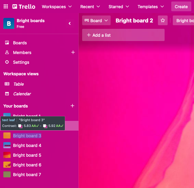
This is not perfect though. There are color combinations that while they meet the contrast ratio are still not great on the eyes. Below, is an example of a board background dominant color that is really saturated. You can see it meets WCAG AA contrast ratio but it is still hard to look at. We’ll be working on adjusting our algorithm to account for this. We’re investigating ways to automatically adjust the saturation (the S in HSL) as an incremental step to make these saturated boards easier to view.
We’re also monitoring new innovations. The W3C has a Visual Contrast of Text Subgroup that is working on the Advanced Perceptual Contrast Algorithm (APCA) which is a new way to compute contrast based on modern research on color perception. We’re excited to watch this standard as it evolves but are currently not implementing it since leaders in the accessibility community are cautioning against adopting this experimental approach too quickly.
Performance
In addition to accessibility, performance is always top of mind. We wanted the board page to paint as fast as possible. Since we added more data that the components rely upon, we needed to make sure this didn’t make the UI slower.
To parallelize operations instead of having them be serial, we fetched data about boards as early as possible in the lifecycle of this single page application (SPA) so it existed in the Apollo Cache in the browser by the time components rendered. We made sure the dominant background color and brightness values are added to this early data fetching and caching.
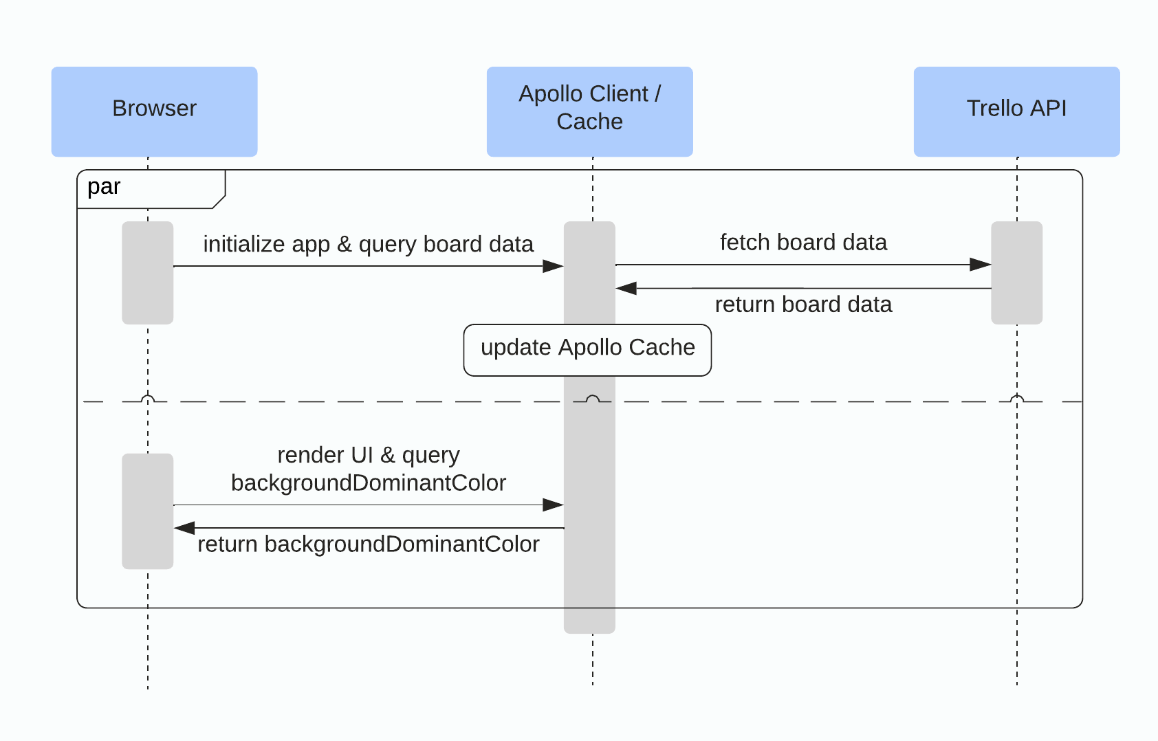
With this in place, we no longer needed to wait for a network request to start and complete as part of the UI component rendering process. We measured rendering duration for a React component using the React DevTools profiler.
Now, the React custom hook for theming kicks in and reads the dominant background color and brightness values from Apollo Cache and sets the computed CSS custom properties into the DOM. Browsers are highly optimized to parse and apply CSS so all the UI components referencing these CSS variables change color quickly.
We found CSS custom properties to be a very useful solution for dynamic, accessible, and high-performing themes on Trello. I hope this post encourages others to experiment with CSS custom properties as well!