


At Atlassian, we’re constantly studying teamwork. In that research, we know it’s best to start with ourselves; to understand how our teams work together first before applying our knowledge elsewhere.
As a data scientist, I naturally turned first to our data. I wanted to create a network graph visualization of our company in order to see how we all work together in action. Sure, we have a more formalized organizational chart that breaks down our departments, teams, and individuals, but is an org chart enough to capture our collaboration?
To answer this question, I aggregated 2.5 million chat exchanges at Atlassian to form over 25,000 distinct interactions from our employees across the globe. I used a forcing algorithm to create a network graph visualization using a combination of Python and Gephi.
The Atlassian People Graph
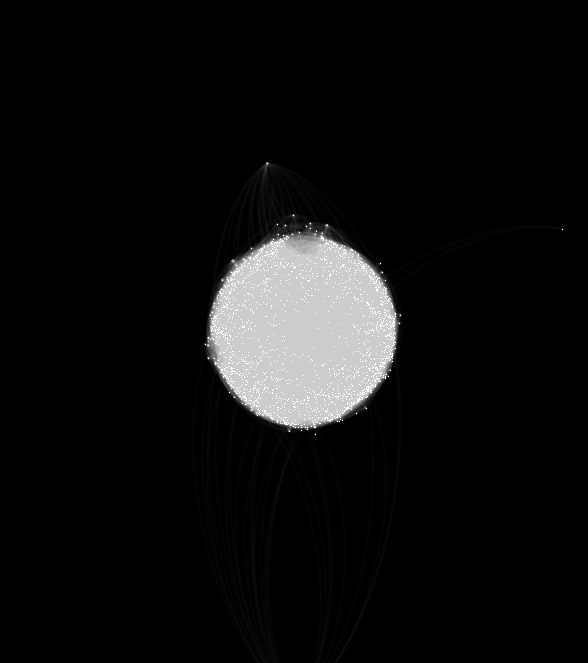

Each dot on this graph represents an Atlassian, and each line represents a conversation on chat. The first thing that jumps out to me from this graph is how connected we all are. You don’t see a lot of silos here, but rather a closely knit unit – that to me, looks a lot like a human heart. We have a culture where anyone at Atlassian can reach out to anyone else in any department around the world, and you can truly see that play out in the graph above.
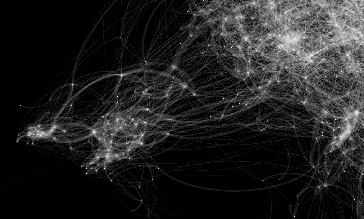
Another thing this graph represents is the amount of communication between Atlassians. If you look closely at the zoomed in graph below, you’ll see that the lines carry different weights, which represent how often people communicate. Finally, the algorithm creates groups of people who tend to communicate frequently with each other, resulting in the cloud-like clusters below.

Not wanting to stop there, next I tagged the graph with identifying metadata about each Atlassian to break down our structure by different factors like geographic location, department, timezone, and job title.
By geographic location

As you can see we have Atlassians spread out in 10 major areas throughout the globe. What’s immediately obvious is that the majority of our people are located in Sydney and San Francisco/Mountain View, with other large populations in Austin, Texas and Manila, Phillipines.
You’ll see most people tend to talk to the people in their location, which makes sense due to team makeup and time zones (more on this below). But what’s interesting to pull out is the mingling of conversations between offices that seem to be hubs of connection across the company, for example, the Austin office highlighted in purple.
What’s also interesting is the clustering of conversation among our offices that provide customer support in Kuala Lumpur, Porto Alegre, Austin, and Amsterdam. With each in a different timezone, you can literally see the collaboration between teams solving customer problems 24/7.
By department
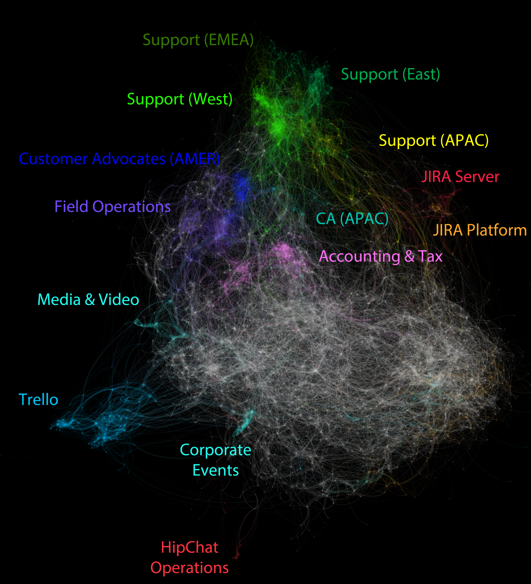
According to our org chart, we have over 200 departments at Atlassian. That is a lot of information to parse, so for my visualization, I took all those department names and simplified they down into core functions. Not surprising for a software company, you’ll see the bulk of our team sits in what I’ve called the Developer “swarm”(the large gray/white cluster). Here we see a lot of communication happening widely across the entire engineering org.
What’s interesting to note are a few bright spots which represent individuals that communicate between a lot of different people on the team. We could call these people our “connectors”, as by the very nature of their chatting, they are bringing lots of different people together. Beyond these few individuals, we are happy to see that broadly across engineering, our collaborative culture is playing out in the way we build our products.
Another interesting point to notice is the wide-reaching connections from the support team to the customer advocate team down to the development team and vice versa. This is an important relationship in our product development as we try to stay close to our the needs and feedback of our customers. With a traditional organizational chart, you’d never be able to see the complexities of how people here are able to reach out of their given field to work with others.
See the light blue group on the left hand side? That represents our friends from Trello, who joined the Atlassian family in January 2017. At the time I pulled this data, they were relatively new to our company, but over time I’d expect to see the number of connections and conversations expand and grow.
By timezone
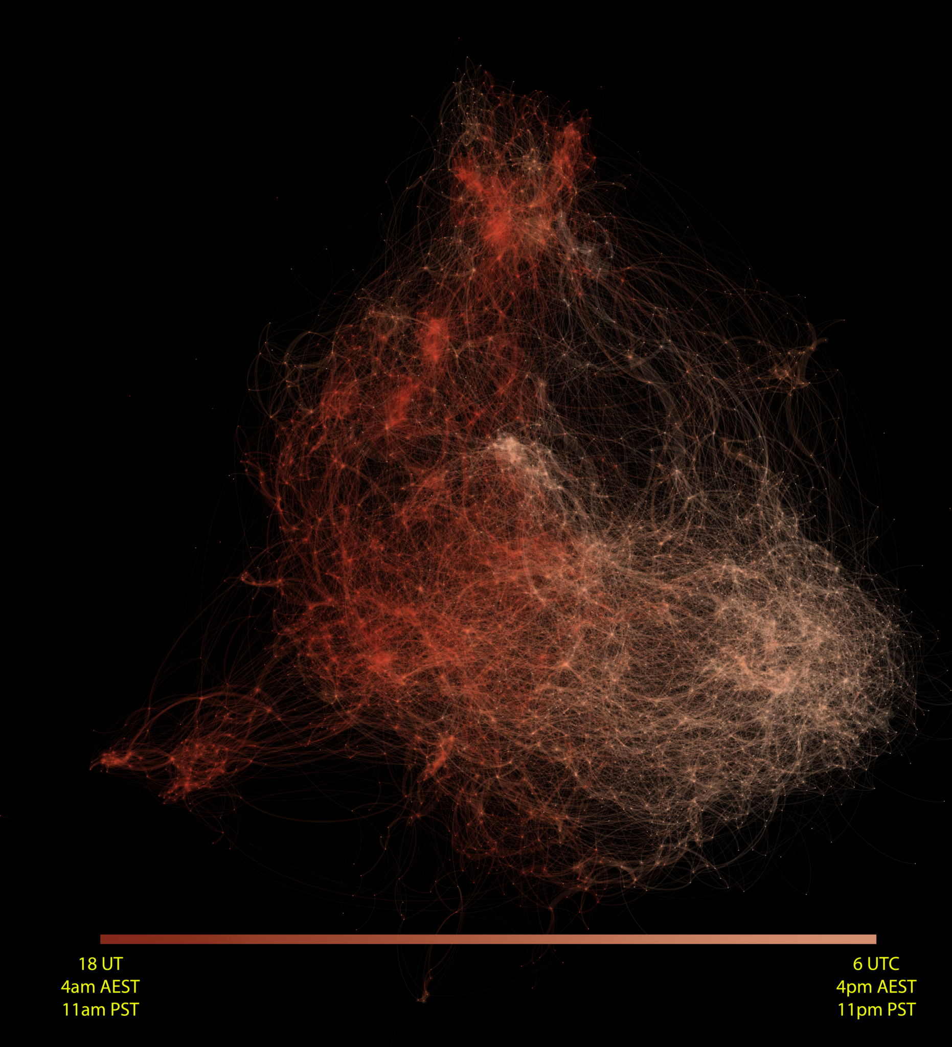
To first order, the graph is largely clustered by time zone. So much so that you can almost visualise the sweeping rotation of the Earth, from the USA on the left, to Europe and Asia, and then finally across to Australia on the right. This is intuitive as you would expect people to more frequently communicate with those who are co-located.
This metric is the average time at which a user sent a chat message. So starting on the left hand in San Francisco, Atlassians there send the most amount of messages around 11am, and that increases in intensity over time as other offices come online as time passes by. You can see that by mid-day Pacific Time, Atlassians on the whole are sending the largest amount of messages to each other around the world.
By job title
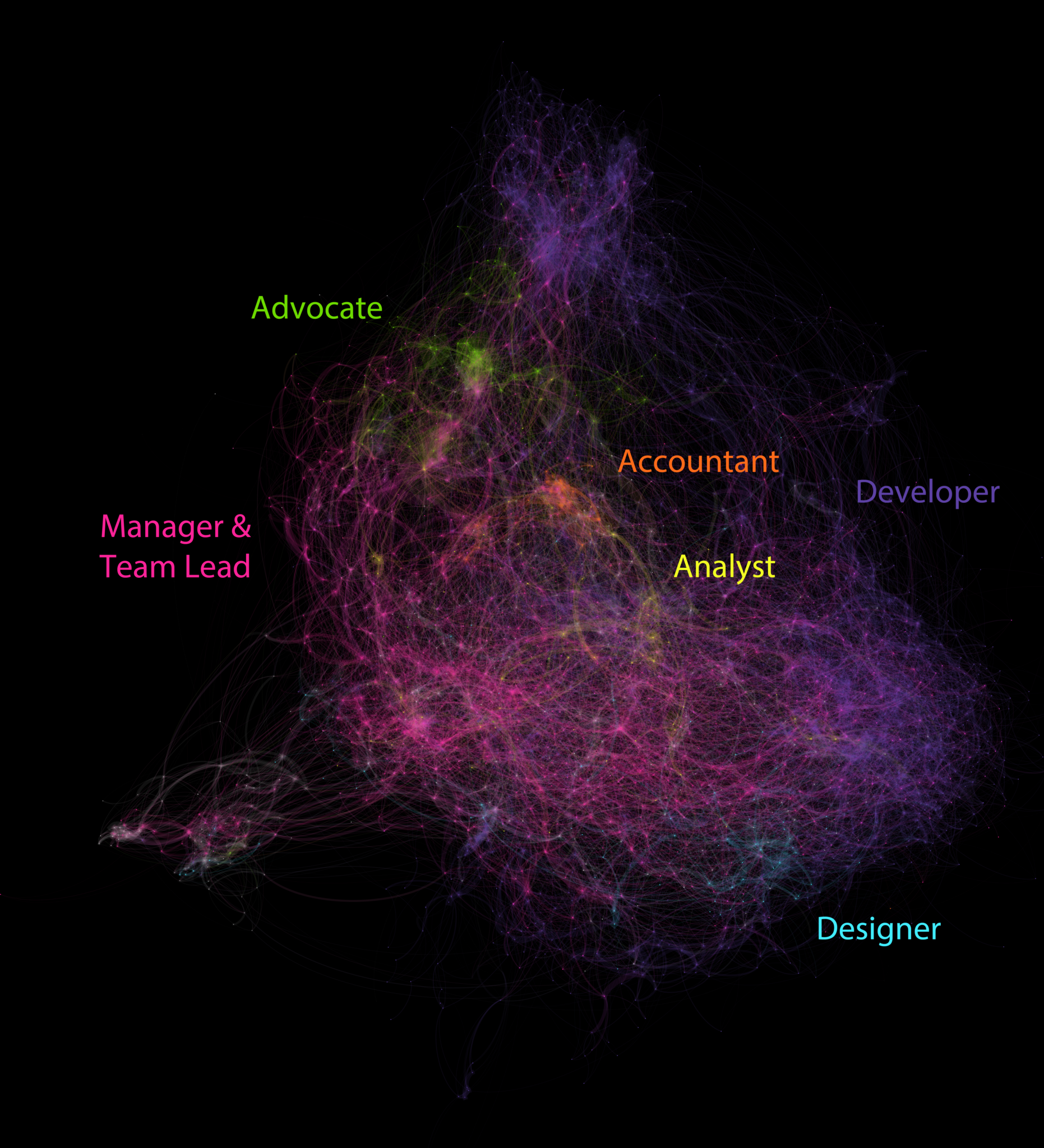
Who do Atlassians talk to in their day to day? When I broke down the graph by a very simplified job title mapping, some interesting patterns started to emerge. See the bright spots on the graph? Those are clusters of high frequency conversation between members of those job titles. Broadly speaking, we see that within job function, very tight bonds are formed, and a lot of communication is happening. That’s why you see the bright green of our advocates, the bright orange of our accountants, and the bright pink of our managers all collaborating together.
What it means to us
Teamwork is about more than just the org chart. Our real organizational chart – one that doesn’t fit into a neat structure – shows as that work really gets done thanks to the many relationships Atlassians have across multiple geos, departments, and job titles. Because our company is set up to work open, ideas flow freely and anyone is available to pitch in, offer a perspective, or lend a hand. The open way of working shows us how important it is that we are all connected, that we are reaching outside of a traditional structure, and working together as one solid unit – or as this graph shows us: one beating heart.