

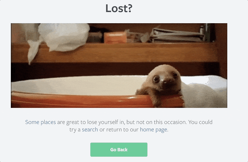
Nobody wants their web visitors getting lost. But it happens. When it does, a great 404 error page can turn a bad experience into a delightful one.
We’re always praising the benefits of good strategies for downtime. Another aspect of that is making sure visitors are taken care of if they land on an old page or a dead link. That’s why we advocate putting a little extra thought into your 400- and 500-level error pages.
A clever or engaging error page reinforces your brand message and increases visitors’ chances of staying on your site rather than clicking out altogether.
What is a 404 error page?
A 404 error page is a web page designated to be displayed when a request triggers the HTTP 404 response code. This code means the client (or, “visitor”) was able to locate the server, but not the specific destination. In other words, they found your site, but not a specific page within your site. So the server sends your browser a 404 response code, letting them know what happened. If the site’s designer designated one, a 404 error page is loaded.
Here’s an example:
Visit Statuspage and your browser will load our main homepage. You’ve located our server. Add a correct destination to the end of that url, /pricing or /login, for example, and your browser loads that specific destination. But try a destination that doesn’t exist, like /gibberish, and you’re served the 404 page. Basically our server is saying this: you found me, I can see my URL in there, but the specific destination you’re looking for after the slash is a page I don’t have a match for. So here’s this error page to let you know that I don’t see a page in my directory that matches what you’re asking for.
The great thing about a 404 error page is that the same page loads no matter what mistake leads you there. So any of the infinite combinations of bad URL extensions will generate that page, provided the top-level domain, the site-dot-com part, is intact.
There are two common reasons a visitor might land on an error page:
- They hit a link that points to a URL for a page that no longer exists
- They click or type a misspelled link
The effect of “link rot” is a byproduct of the first reason, old links. Websites are regularly updated, moved, or deleted. But no one person can fully control, or know, the network of external properties linking to their page. This means that although the links live on, they point to a page that no longer exists. Thus, link rot. It’s so widespread that half of the links cited in Supreme Court opinions no longer host the original content, according to one estimate.
Since we can’t control who might be sending visitors to dead links on our domain, the next best thing we can do is have a great 404 error page set up. Even though sending visitors to an error page isn’t an ideal experience, it’s still an experience you can own.
What about other error pages?
While the 404 is the most common error code most people see, it’s only one of a handful of errors that can be served.
Any three-digit error code that starts with a 4, like 404, is called a 400-level error and means something went wrong on the client’s side. The client, in this relationship, is your web visitor. More specifically, it’s their browser. So it makes sense that a misspelled URL is considered a client error. The server (the computer hosting the site) is working fine.
Other common 400-level errors include:
- 400 Bad Request: The request sent to the server was malformed or somehow didn’t follow syntax rules.
- 404 Forbidden: Sounds ominous. But all this really means is that the requested URL is valid, but the client doesn’t have the proper permissions to access the site. This can happen when you try to visit a URL for a site you need to be signed in to visit.
The other common set of error codes are 500-level codes. Where 400-level codes indicate a problem with something the client is doing, 500-level codes flag something unexpected happening on the server side.
Some of the common 500-level codes:
- 503 Service Unavailable: This is your standard “server unavailable” error. Typically the server can’t respond because it’s overloaded or down for maintenance.
- 504 Gateway Timeout: The server was acting as a gateway to an upstream server, but didn’t receive a response from the upstream server in time.
Pro tip: Even if a site doesn’t have an error page, you can see the error codes for yourself in your browser. In Chrome, for example, right-click on the page and hit “inspect.” You’ll see the set of developer tool panels. In the tab labeled “Console” you’ll see a list of any HTTP response codes that may be getting generated, along with a bunch of other “under the hood” info the server is telling your browser.
Fun fact: A little-known Error 451 code exists and is sometimes used. The code is meant to be used when access is denied due to legal request, and is a reference to the dystopian novel “Fahrenheit 451.”
44 incredible 404 error page examples
1. 20th Century Fox
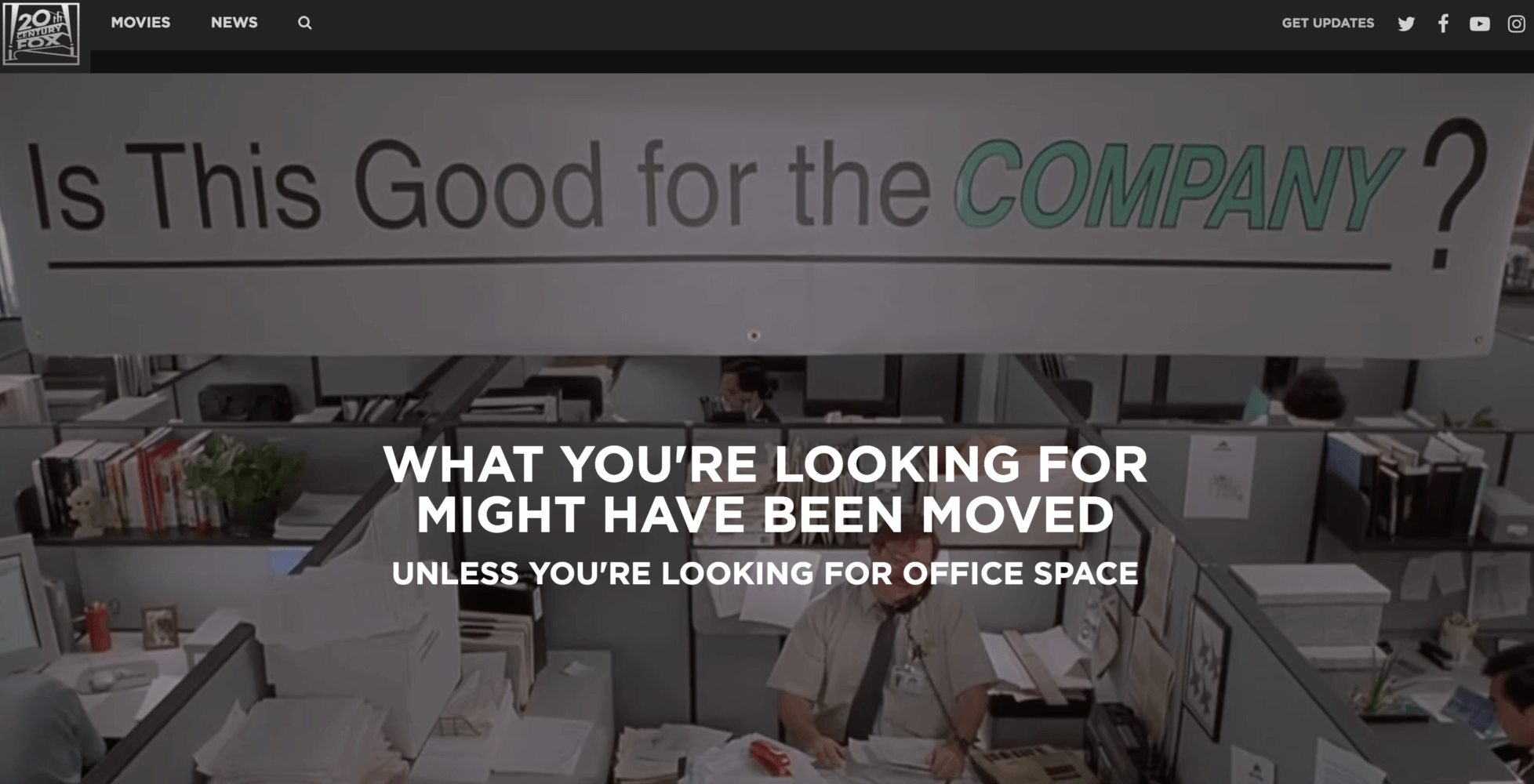
A company like 20th Century Fox has a giant library of memorable material to draw on for inspiration. They’ve pulled in some clips from their film library favorites like “Office Space,” “Revenge of the Nerds,” and “Edward Scissorhands.” Click the text and you’ll get to a page where you can buy your own copy.
2. Amazon
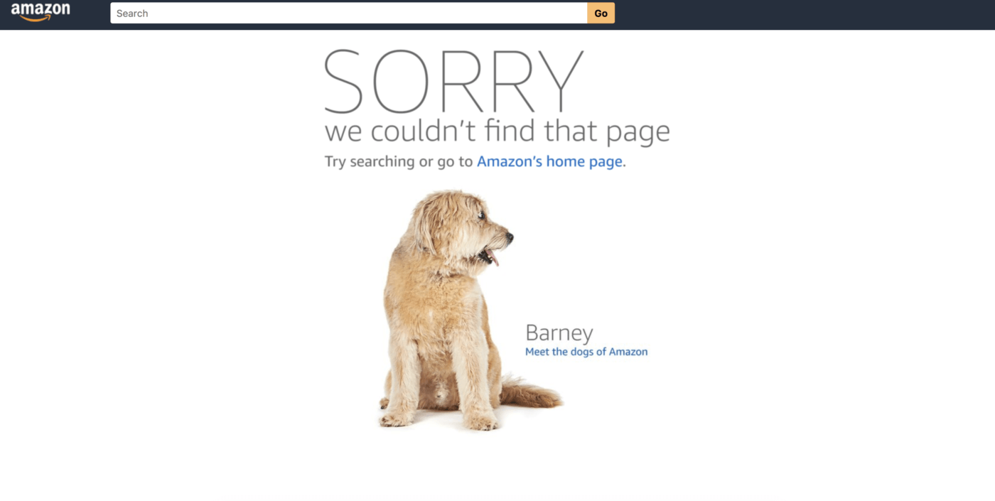
Amazon’s good at doing a lot of things at once. Their error page is no different, part brand affinity device, part recruiting tool, their error page loads images and copy on the many different dogs who frequent the company’s offices. From there you can click into bios of the different dogs, and go further down to real stories from real human employees about working at Amazon. It’s almost like they knew that talented people who build on the web would be looking for fun examples of error pages.
3. Astuteo
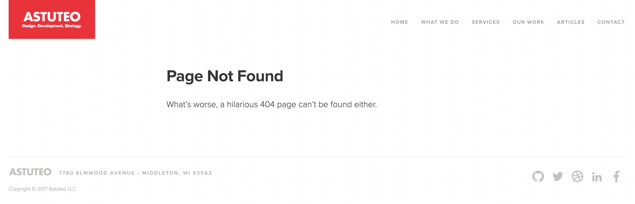
Web design and digital marketing firm Astuteo got a lot of attention for their “Casablanca”-themed error page. Land on their error page now and the copy makes a clever reference to everyone looking for a funny error page. Still funny.
4. Batman 3-D

German artist Achim Loobes’ Batman fan art website is an excellent example of using design and motion in an error page. Move your mouse around to direct Batman’s flashlight and reveal the error message.
5. Benjamin Reid
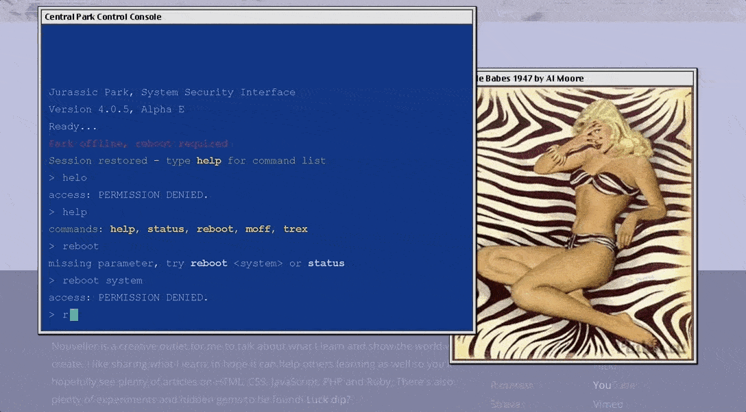
UK-based web designer Benjamin Reid’s firm Nouveller built an incredible error page using the film “Jurrasic Park” as inspiration. The page lets visitors try their hand at breaking into the park’s computer system, based on the scene where Samuel L. Jackson’s character tries to bypass the security setup by the park’s devious programmer.
6. Bernie Sanders Campaign
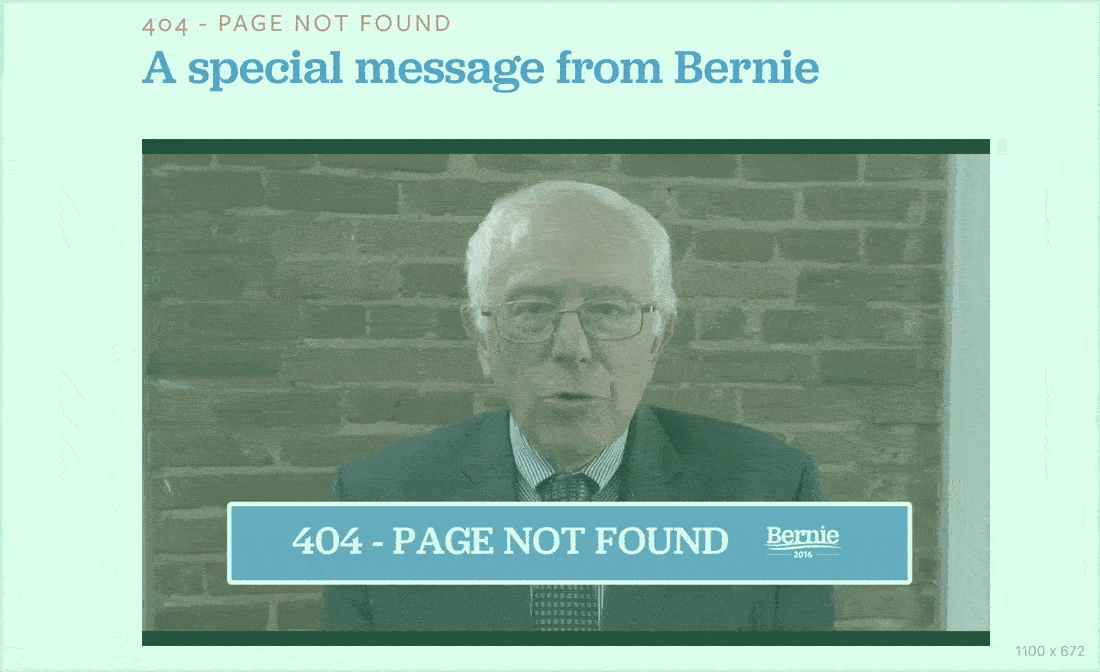
Shortly after announcing his 2016 presidential bid, Bernie Sanders created the what’s probably the most memorable error page of any presidential candidate. The page plays a video of Sanders explaining what went wrong and how to get back to the homepage. “Just scoot down to the bottom of the page and you’ll find your way back home to where you should be!”
7. Bitly
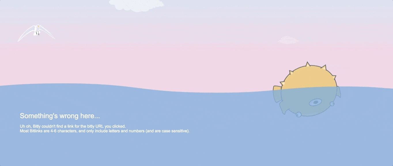
Interactivity and motion art doesn’t have to be over the top to make an impression. Bitly’s error page takes visitors to a creature floating in the sea. Use your cursor to make the waves bounce and roll. Surprisingly calming and satisfying, almost makes you feel OK about being lost as sea.
8. Blizzard Entertainment
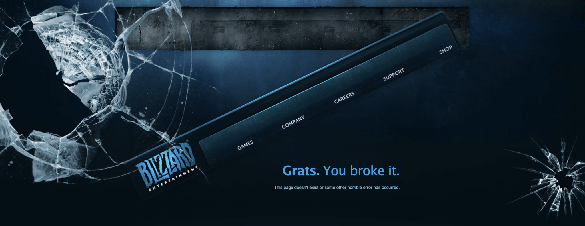
Blizzard Entertainment uses a broken glass design on their error page with cheeky copy about the user “breaking” the page. Clever concept, especially for the millions of Blizzard fans firing digital ammo on their screens.
9. Bloomberg
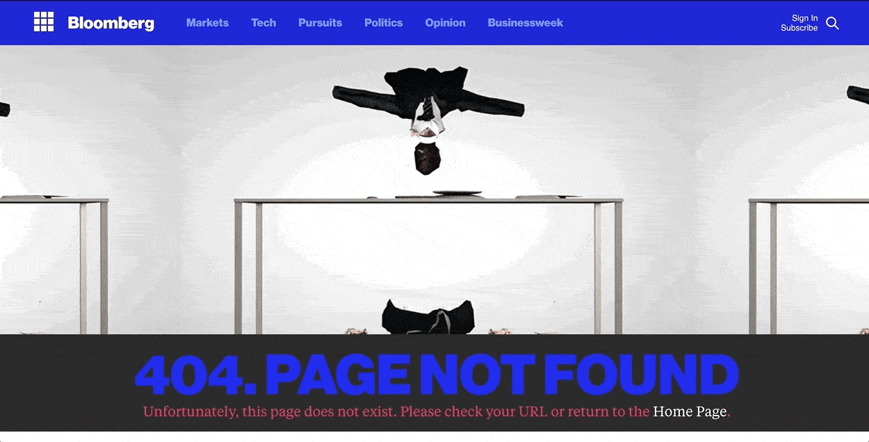
Bloomberg’s known for two things. Great financial reporting, and great tools for financial services professionals. That’s why it’s bizarre and memorable that they’ve put this animation on their error page. It shows a man in a suit, slapping his computer off a desk and then falling into pieces on the floor. Perhaps a metaphor for spending too many late nights at your Bloomberg Terminal?
10. Bluegg
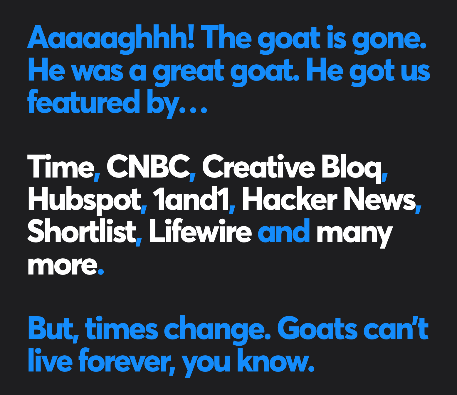
Blugg’s had a pretty famous 404 error page. For a long time, the page featured a viral video of a laughing goat. Sounds odd, but it matched the tone of the company, it was funny, people loved it. So much so, that when the team redesigned their error page, they just had to talk about the goat. They even included a roundup of articles where the goat was mentioned. Good for you, goat.
11. Codecademy

Codecademy helps people learn to code. What better place to put a call to action to a lesson about error pages than their very own error page.
12. Daniel Karcher
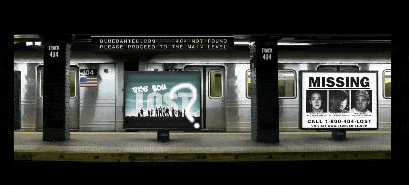
The entire scene in this error page is mesmerizing and a bit haunting. The subtle touches and visual effects happening in the abandoned subway setting create a mood that gives the effect of winding up somewhere unexpected.
13. Dilbert
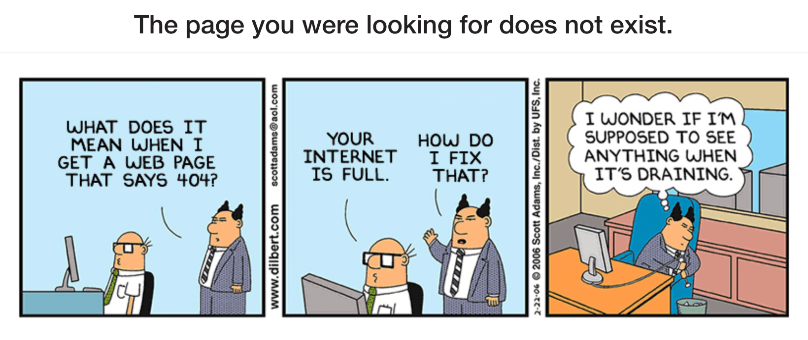
The Dilbert comic strip is a great example of using owned content as material for your 404 page.
14. Dogstudio
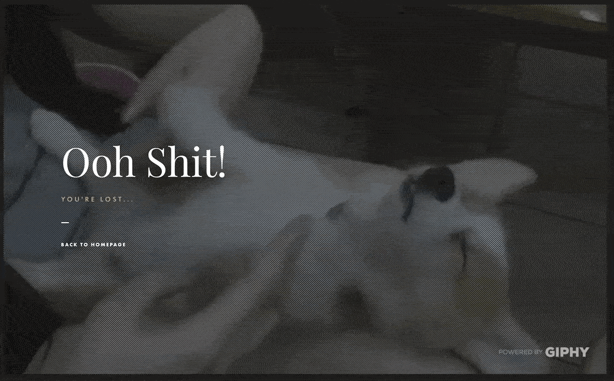
Dogstudio leverages Giphy’s awesome library of animal gifs to populate their error page with a rotating cast of dog gifs.
15. Eastern Market
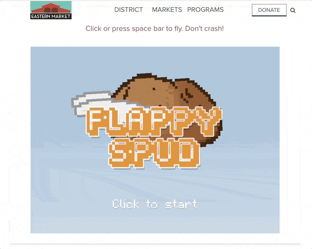
People love flappy games, the kind where you tap or click to fly an object through the sky and avoid obstacles. Detroit’s Eastern Market hosts a 404 error page with a game called “Flappy Spud.” Maybe it’s the same kind of spud you can buy at the market. Also a nice touch that the potato explodes into a pile of french fries when it hits a wall.
16. Emailcenter UK
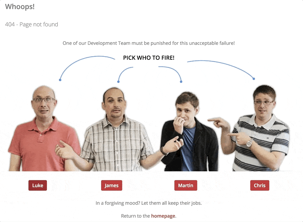
Error pages are a good place to show off some of your company’s team members and creativity. For Emailcenter UK, this meant an interactive joke about firing a member of their Development Team. It’s a clever way to have some fun as a brand and show off the team behind the scenes, who typically don’t get a lot of fanfare.
17 . Google
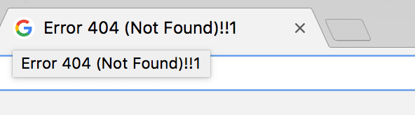
Google’s always done a great job of keeping their brand fun and playful even through they create some of the most visited tools on the web. With so many different visitors and use cases for their products, it’s a tough line to walk. Google does a nice job of putting subtle pops of personality in unexpected places. Their error page is a great example.
The error page is a pretty basic illustration of a broken robot and some copy. But the easter egg is up in the page title, the one you see on your browser tab. It looks like a typo at first, but “!!1” is a reference to a web joke commenting on how quickly enthusiasm (!!!) can get sloppy (!!1). Mind that shift key, kids.
18. HeyZap
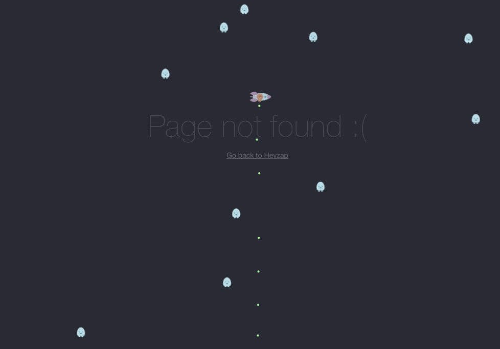
People love vintage video games. The team at HeyZap captured some of this love by coding a version of the arcade classic “Astroids” into their error page. Fire a few lasers at flying space rocks and you’ll soon forgive whoever sent you to a dead link.
19. Hot Dot Production

Hot Dot Production built a slick interactive 404 error page with a giant, floating “404” animation. Click parts of the numbers and the dots explode into space and respawn.
20 Hugo Bonacci
Developer and designer Hugo Bonacci’s error page seems like a standard 404 error page when you first land on it. Then a purple spinning black hole starts sucking in all the elements of the page.
21. IGN
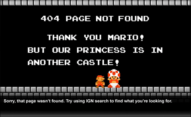
IGN borrows some nostalgia from video game lovers for their Mario-inspired error page. The copy references the “Princess is in another castle” moments from the games.
22. IMDb
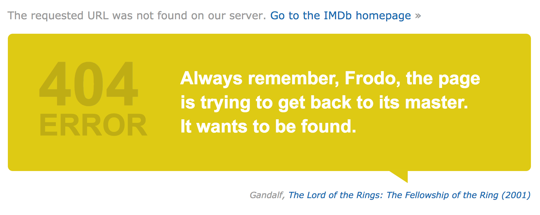
Error pages don’t need to load the same content on every visit. They can be set up to rotate through a library of copy or artwork, so every visit feels new. That’s what IMDb did with their error page, which features slightly-altered quotes from movies. Go ahead and hit refresh a few times to see what other quotes come up.
23. Iconfinder
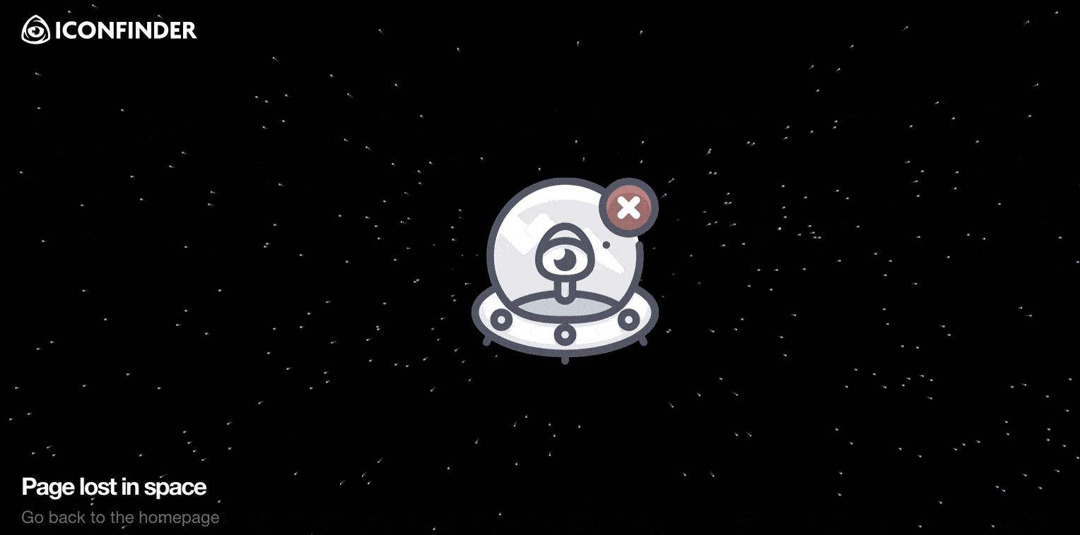
The “Star Wars” flying-through-space effect has mesmerized audiences since the 1970s. It’s in full effect on Iconfinder’s 404 error page. Another great example of subtle animation making a big impression.
24. Imgur
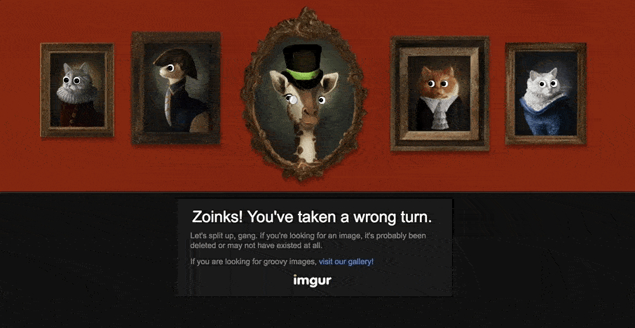
Speaking of subtle, you might land on Imgur’s error page a dozen times before noticing that there’s even an animation happening. Move your mouse around and try to find it.
25. Jackrabbit Design
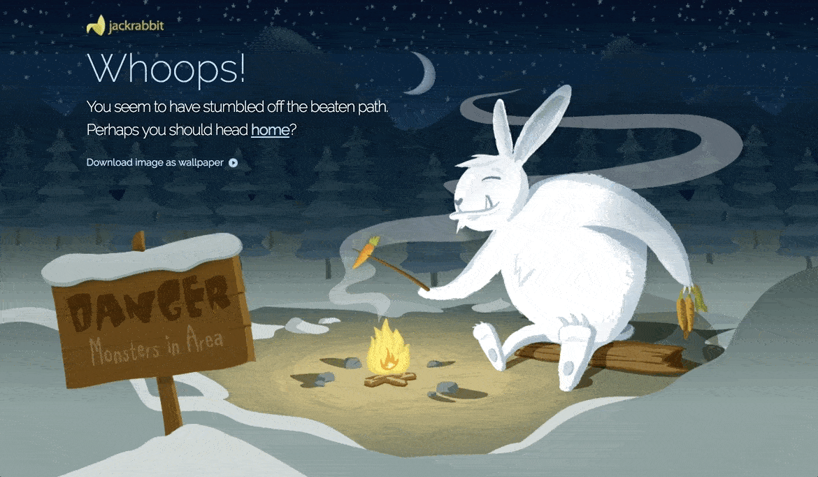
Jackrabbit Design brings visitors into this rich animation by creating layers that move and shift based on the user’s cursor. It’s a great way to get people spending a little more time with your artwork.
26. Kualo
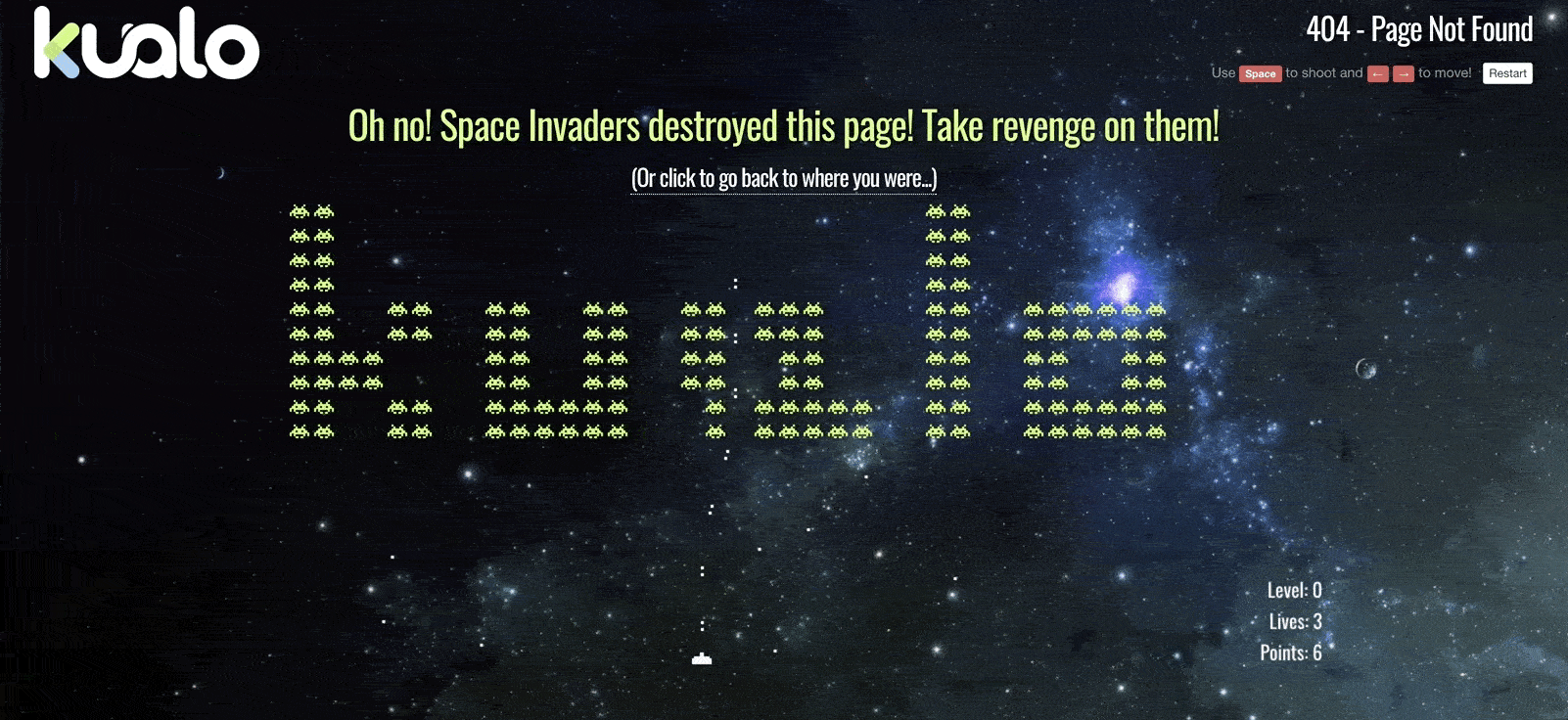
Space Invaders is another arcade classic. The UK team behind Kualo made a fun spin on things by spelling out their company name with Invaders. Invaders you’ll love blasting with a space laser.
27. Lego
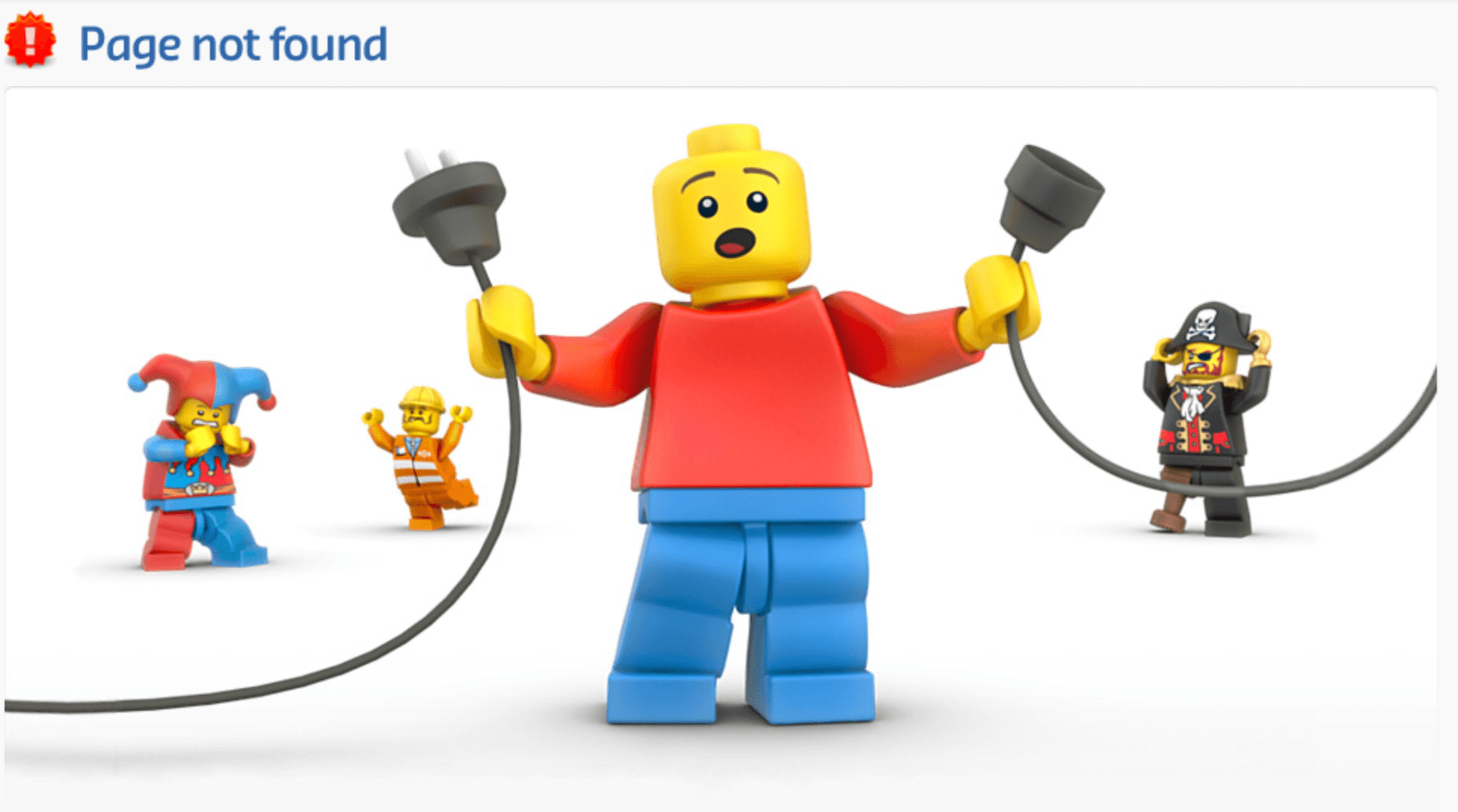
Lego’s error page is simple, but it’s become a classic. The artwork shows lego characters in states of disarray over the pulled power plug. A great visual metaphor and clever way to use their familiar brand to tell a story.
28. Lonely Planet
Not every error page needs to have some clever brand connection or complex metaphor going on. Sometimes a funny animal gif is a enough to turn user sentiment around. Lonely Planet does a nice job with this error page gif.
29. Lush
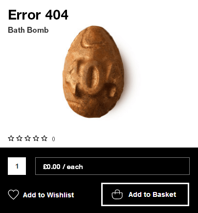
This error page from cosmetics brand Lush is an excellent example of tying your page into a promotion. The brand announced for Easter 2014 their “Easter Egg Hunt.” Find the easter egg on their site and win a free prize. Turns out the easter egg was hidden on the 404 error page, and the prize was a special “Error 404” edition of their popular bath bomb product.
30. Magnt
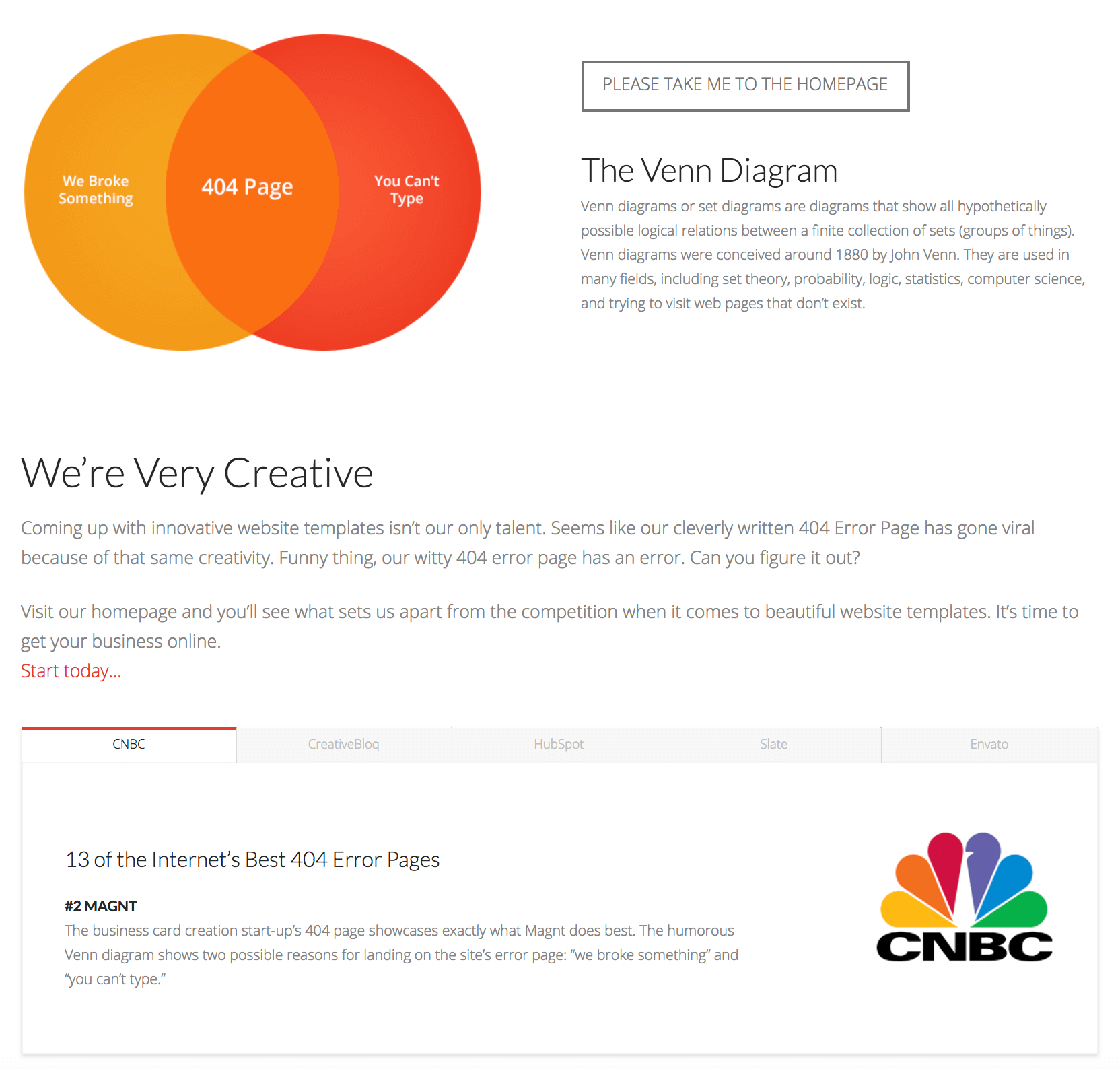
An error page doesn’t need complex animations or spaceships zapping lasers to get people’s attention. Magnt’s simple Venn Diagram error page has gotten plenty of love over the years, so much so they added a section highlighting the press clippings the page generated.
31. MailChimp
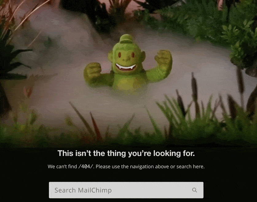
Mailchimp’s subtle animation of fog rolling through the jungle shows off the brand’s ability to tell a story and capture attention using little touches of creativity. It’s a nice effect that you almost don’t notice if you aren’t paying attention.
32. NPR
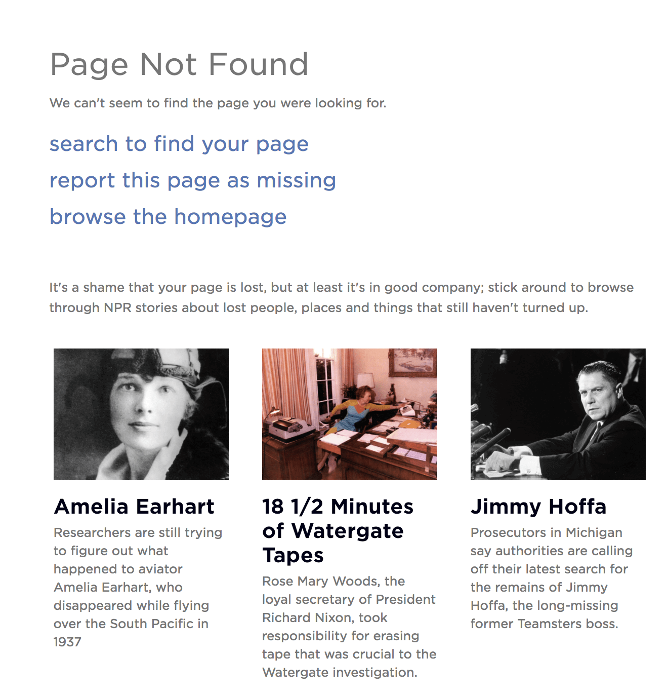
NPR has a ton of great content they can point visitors to. They have some fun with this on their 404 error page, which features NPR stories about other people and things that took a wrong turn.
33. National Museum of Funeral History
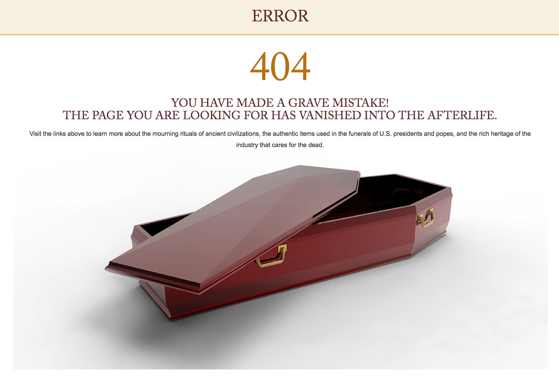
Are funerals a laughing matter? If anyone would know it’s the National Museum of Funeral History. Their error page has a “grave mistake” pun and mentions the page “vanished into the afterlife.”
34. New Yorker
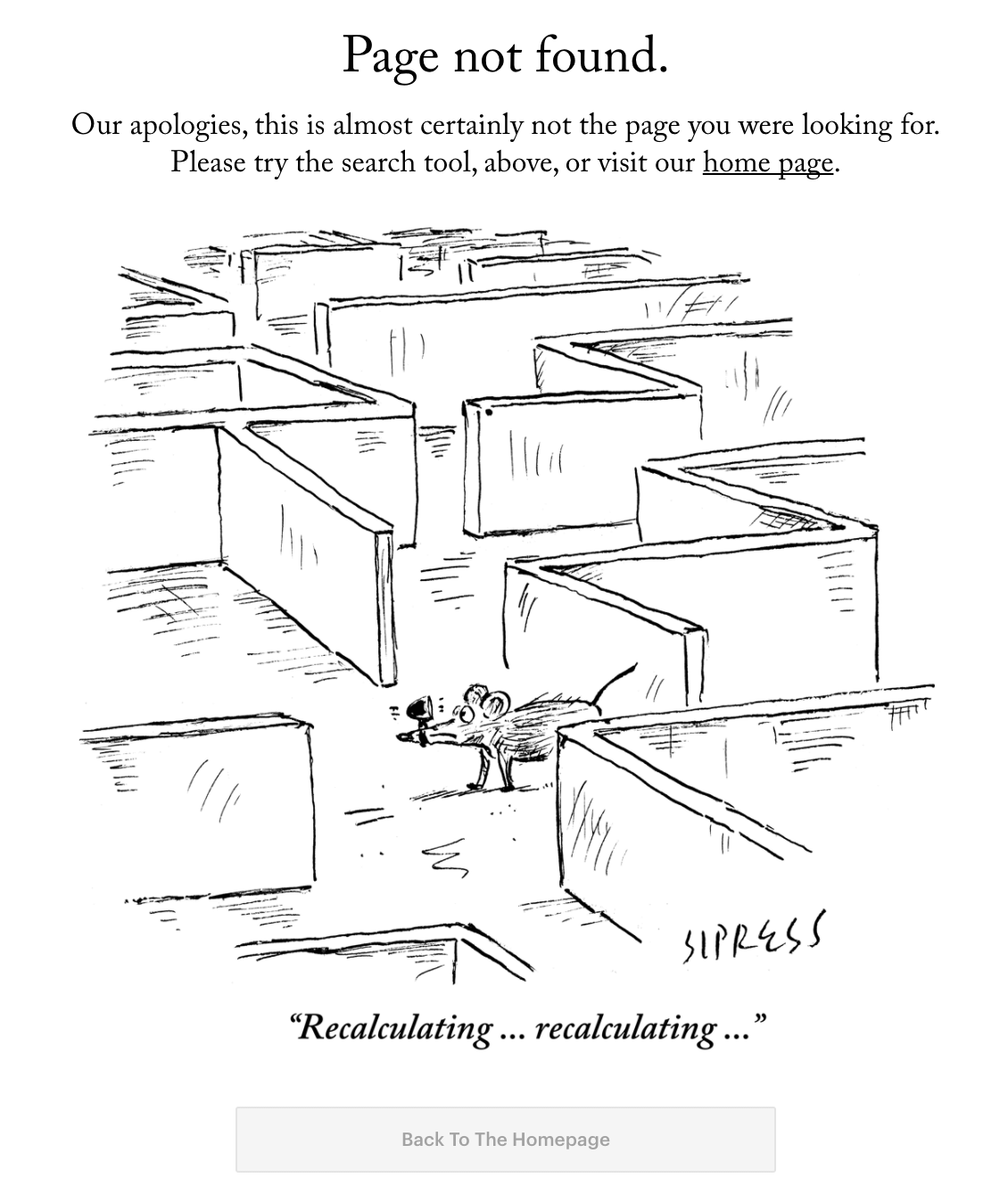
The New Yorker is known for their excellent cartoons. So of course they have one that works perfectly for an error page.
35. New Zealand Government
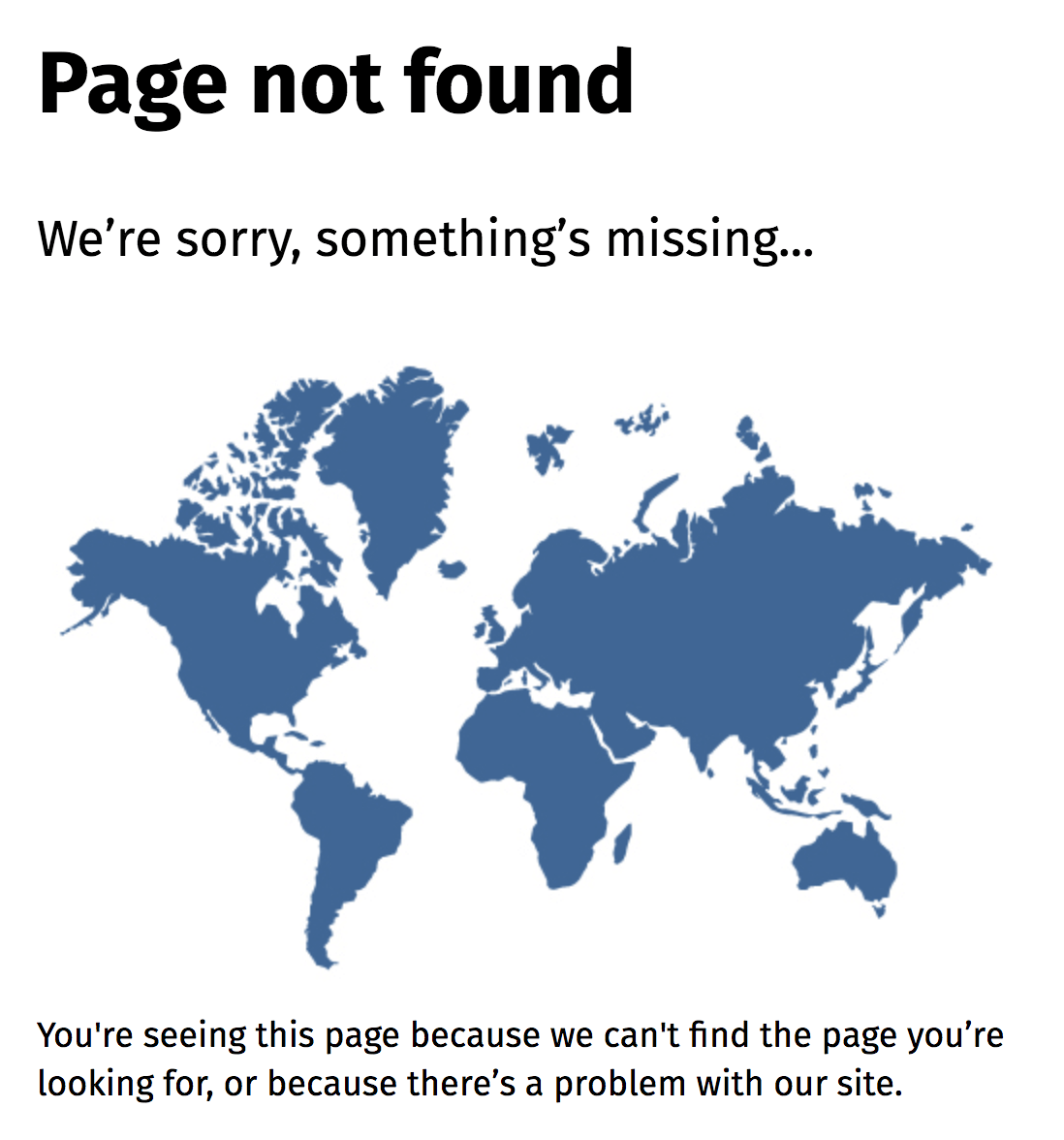
People have a bad habit of leaving New Zealand off maps. The country’s government had a bit of fun with this on their own website with a “something’s missing” reference and a world map with no New Zealand in sight.
36. Nuvango
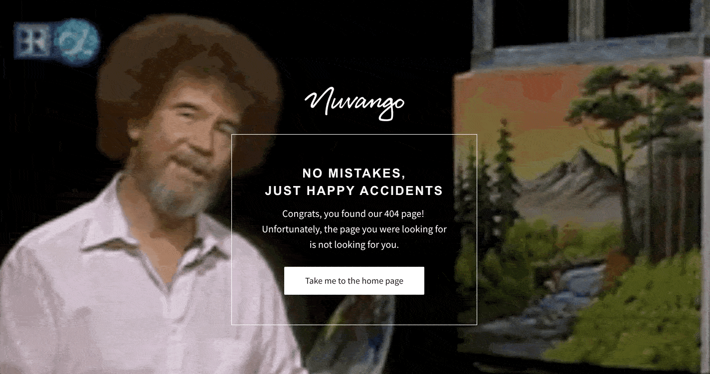
There are no mistakes, just happy accidents. If the goal of an error page is to turn frustration into a different emotion, like calm, there’s no person for the job like Bob Ross.
37. Orange Coat
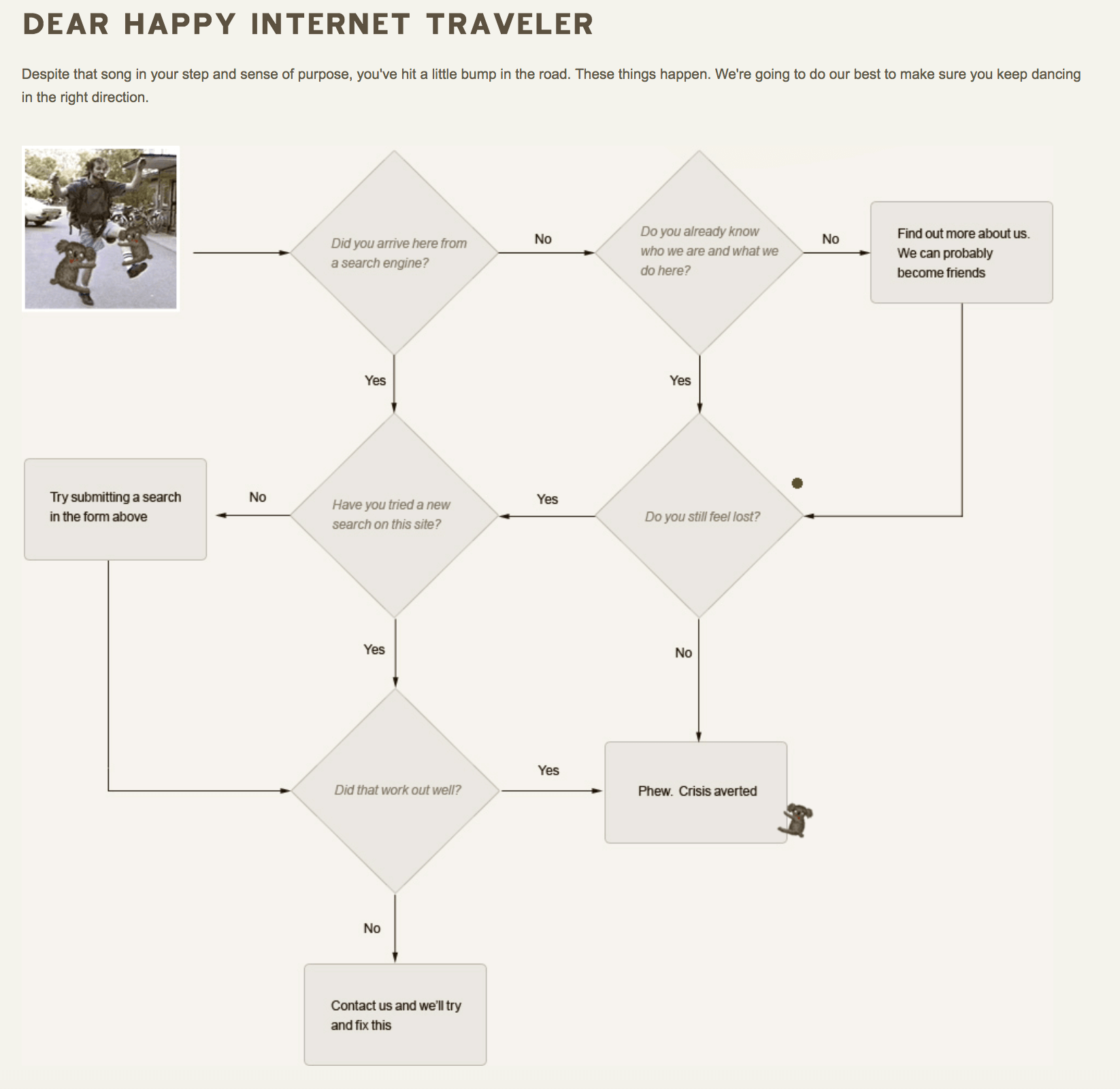
Interactive doesn’t have to mean games and Javascript widgets. Orange Coat’s error page gives visitors a choose-your-adventure style flow chart to work through.
38. Romain Brasier
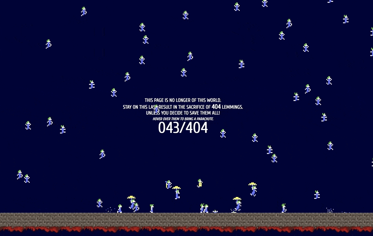
Another great examples of using classic video games to inspire nostalgia and joy in your error page visitors. Romain Brasier’s personal site gives you the clever goal of saving as many as you can of the 404 lemmings dropping from the sky.
39. Spotify
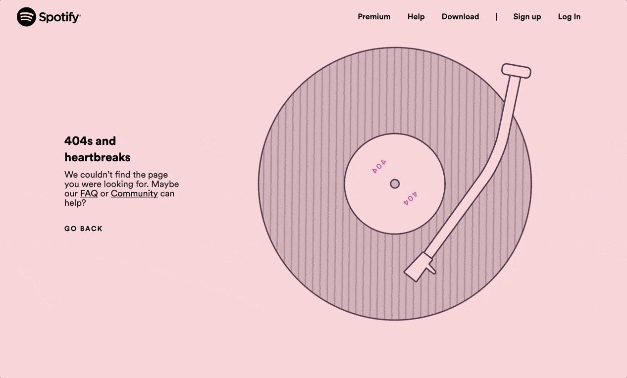
The copy is a reference to a Kanye West album, the animation is a satisfying movement of a vinyl record. So chill you just want to fire up some music and watch the pixels spin.
40. Steve Lambert

Dubbed “The most awkward error page on the internet,” artist Steve Lambert’s page is worth a watch. Try getting to the end. Like Steve writes on the page, “This kind of idea only comes to you at 12:30am. And you gotta do it then or you’re never gonna do it.”
41. Sygic Travel
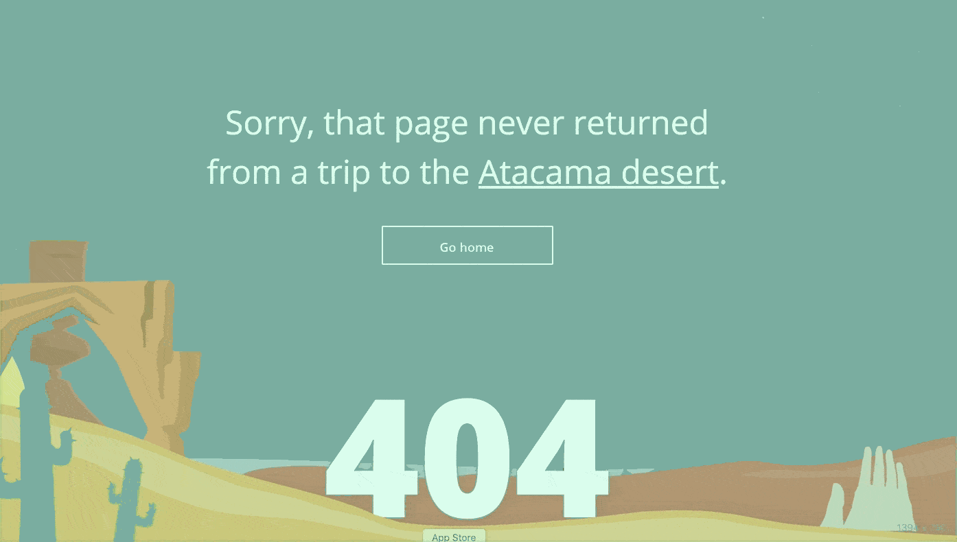
Sygic Travel inspires wanderlust with their animated error page. Watch the sun rise and fall as the desert landscape moves and cycles through day and night.
42. The Australian
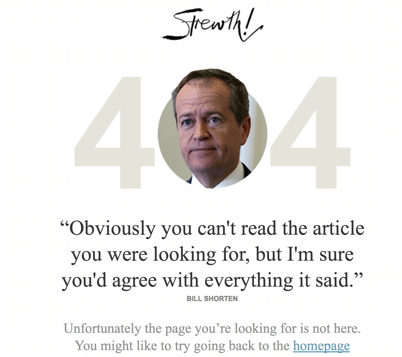
News organizations are typically a little stodgy with their brands. The Australian does a nice job flipping this perception on their error page. The page features fake but nearly-believable quotes from Australian politicians.
43. The Creation Museum
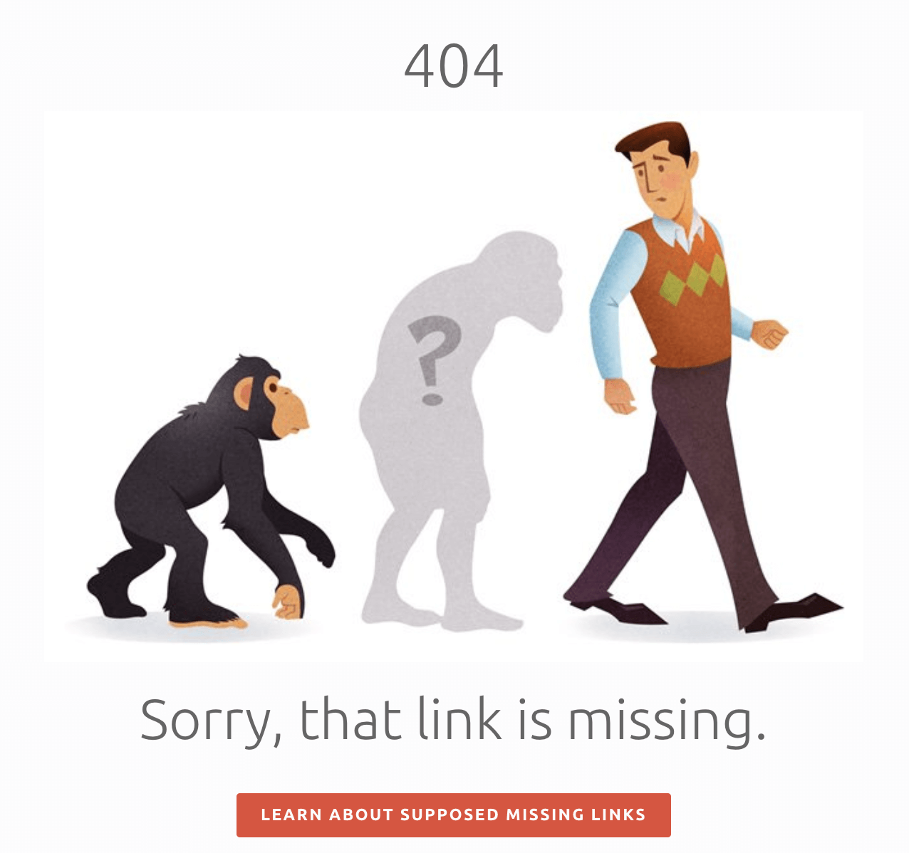
The Creation Museum is a place with a big mission. Many folks are divided about that mission, but either way it’s a big task: convince the world that evolution didn’t happen. They take a playful stab at evolution on their error page.

44. The Irish Times
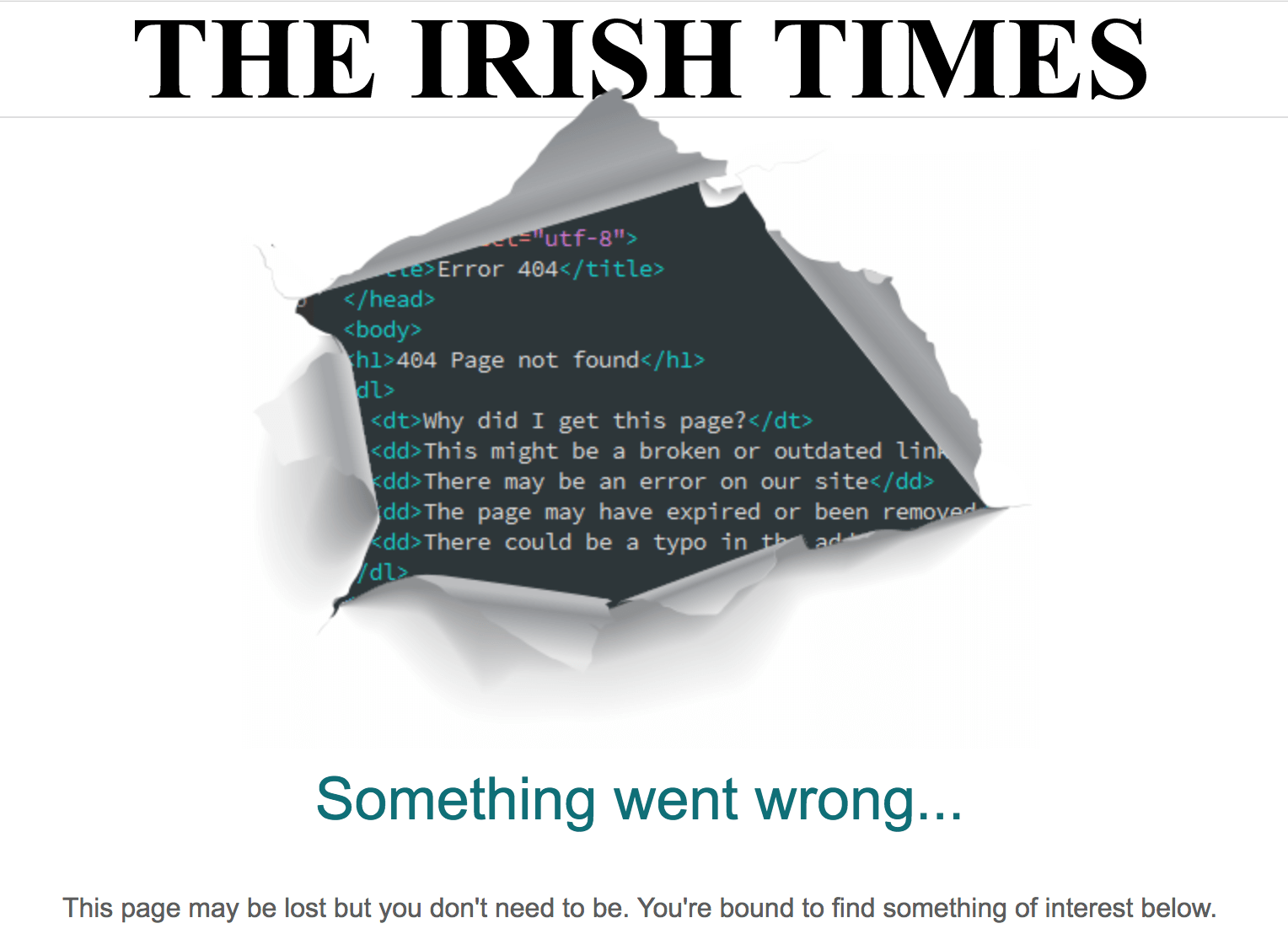
Here’s another example of a news organization having fun with their error page. The Irish Times 404 page shows code bursting through the newsprint.
Bonus tip:
Link error pages to your Statuspage. So when your users reach a page that is down, they can click into your Statuspage to get details on what the issue is and the status of the fix.
Statuspage is a tool that helps you easily communicate details of incidents and maintenance periods to your customers.
Here’s why it’s important to have a status page in addition to an error page:
- Reduce support tickets: When users know when to expect a resolution, they won’t need to open a ticket to ask for more information or worse, complain on social channels.
- Notify users automatically: When your users subscribe to your status page, they get notified via email, SMS or Slack automatically when there is an error or maintenance period on your app.
- Better customer experience: Being transparent with your users about maintenance periods and resolution times builds trust with your customers and is a better customer experience.