


One of the focus areas for the Sourcetree team is how we can take something relatively complex—the command line clients for Git and Mercurial—and present it in a GUI that provides all the flexibility an expert would require but doesn’t intimidate those new to DVCS and its tools.
I recently joined the team, having spent the last couple of years working in a Java/Linux environment. Part of my re-introduction to Windows has been getting familiarized with the Windows Task Manager. Like it or loathe it, using it is an everyday part of developing on Windows.
90% of the time, I go in to the Task Manager to kill a wayward process. 90% of the time, I already know which wayward process I want to kill. And, 90% of the time, it’s one I created. There are other reasons I use the Task Manager, but this use case far outweighs all others:


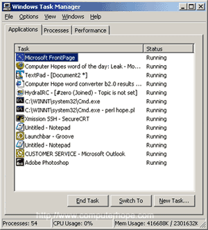

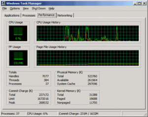
Every Windows iteration has added more information and more options, but my primary use case has always stayed the same: find a process and kill it.
Now as I return to work in Windows 8, 8.1, and 10 it looks like I’m not alone. The Task Manager has had a fundamental redesign, and for me and my 90% use case it’s perfect.
All the information I need is there, but no more, and the functionality I need is obvious and easy to find. For the other 10% of the time, the More Details option, or the Context Menu and Keyboard Shortcuts, give me easy access to the more advanced information and functionality.
I am not, by background, a user experience designer. But my role on the Sourcetree team is encouraging me to pay more attention, to recognize the UIs that get the important information in front of me as quickly as possible. The ones that help me do my 90% use case efficiently without preventing me from doing the other, more complex, 10% when necessary. For me, the new Task Manager accomplishes all of this.
It turns out, I must be a model Windows user. After raising this redesign internally, I was pointed to this blog post by the Windows Engineering Team about the processes and metrics they used to inform this work.
They could be talking about me. 🙂
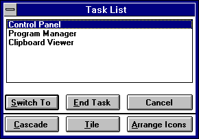
Finally, I also find it extremely interesting that the Windows Engineering team felt the need, and confidence, to re-appraise, re-design, and re-build a user interface that is seen as part of the Windows furniture. Not only that, they completely reversed the direction of travel. The Task Manager has consistently gathered more information, more functionality, and more complexity with each version of Windows. It’s striking how closely the latest incarnation resembles the one found in Windows 3.1, 20+ years ago.